-
-
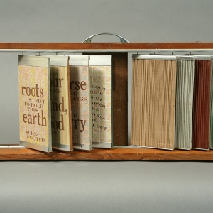
Sukoshi
-
One Liners
-
Portmandemic
-
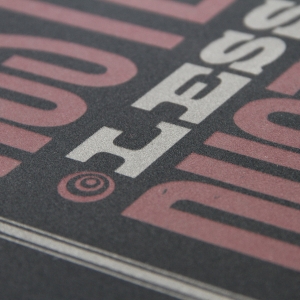
Tensile
-
Memory Lame
-
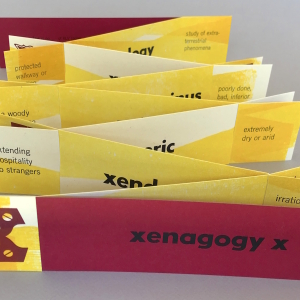
Xenagogy X
-
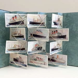
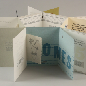
Fathoming
-
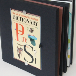
Po-St
-
Honey B Hive
-
Rags to Riches Flexagon
-
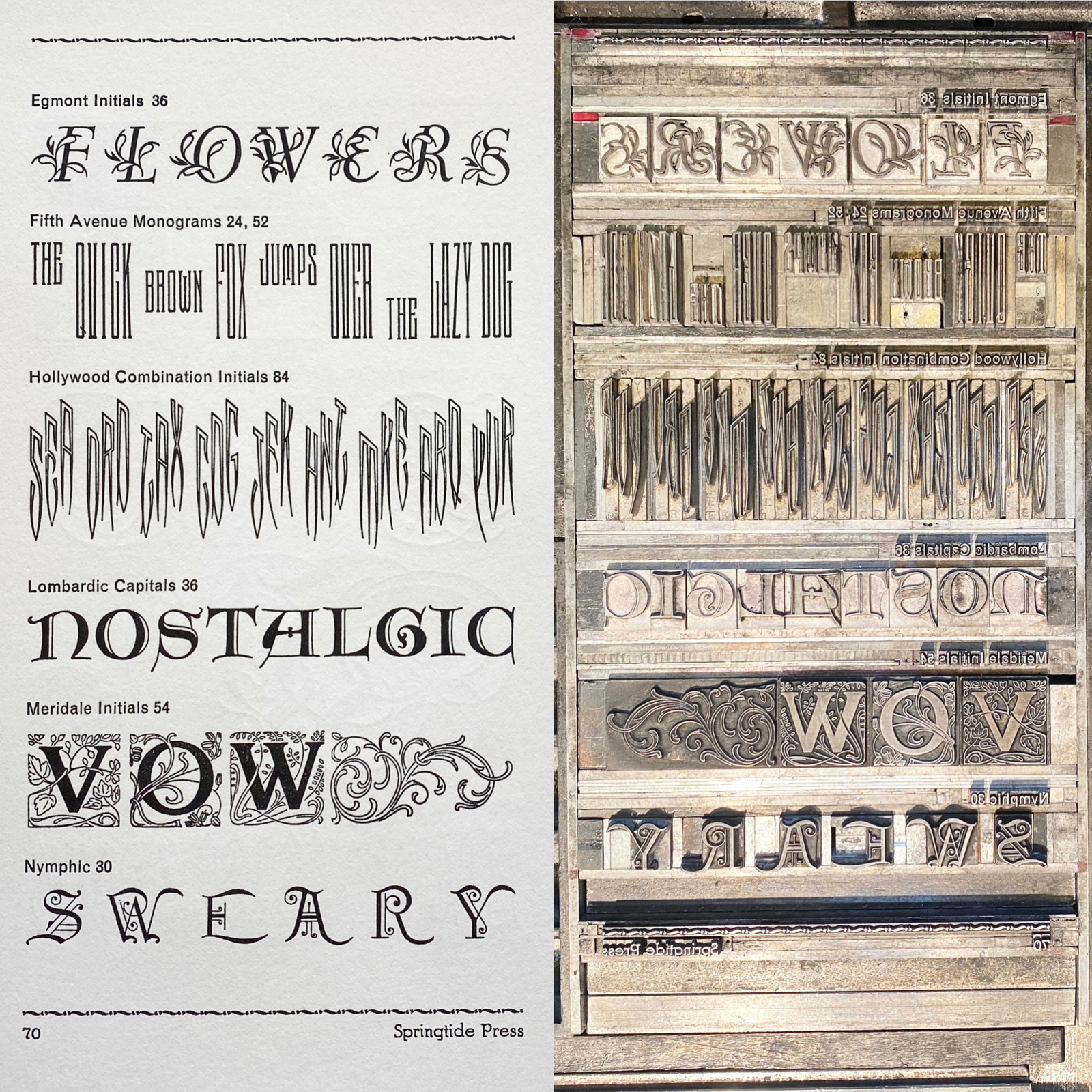
Printer’s Blocks
-
Unnatural Light
-
Ingrained
-
The Girl in the Moon
-
Sheets
-
Horse Power
-
Parts Unknown
-

A Proverbial Book
-
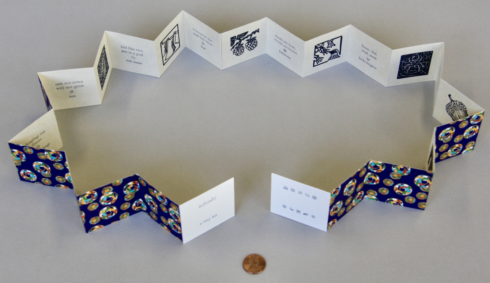
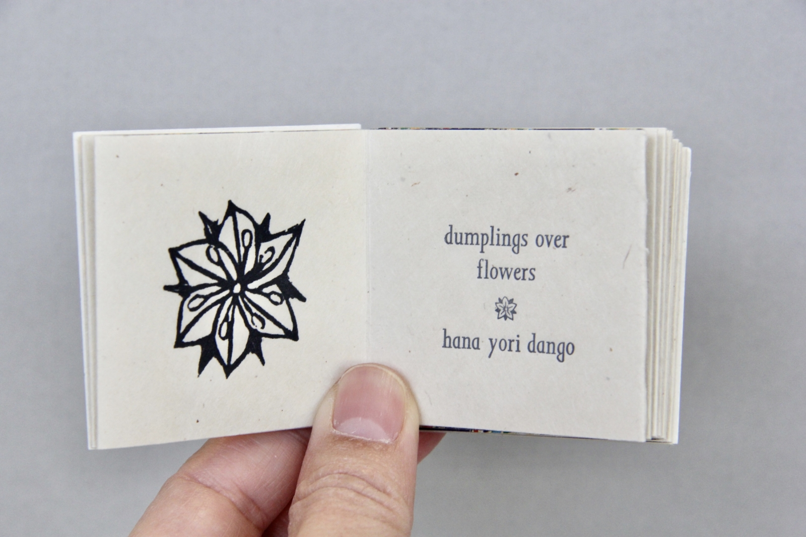
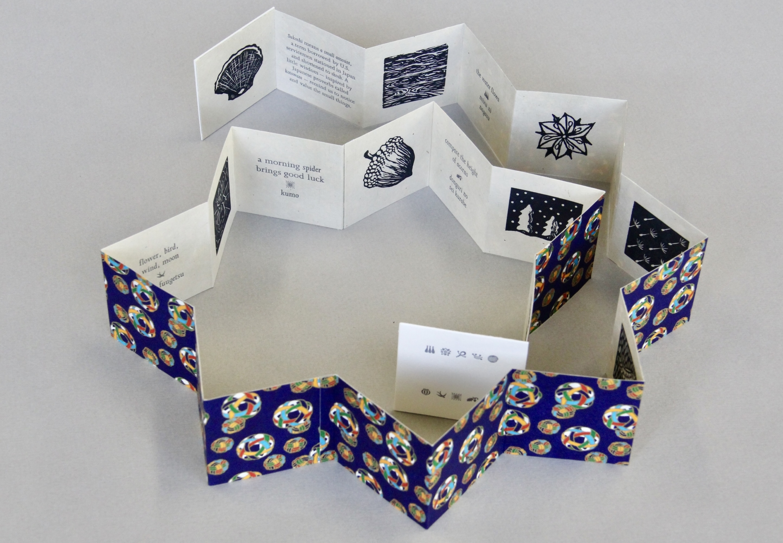
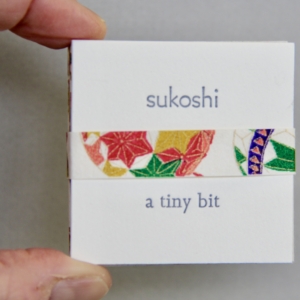
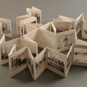
Sukoshi, 2025
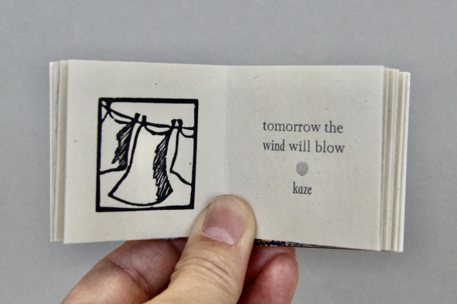
Meaning "a tiny bit" or "a small amount," "sukoshi" was borrowed by U.S. servicemen stationed in Japan, and shortened to "skosh." A little wisdom—inspired by Japanese proverbs called kotowaza—reminds us to notice and value the smallest things. Sukoshi features images found in nature representing each season, beginning with spring. Each image is paired with a kotowaza, and includes words or phrases in romaji, the romanization of the Japanese language. While some are familiar, like "peas in a pod," others may not be to some readers. Kacho fuugetsu, a six-century-old Japanese philosophy, directly translates to "flower, bird, wind, moon" and encapsulates continuous self-discovery through the appreciation of the natural world. While Sukoshi fits like a tiny treasure in the palm of a reader's hand, it unfolds to a wingspan, evoking the expansive power of nature nestled in the smallest things.
Sukoshi is letterpress printed with 12 original linocuts by Yoshi Nakagawa, and handset type by Jessica Spring. Printed on kitakata, and backed with chiyogami paper, each book is folded into an accordion with museum board covers. A variety of vintage Japanese decorative papers were utilized, so—as in nature—each book in the edition is slightly different, belted with the patterned paper inside each copy. Produced in an edition of 100 which includes 12 deluxe copies that are hand-colored and boxed.
2x2 closed, 2x2x48 open, signed by both artists.
-
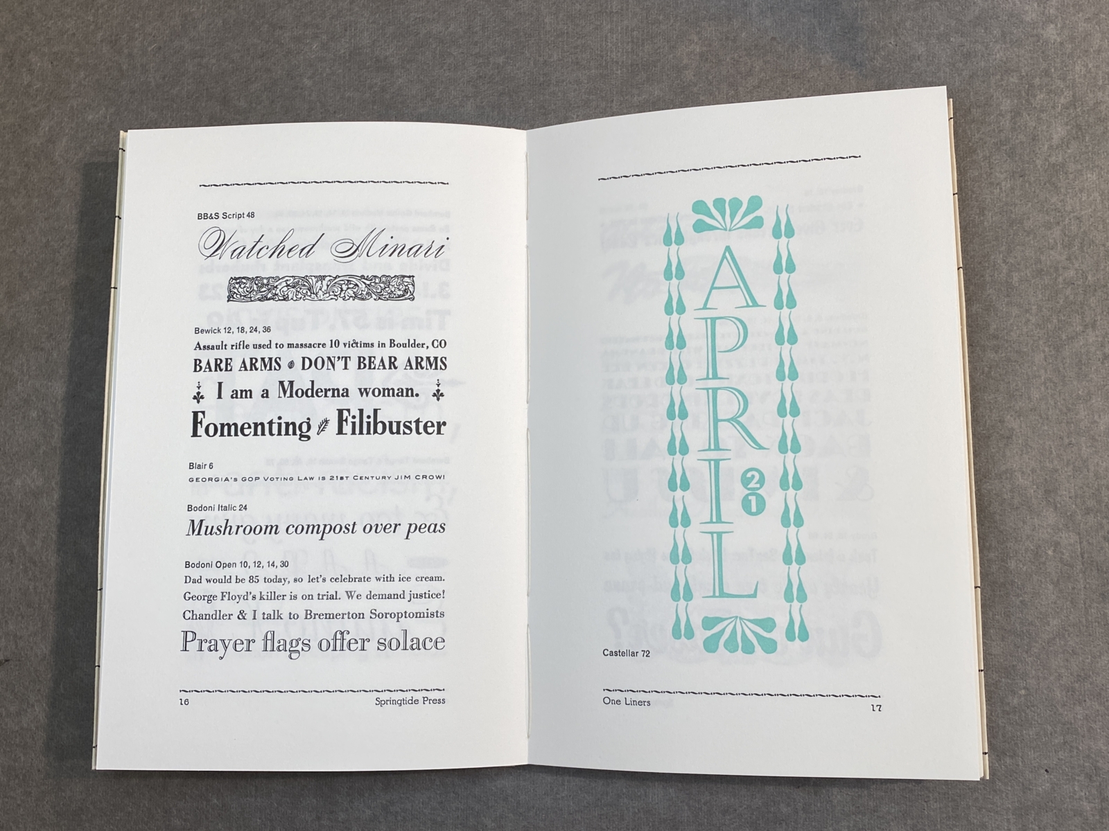
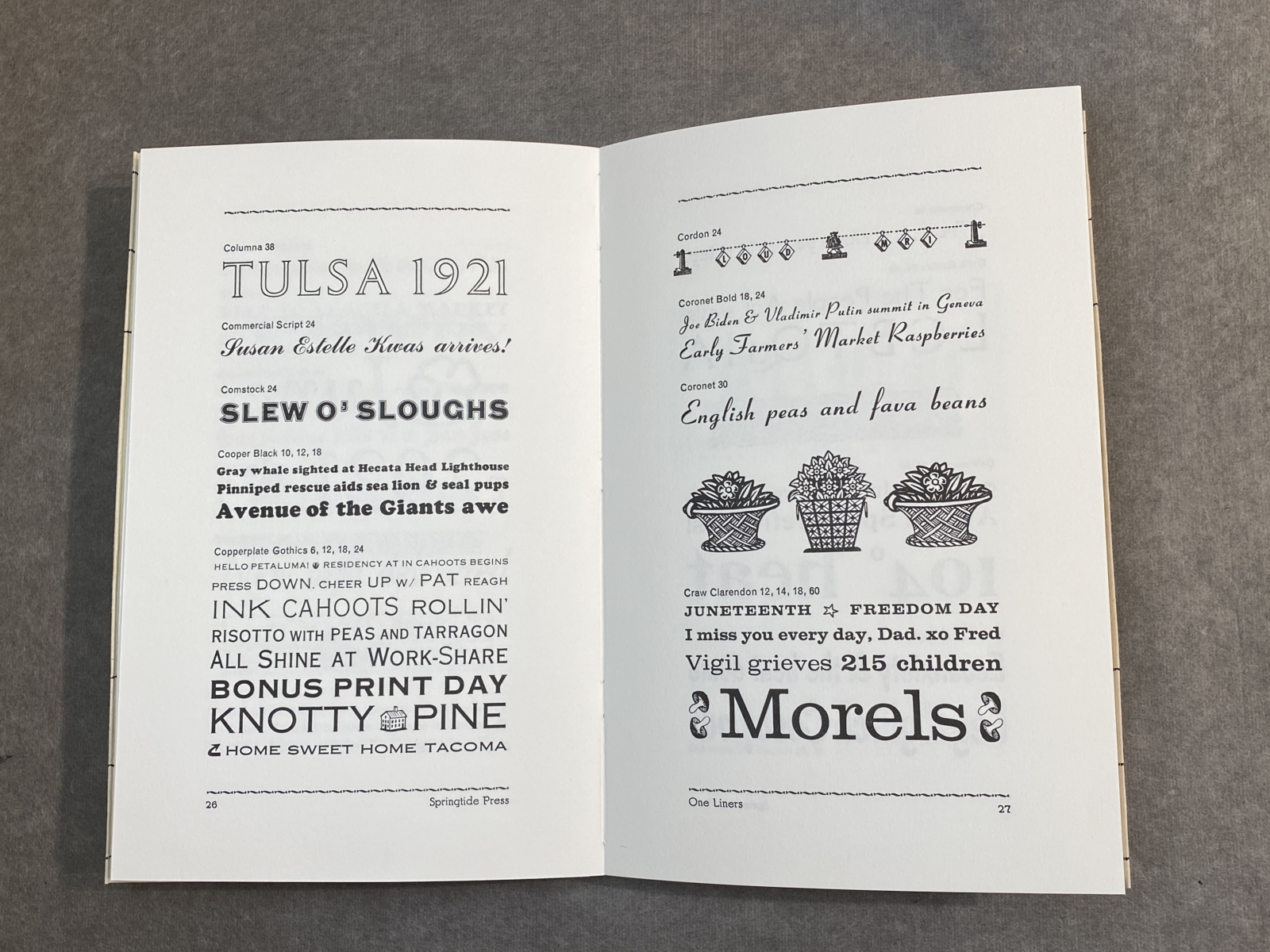
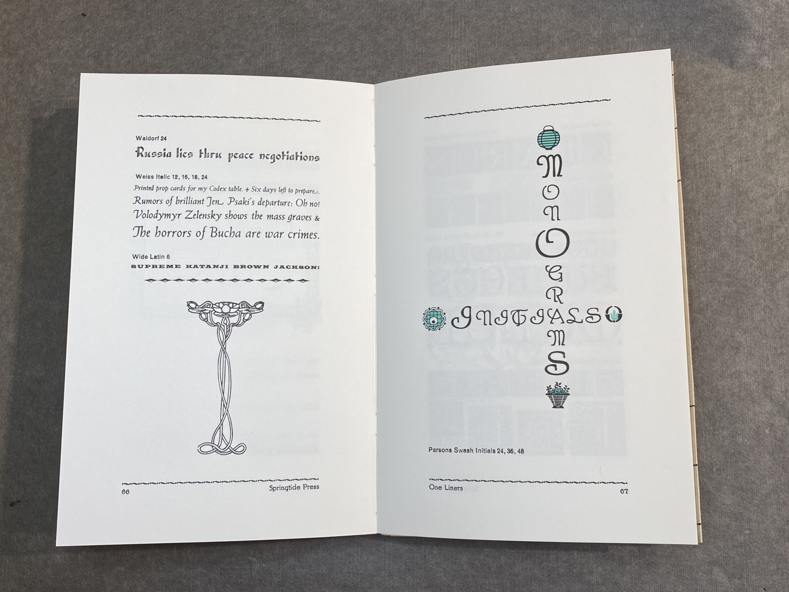
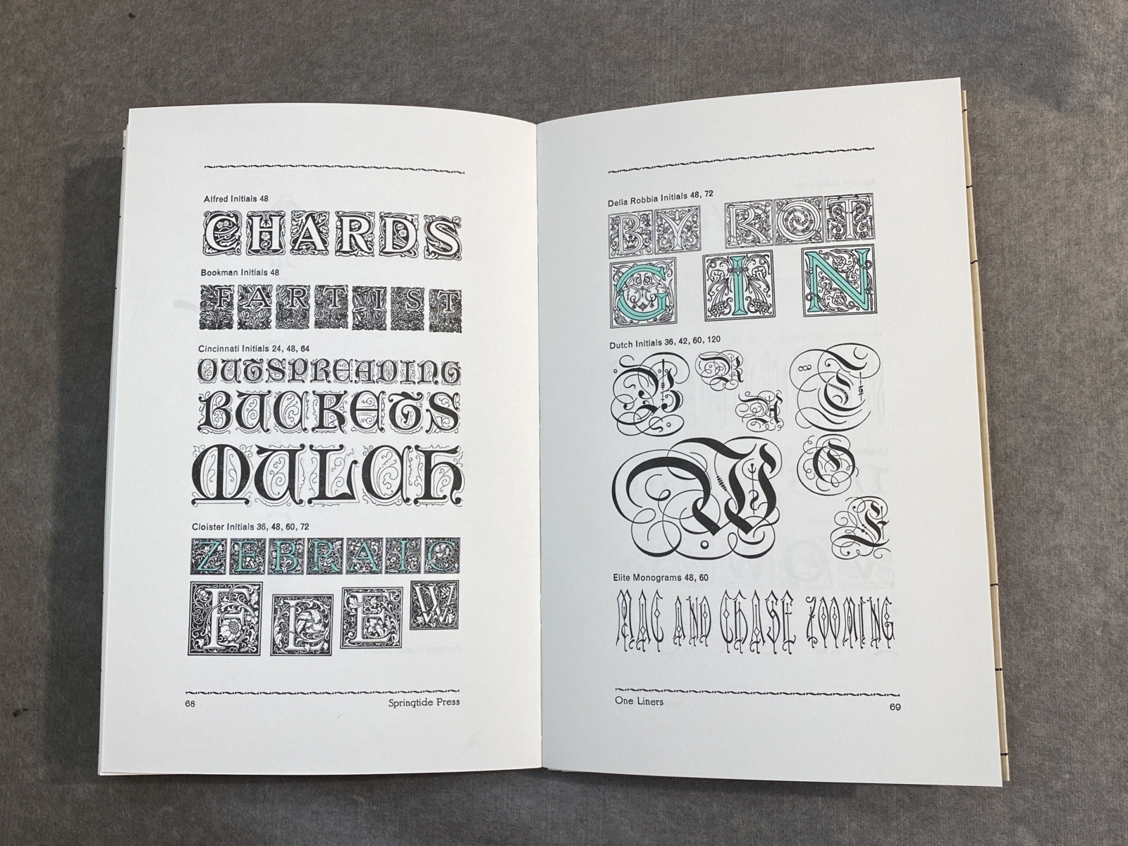
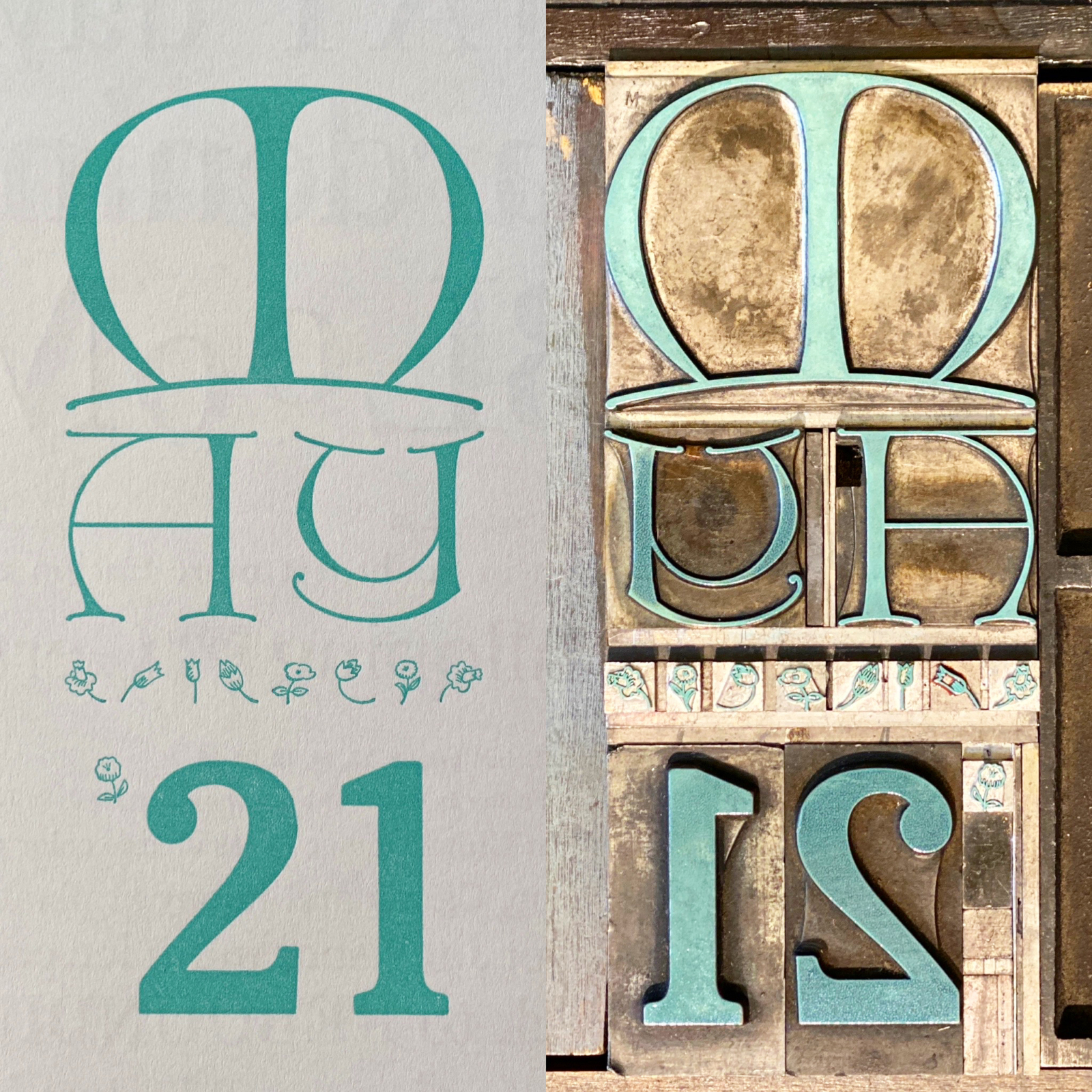
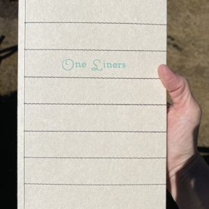
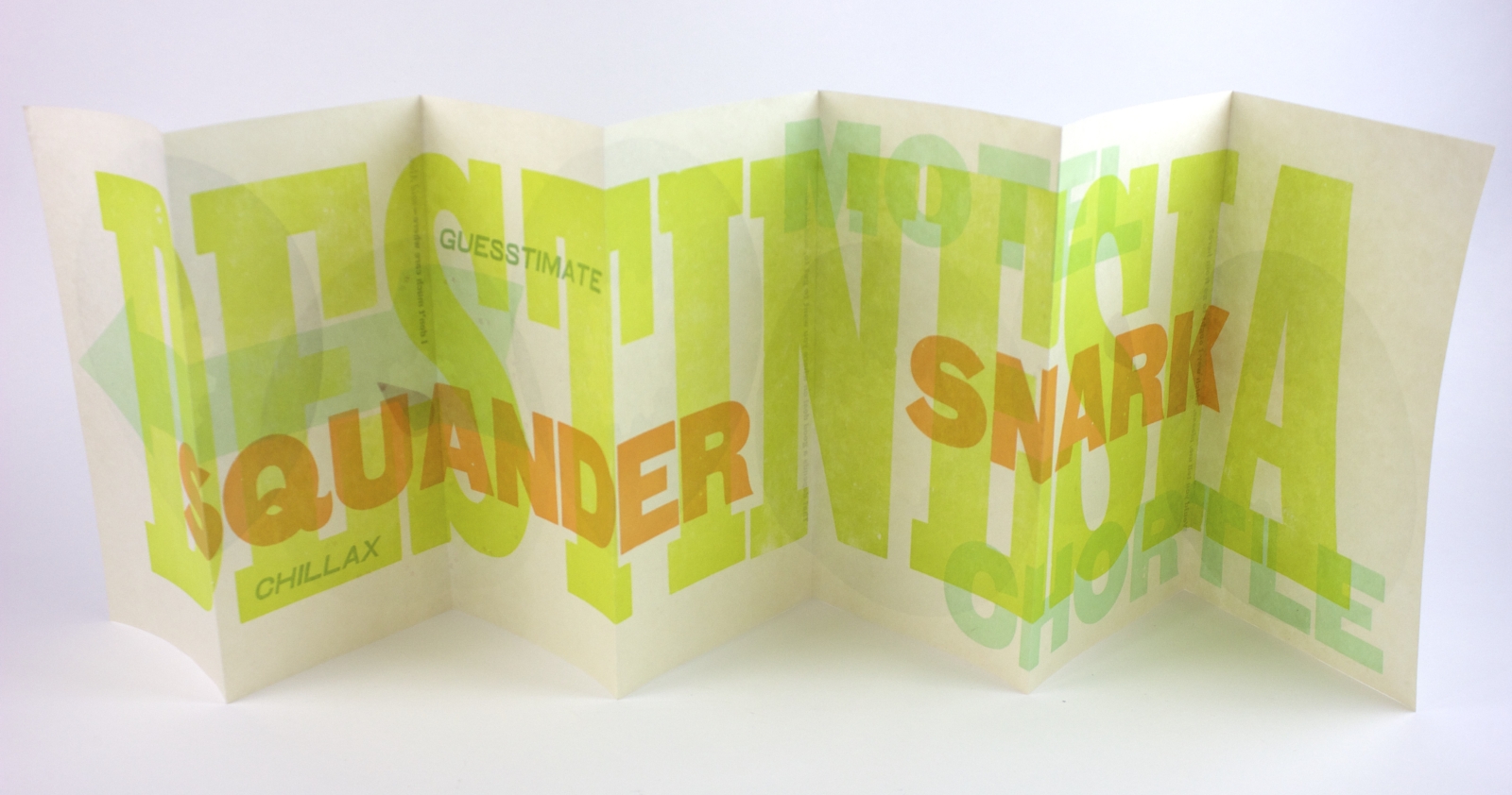
One Liners, 2023
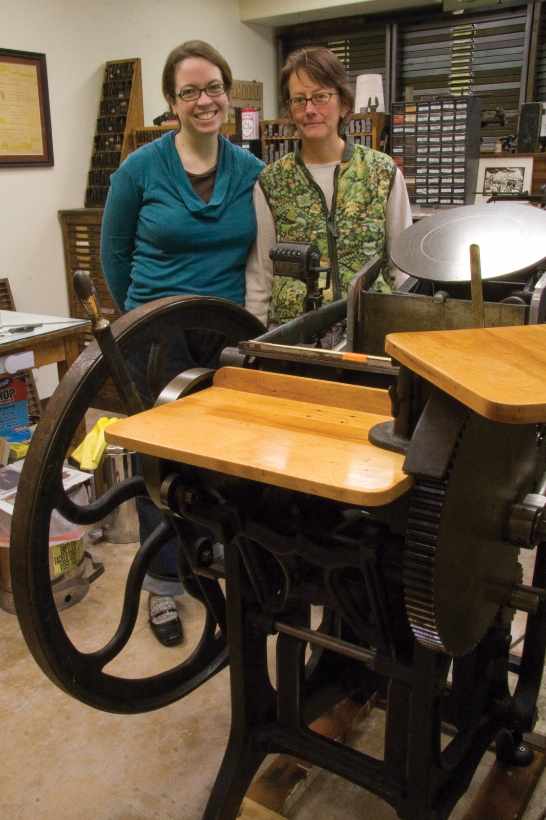
One Liners features single line specimens from 238 metal typefaces in the collection at Springtide Press. Set daily from January 1, 2021 to April 6, 2022, the intent was to capture each day, from the most mundane and personal, to events unfolding in the world. There was no lack of content: on day six our nation’s Capitol was attacked, and the insanity continued with a global pandemic, political protests, environmental catastrophes, and the loss of a dear friend. Each typeface in the shop, in every size, was set. Anything too large, overlooked, or newly purchased was used to set monthly chapter opening pages and surrounded by borders from the collection. Embellishers, festoons, and vintage cuts are sprinkled throughout, to function both as decoration and to even out page lengths. An extra chapter featuring initials and monograms is included, highlighted with several two-color specimens. "One Liners" is both journal and typographic specimen, revealing 461 days in the life of a printer, shared through her love of letters and wordplay.
Printed by Jessica Spring on Mohawk Superfine in an edition of 150 copies. Tue-mouche binding by Gabby Cooksey with Hook Pottery Paper case. 6 x 9.375 inches, 74 pages
-
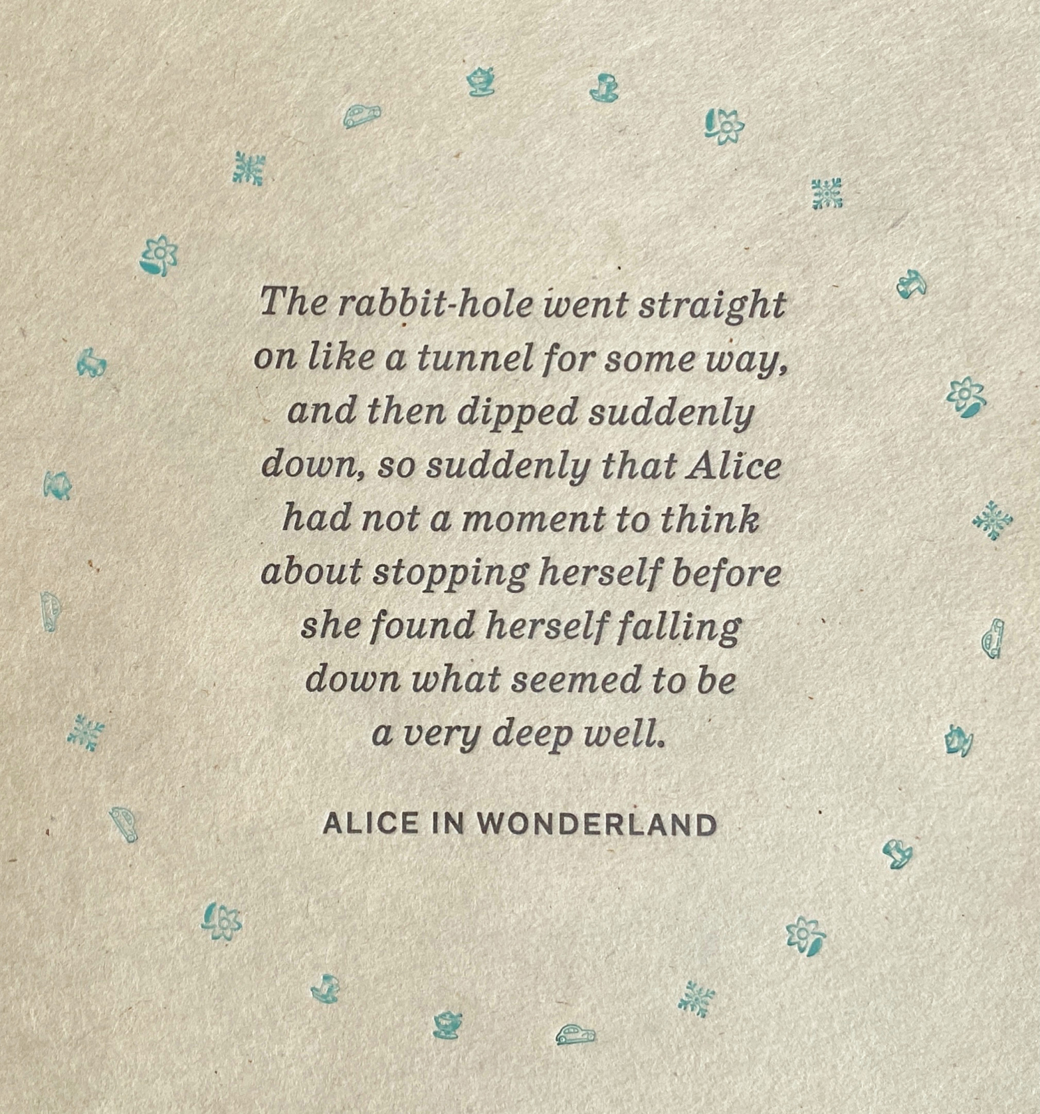
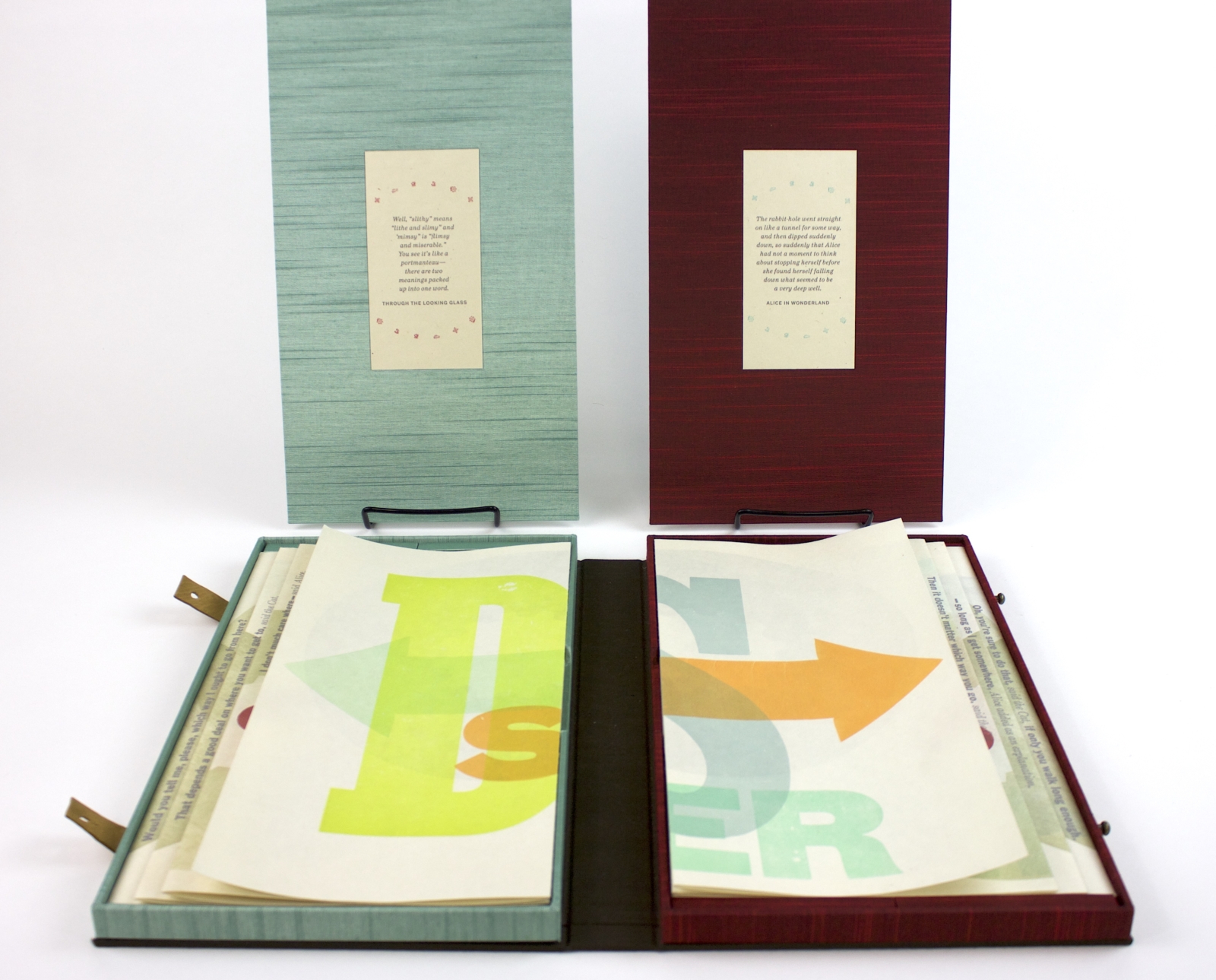
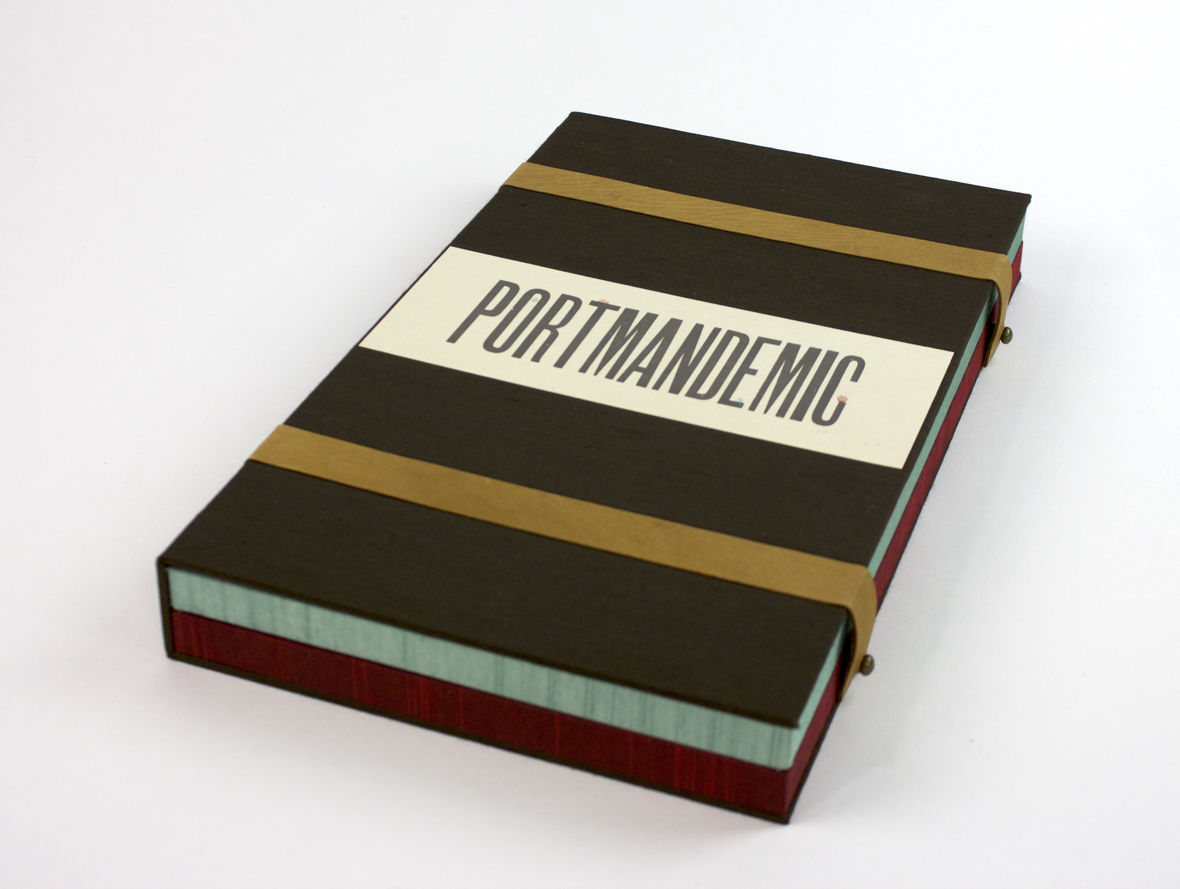
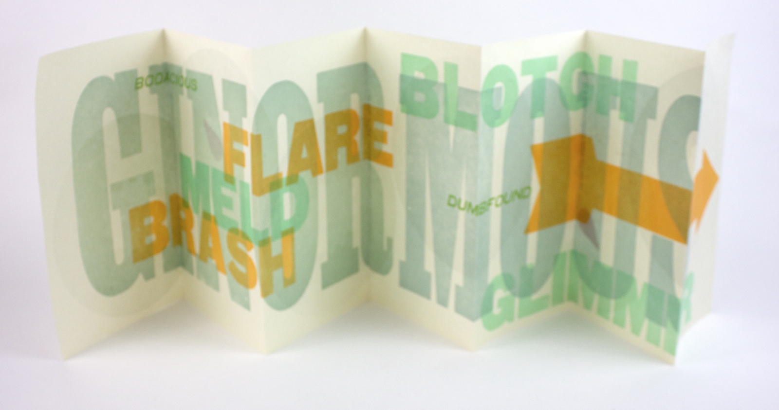
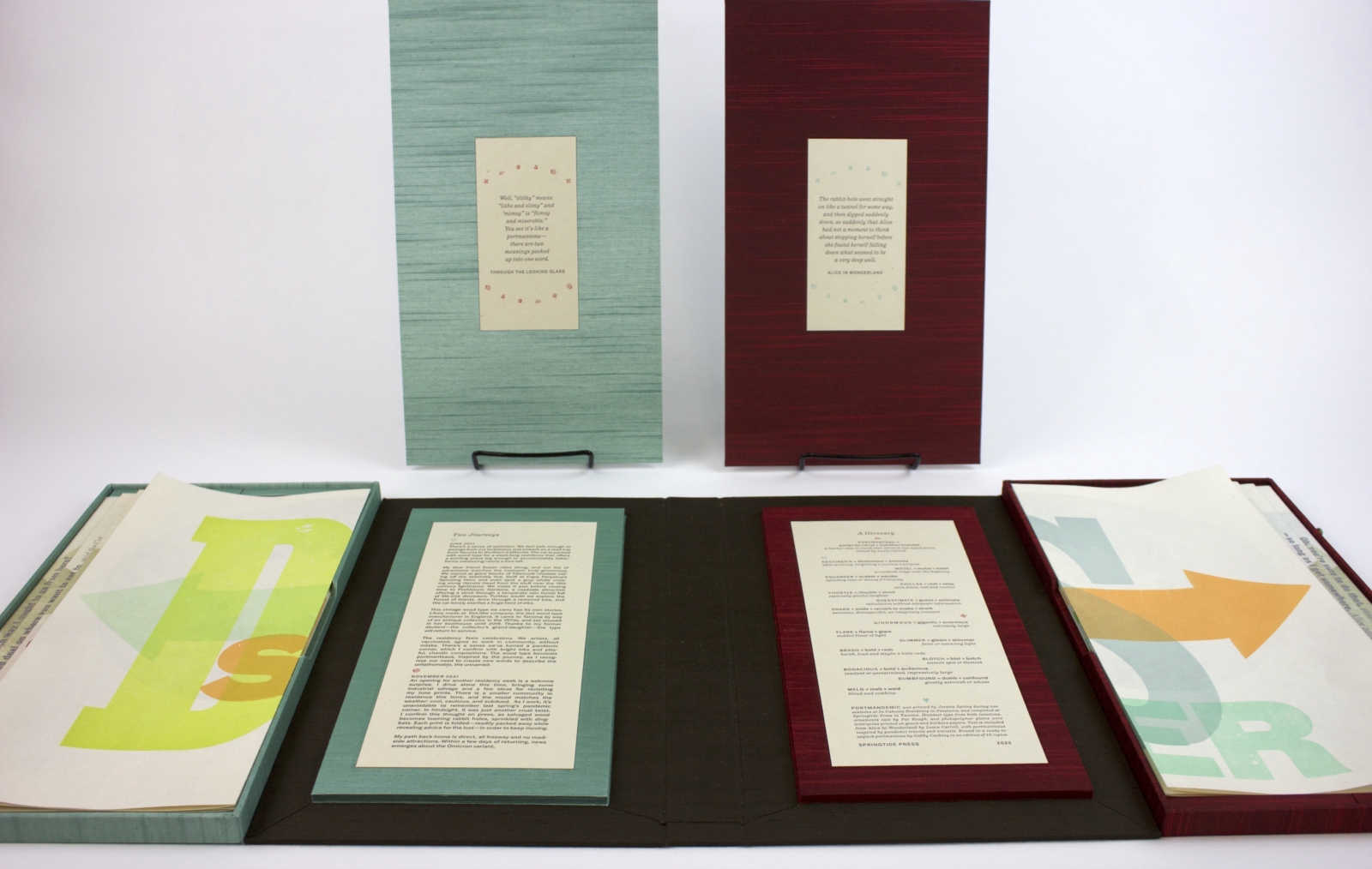
Portmandemic, 2022
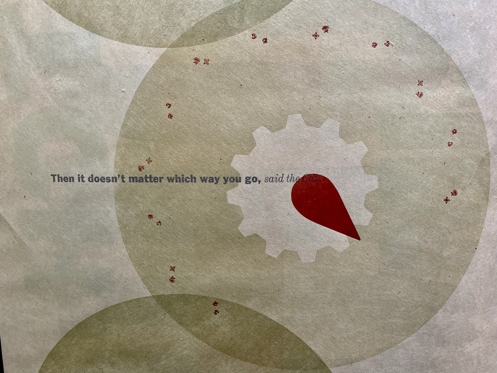
Once opened and carefully unpacked, Portmandemic includes two 13 x 50 inch letterpress prints made with huge wood type in 2021. One side of each print is layered with portmanteaus—a term coined by Lewis Carroll which combines porter (to carry) and manteau (mantle)—to describe two words combined for a new meaning. Alice’s conversation with the Chesire Cat, which begins: “Would you tell me please, which way I ought to go from here?” is revealed when the prints lay folded, but disappears once unpacked. When the print trays are lifted, an essay by the artist about her pandemic travels and a glossary of portmanteaus used in the book can be read.
Portmandemic was printed during two sessions at In Cahoots Residency in Petaluma, and completed at Springtide Press in Tacoma. Handset type from both locations, ornaments cast by Pat Reagh, and photopolymer plates were letterpress printed on gasen and kitikata papers. Text is included from Alice in Wonderland by Lewis Carroll, with portmanteaus inspired by pandemic travels and travails. Ready-to-unpack portmanteau bound by Gabby Cooksey, covered with Asahi bookcloth and leather straps.
Edition of 10.
-
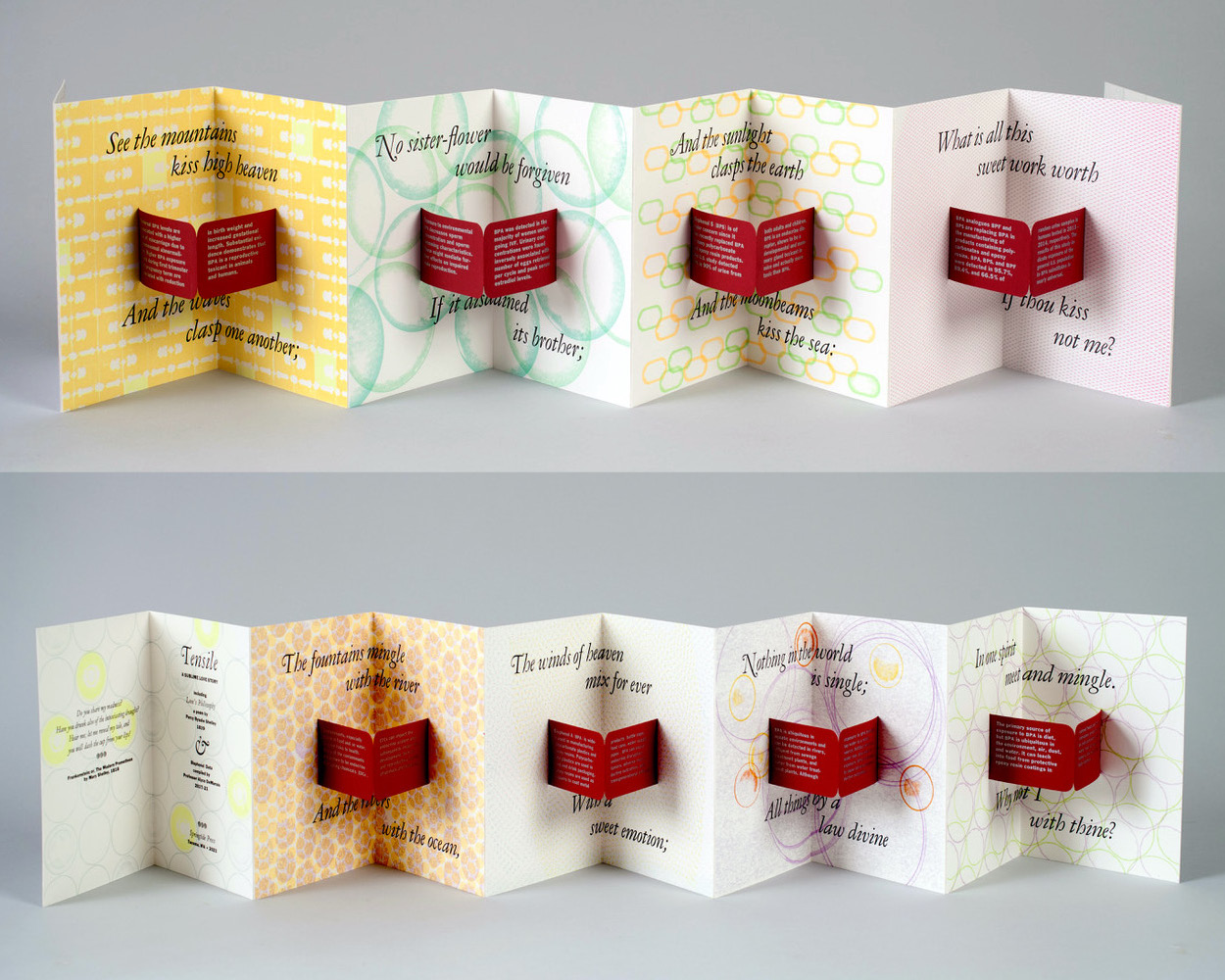
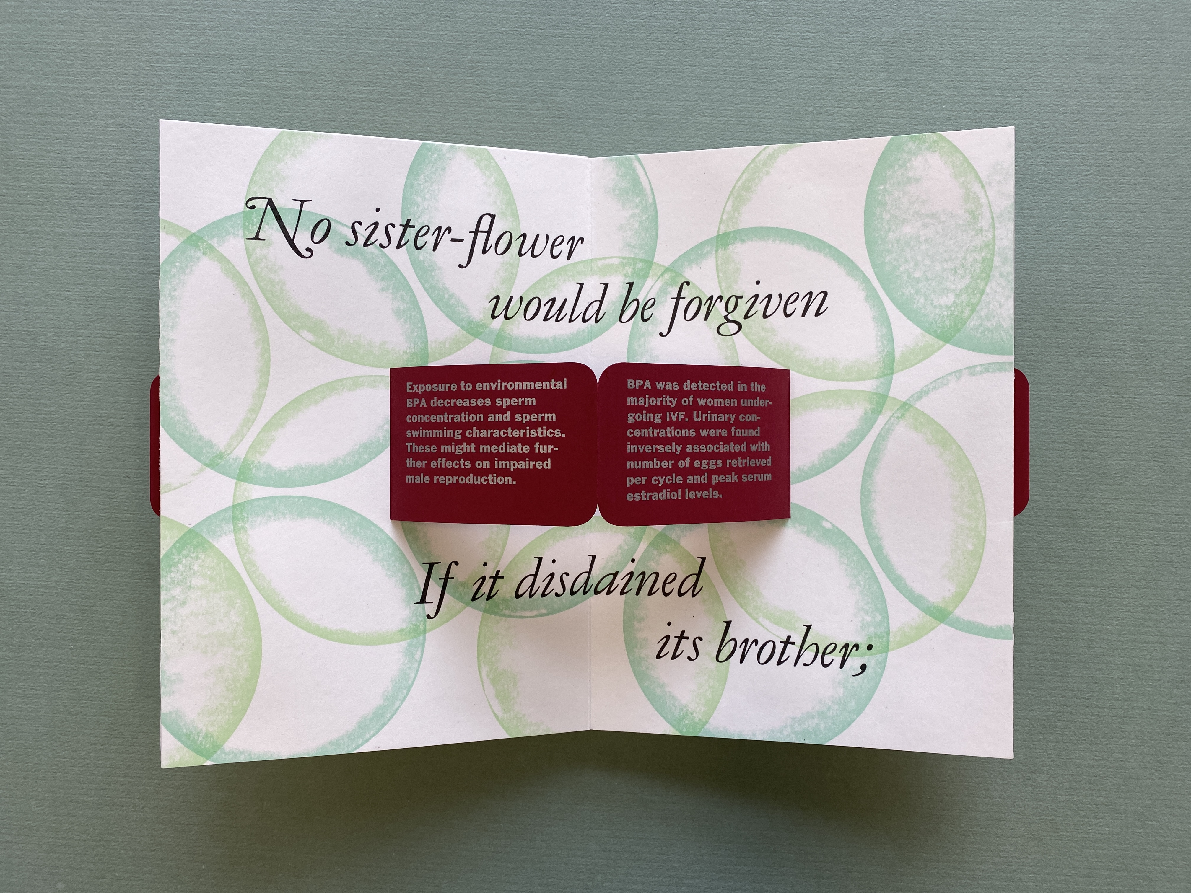
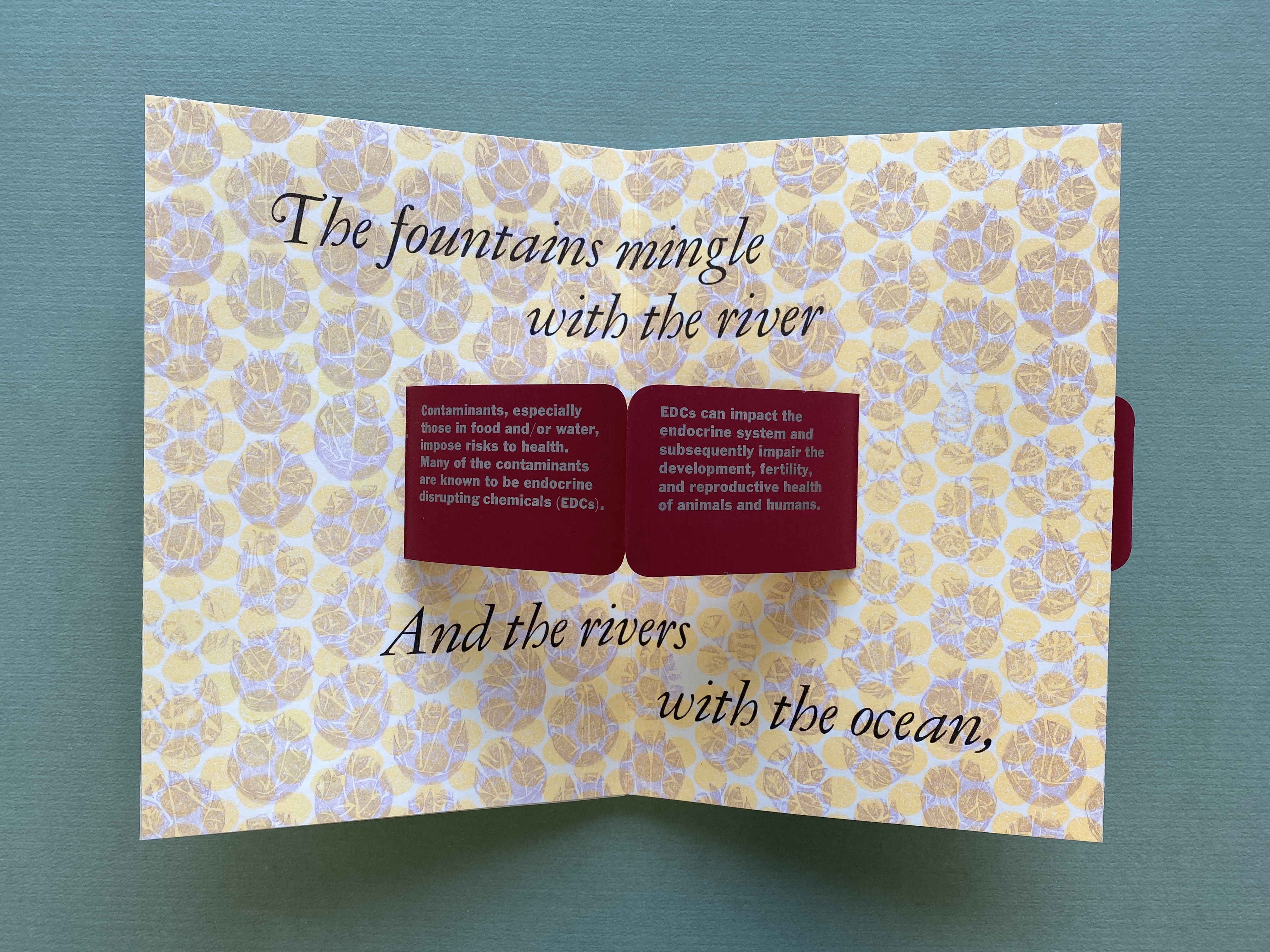
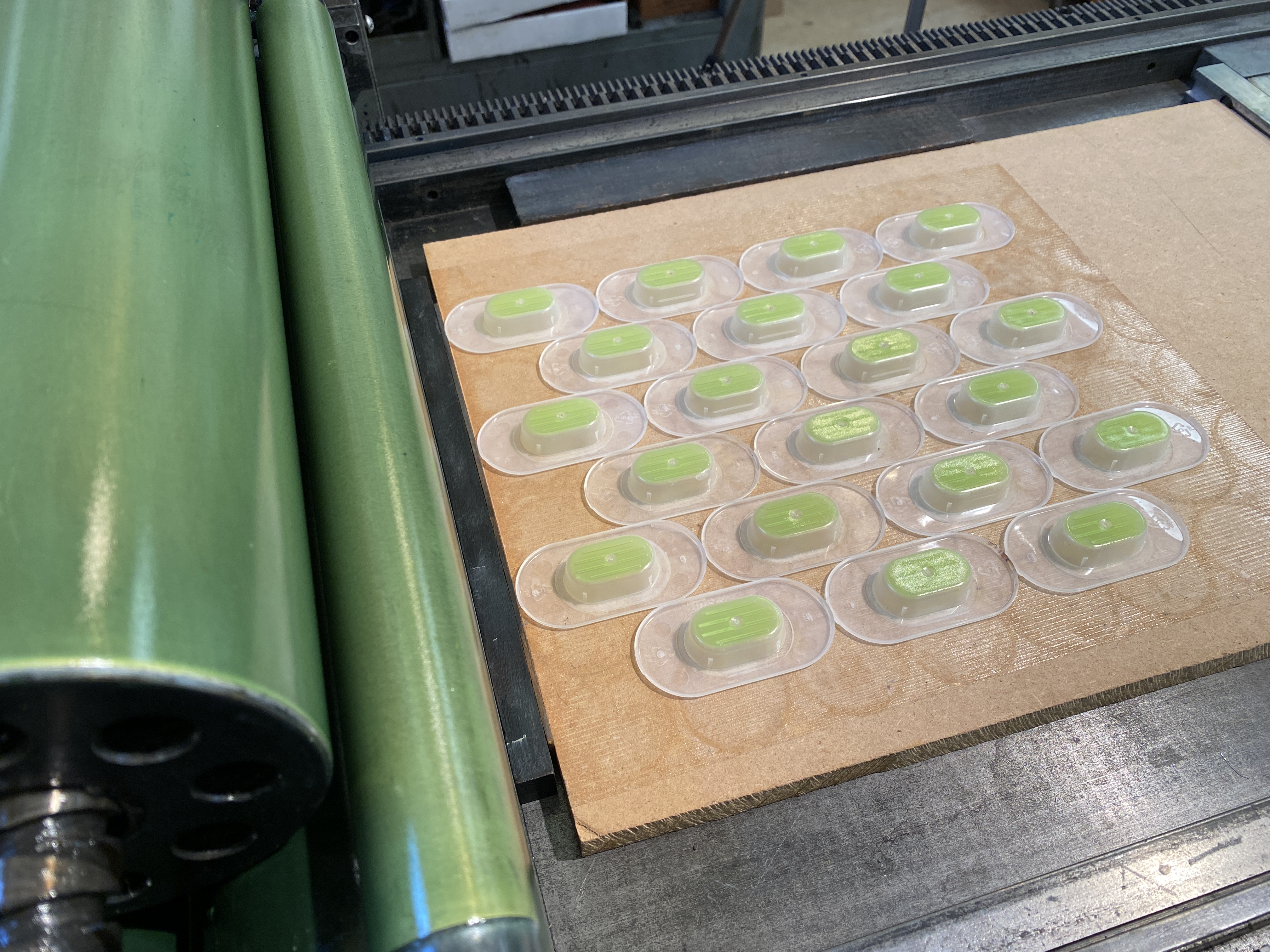
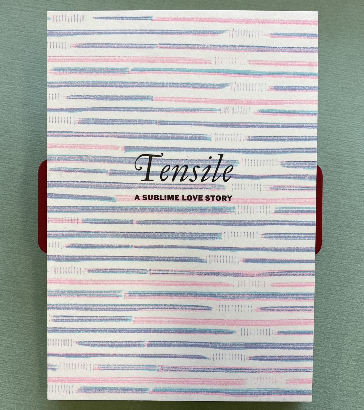
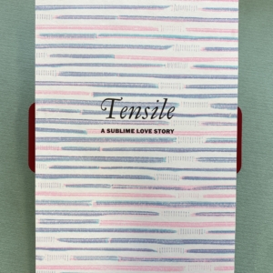
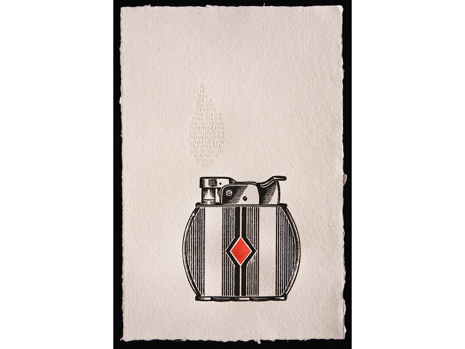
Tensile, 2022
Tensile: A sublime love story weaves together a 19th century poem of seduction by Percy Bysshe Shelley, with current research on bisphenol contamination in our environment and bodies gathered by biologist Alyce DeMarais. Used to manufacture plastics and resins for food and drink packaging, bisphenol impacts the endocrine system, impairing development and reproductive health with transgenerational effects. 19th century writers didn’t know synthetic plastic would emerge in 1907 to change the world. In the midst of industrialization, Romantic era poets reinvigorated a spiritual connection to nature by portraying the Sublime. Shelley’s “Love’s Philosophy” celebrates the mingling of rivers and oceans as scientists conclude that exposure to bisphenol contamination is ubiquitous. Illustrations were printed directly from single-use plastics (including bread-bag ties, milk bottle caps, drinking straws and contact lens containers) to create sublime landscapes, and explore the irony of our love affair with this monster of our own creation. 6 x 8” expands to 60 inches. Leporello structure with pop-up text panels and plastic covers, in a plastic box, bound by Gabby Cooksey. Letterpress printed with handset Garamont Italic, cast by Gregory Walters, and printed by Jessica Spring. -
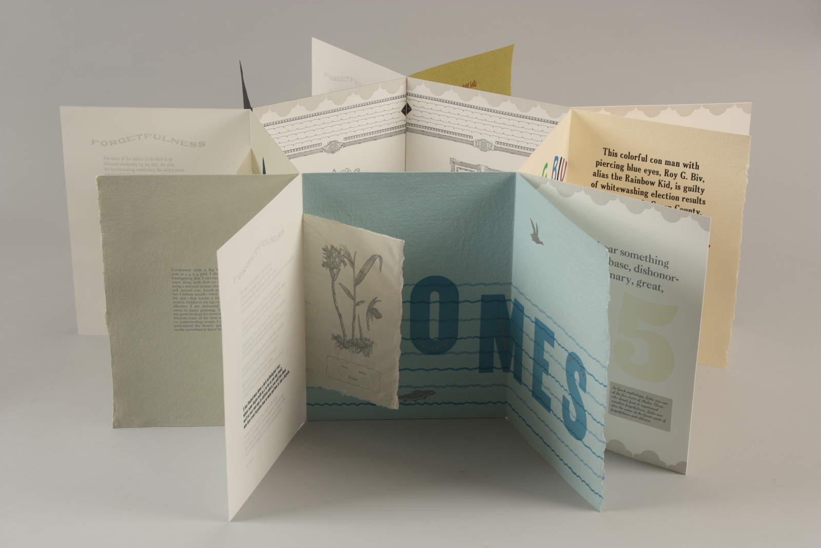
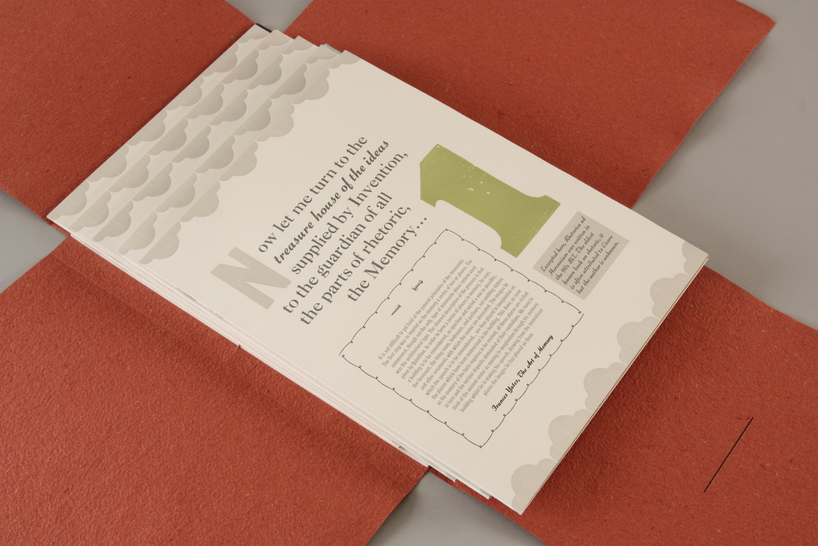
Memory Lame, 2019
Memory Lame focuses on retention and loss of memory. The book structure must be built by the reader with content emanating from a central, pentagonal memory palace—the most common mnemonic place system—aided by cues of geometric shapes and large numerals. Surrounding the palace are excerpts from Rhetorica ad Herennium, the oldest known book on rhetoric and memory. Billy Collins’ poem “Forgetfulness” is repeated in each chapter, the text moving from black to gray as the reader circles the book. Common mnemonic devices tease the memory, printed on sheets of handmade Saint-Armand. Tucked in each chapter are illustrations of plants that improve cognitive function, printed on transparent abaca. Text set in geometric shapes share the author’s grueling experience of cognitive and memory testing. Letterpress printed with handset wood and metal type, ornaments and photopolymer plates on Saint-Armand, Magnani and handmade abaca. Bound by Gabby Cooksey in an edition of 25 copies. -
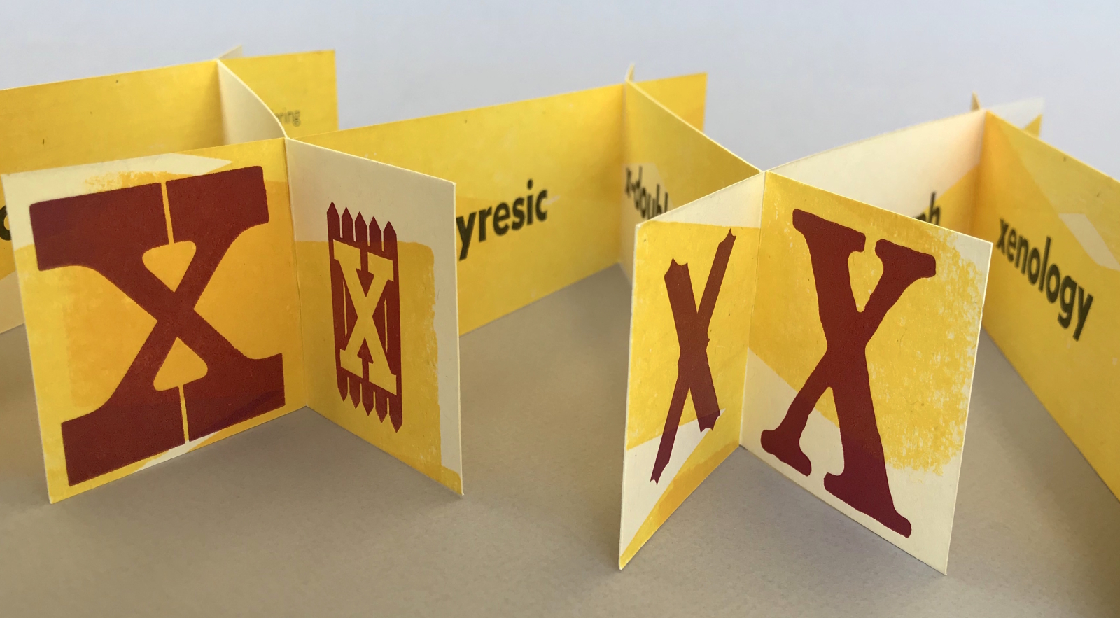
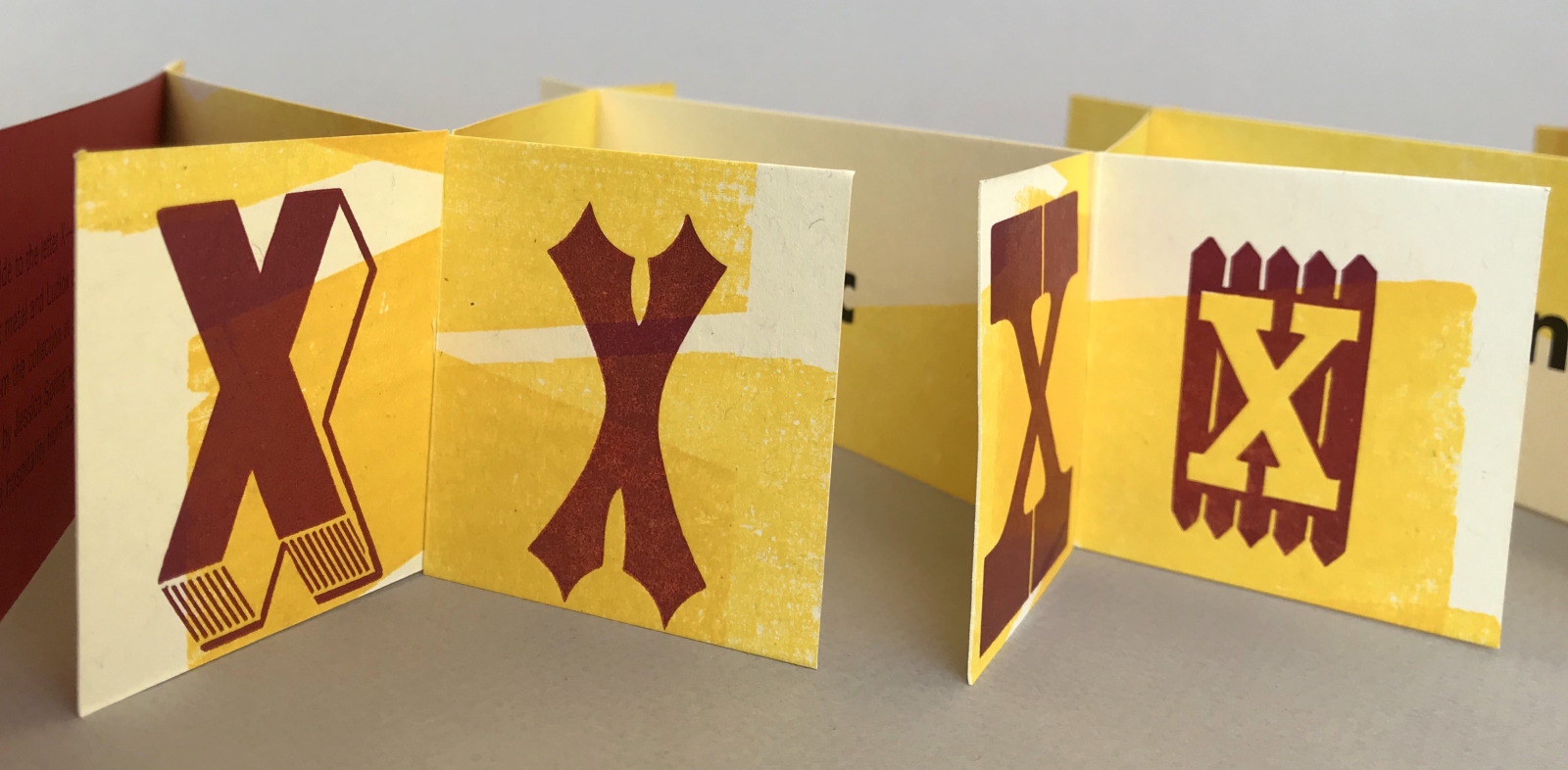
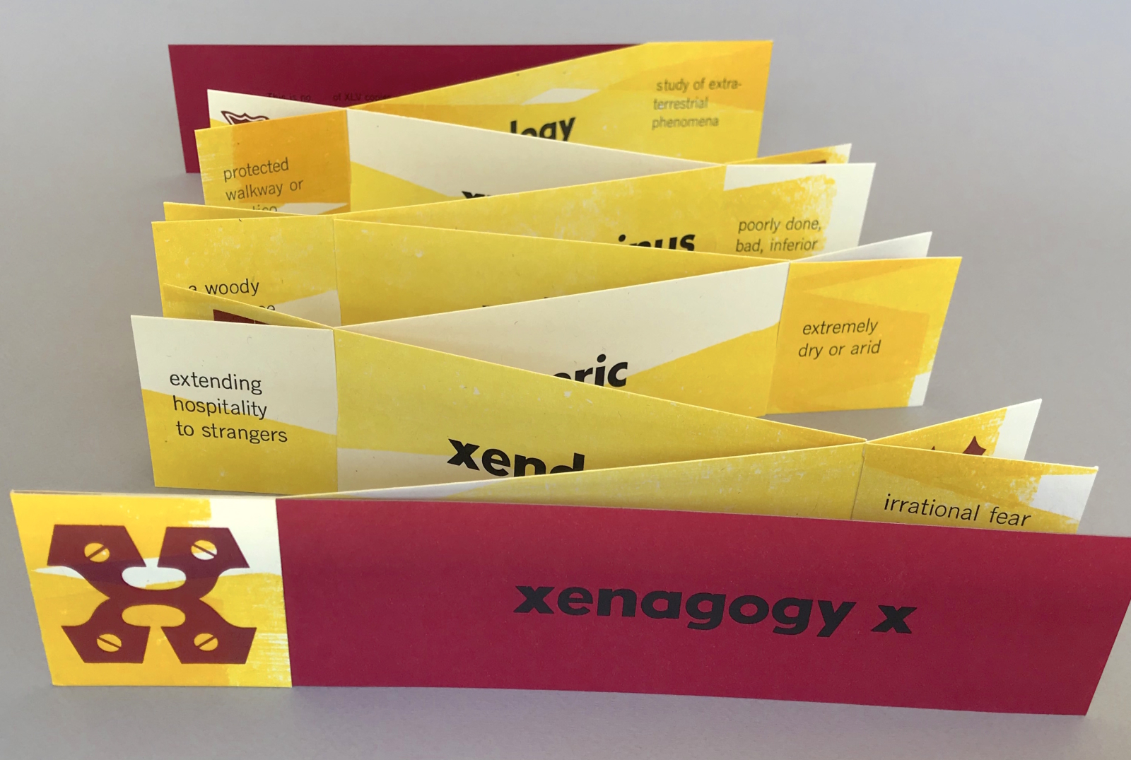
Xenagogy X, 2019
X has never been common in the English language, and just .02 percent of the dictionary begins with this rare letter. For letterpress printers using wood type, the X is often missing from a font, or the poor sort has had its reverse side surrendered for carving a sorely needed A or E instead. During a residency at Shooting Star Press in Little Rock, Arkansas, I had the opportunity to explore the huge wood type collection, full of rare and exotic specimens. Inspired by the extraordinary xenodochy (hospitality) of my hosts in contrast to our country’s disturbing xenophobia (fear of foreigners), I set out to create Xenagogy X, a guidebook. Words led by the letter X are surrounded by their definitions and framed by X specimens, all bound in an X-cordion. An independent variable, an unknown value, the letter X serves to expand and excite. Letterpress printed with handset wood and metal and Ludlow-cast type on French Speckletone with varnished railroad board covers. Edition of XLV copies. -
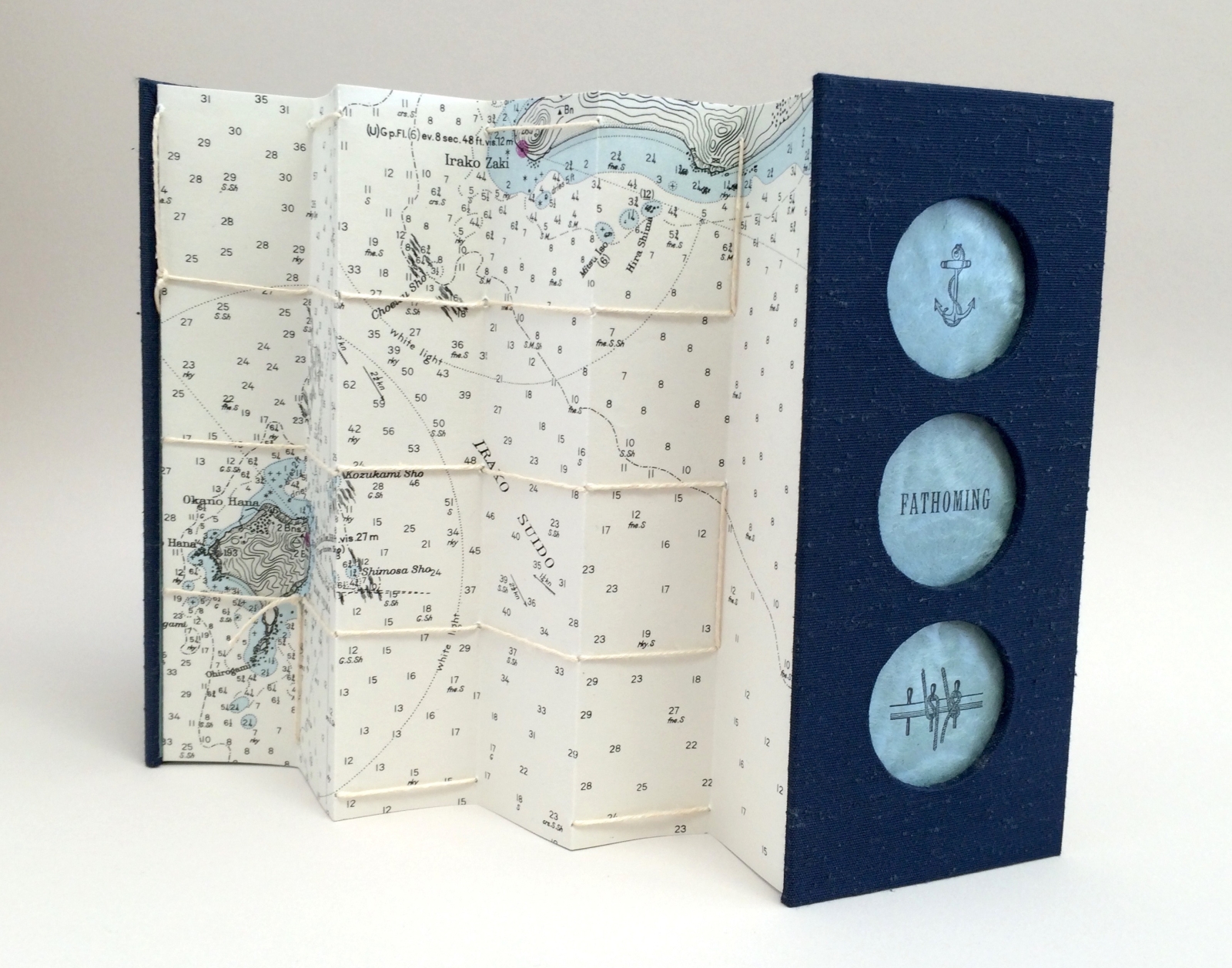
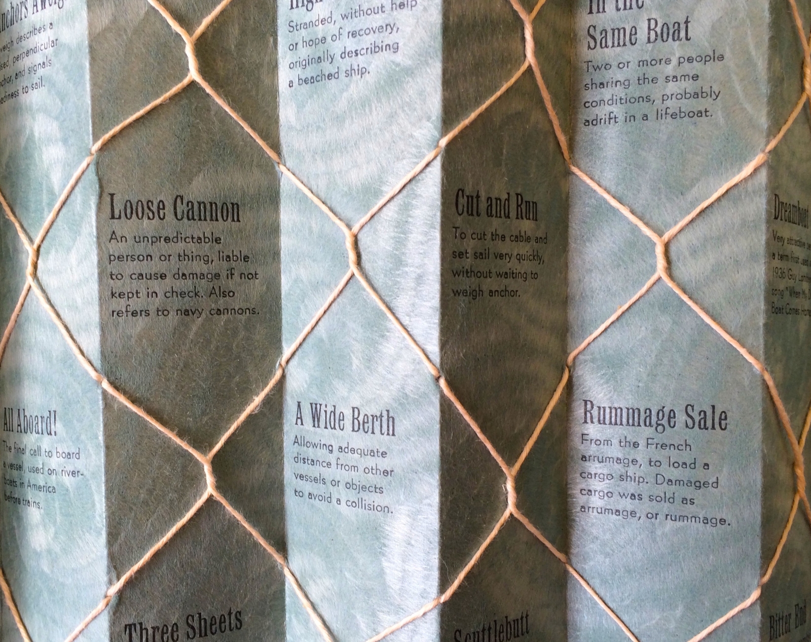
Fathoming, 2016
Fathoming explores the origins of nautical terms, many familiar such as “anchors aweigh” and others that have evolved into new usage, like “bitter end.” Bound in an adaptation of Hedi Kyle’s flag book structure, vintage tobacco cards depicting vessels sail across the book’s interior while the back displays 1945 Japanese maritime maps. The front and back covers incorporate portholes which reveal prints of nautical terms and imagery. Fathoming was letterpress printed with handset Latin Condensed and Bernhard Gothic and displays tobacco cards from 1924–1937. Presented in a clamshell box made by Gabby Cooksey. Varied edition of 7 (one for each of the seven seas.) -
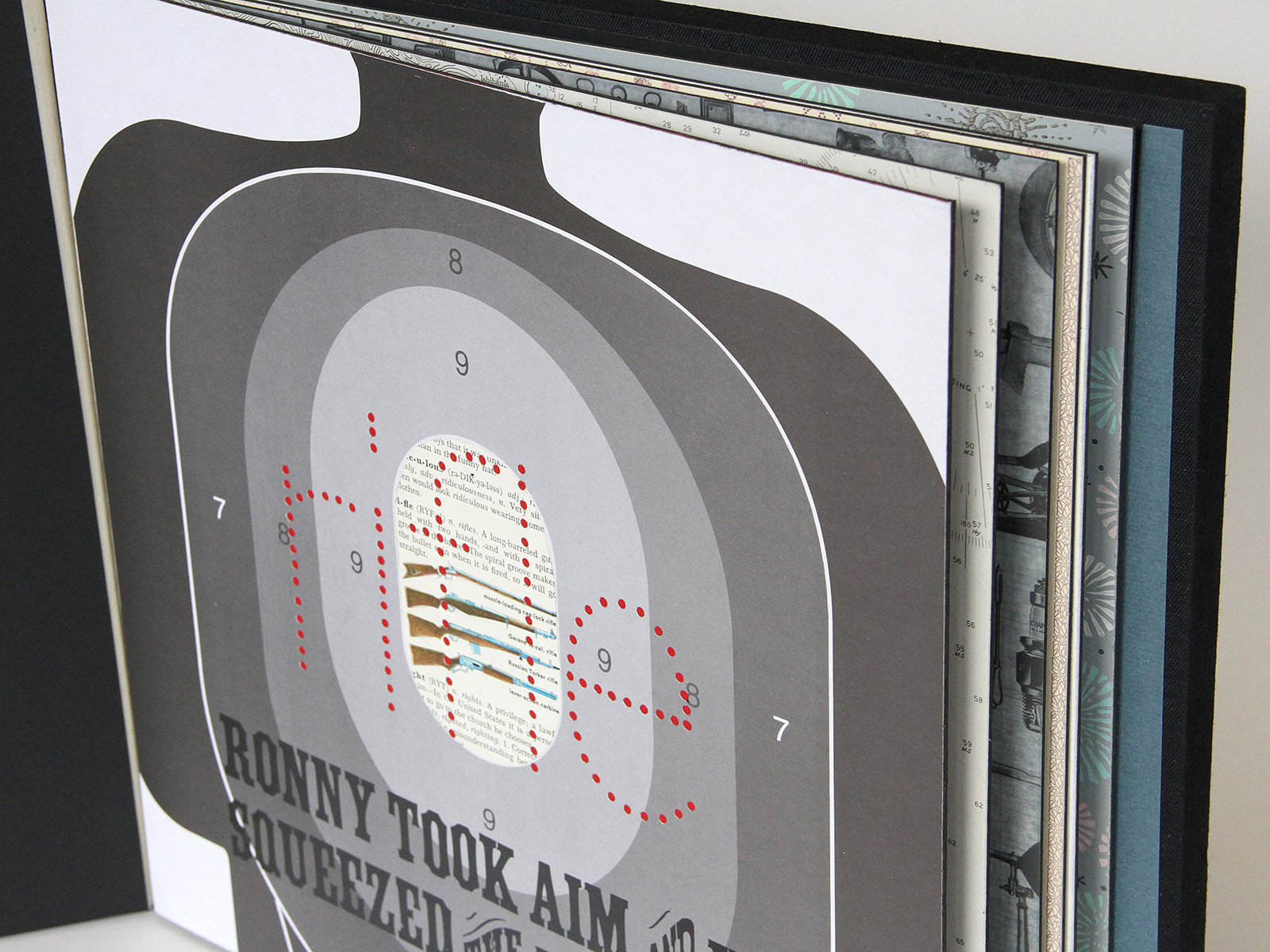
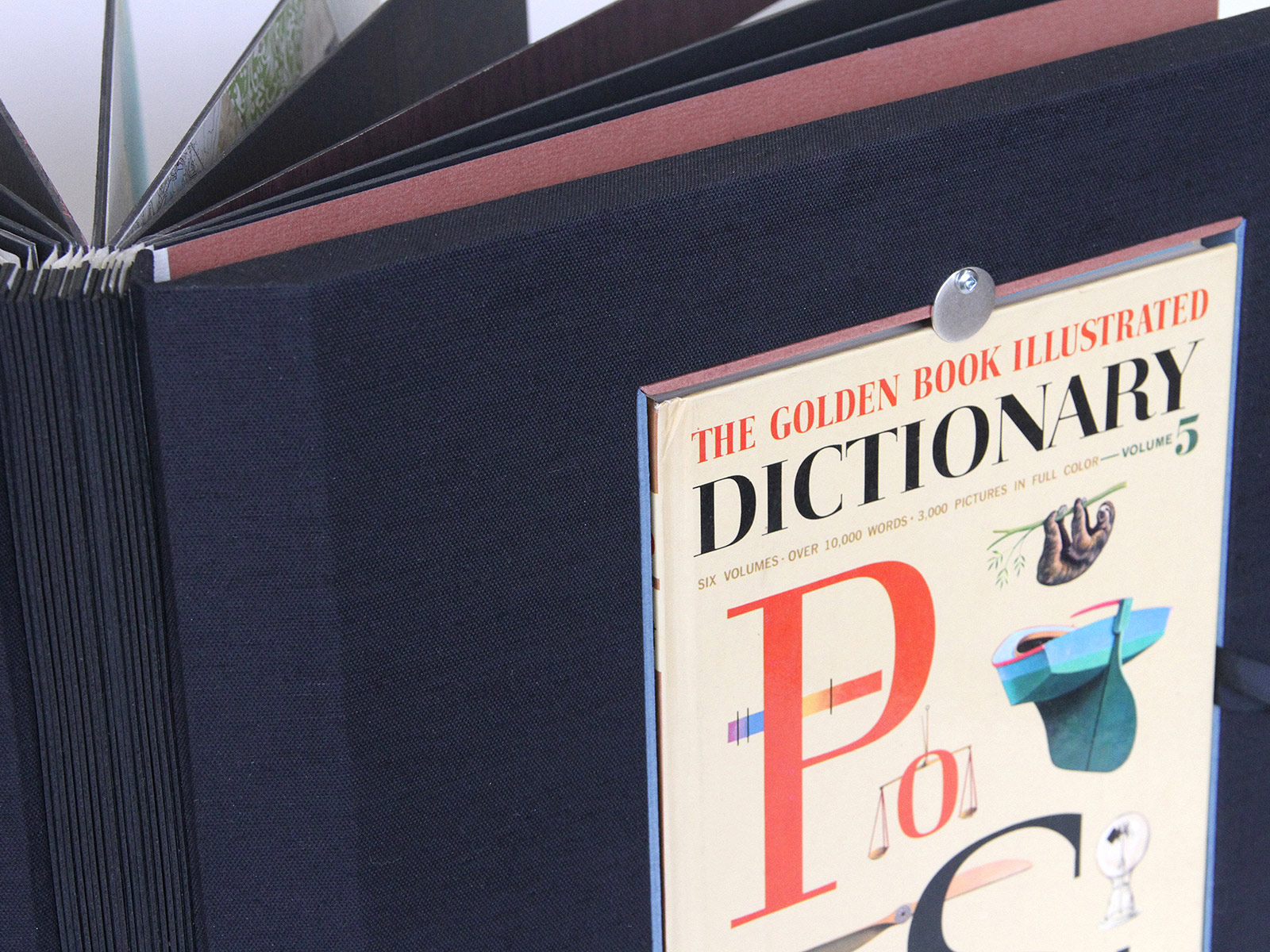
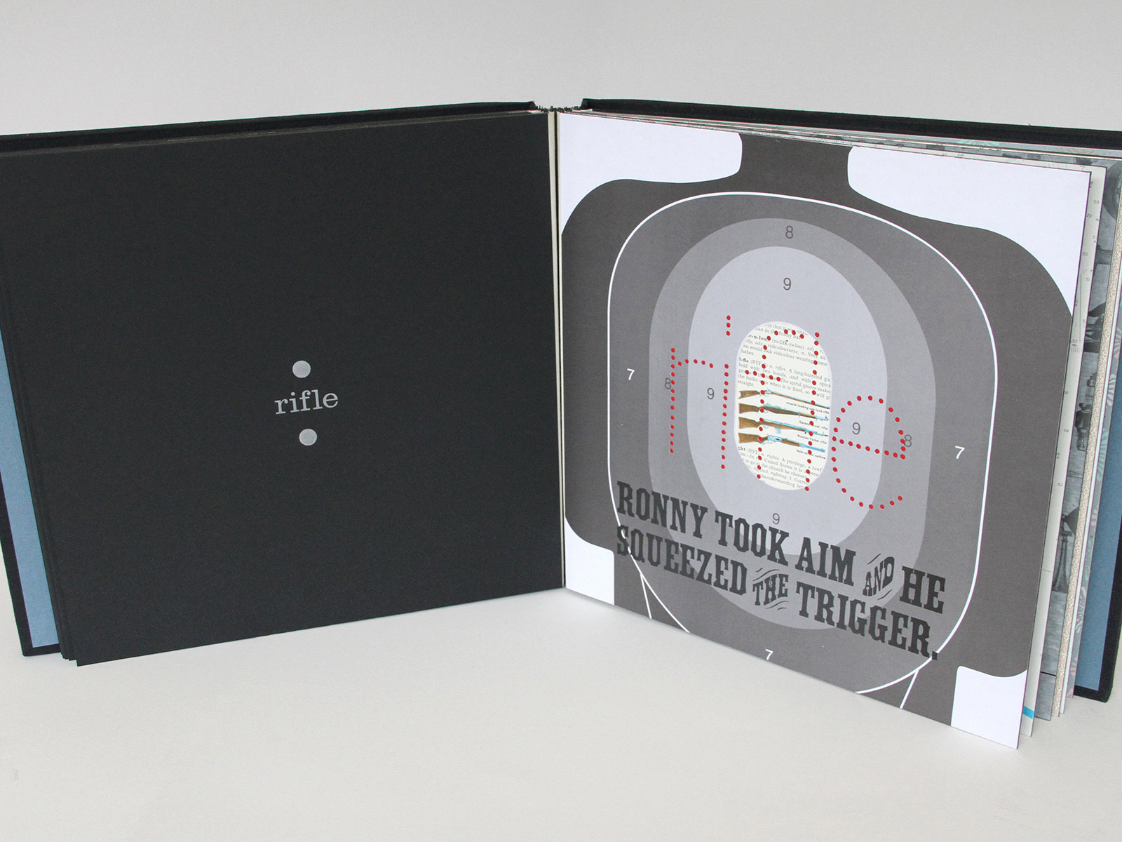
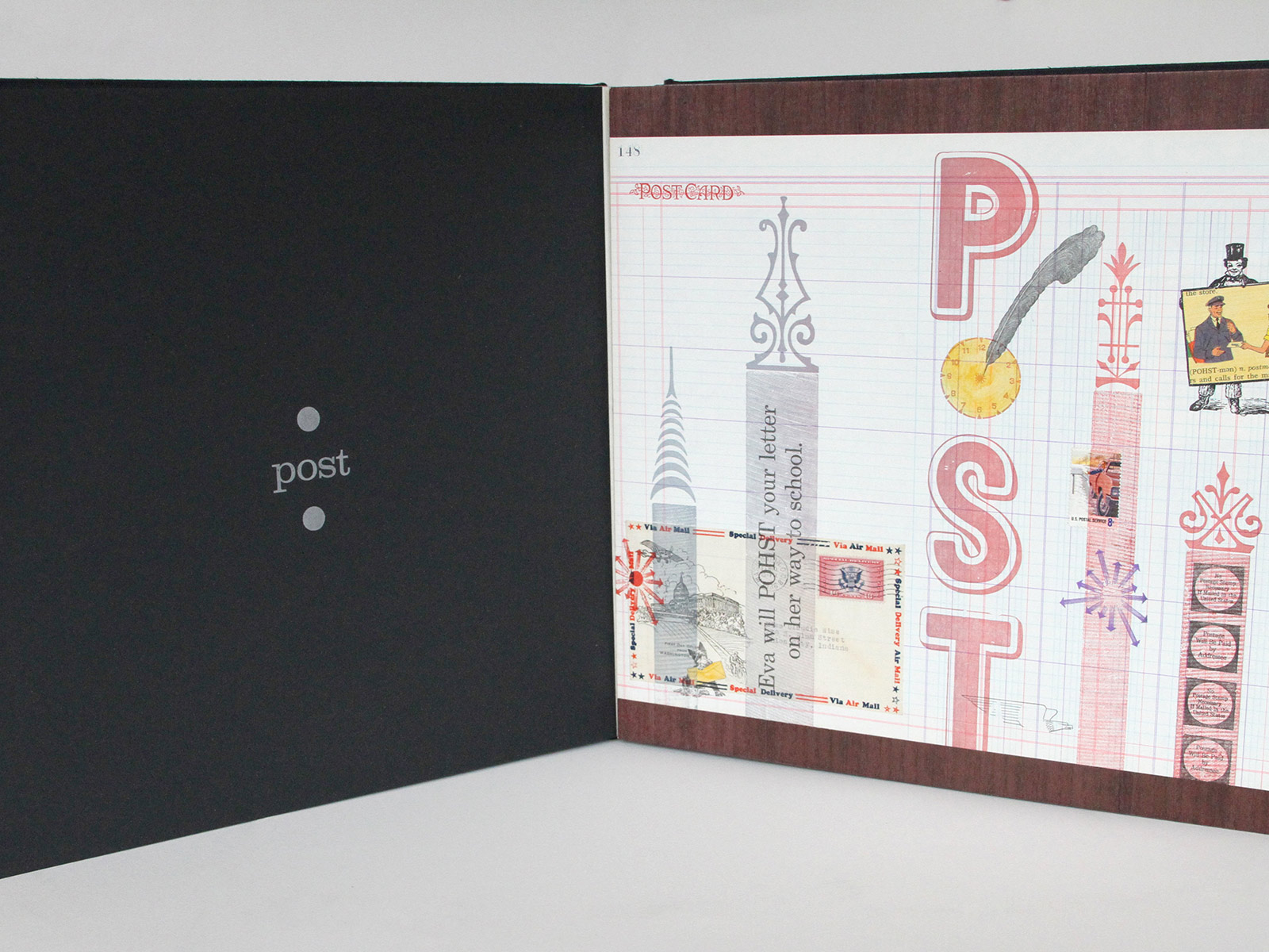
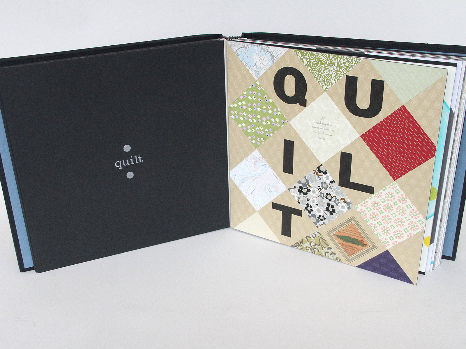
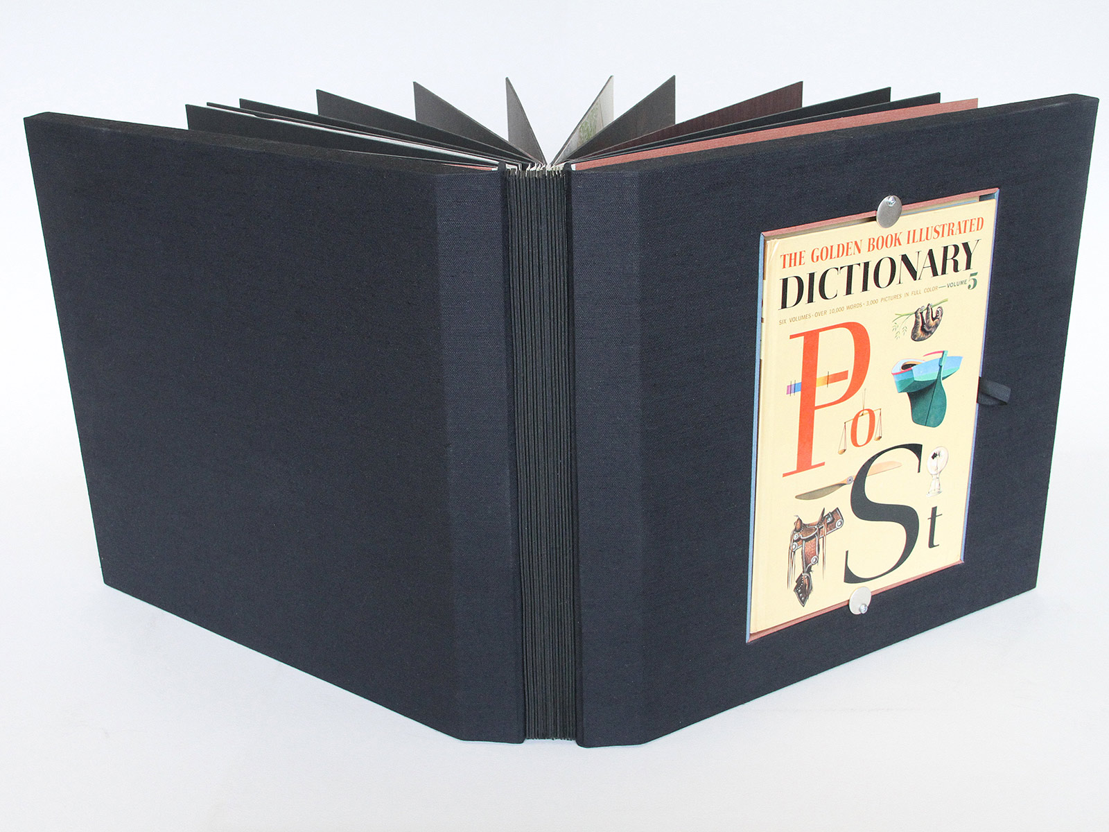
Po-St, 2014
Po-St is a series of prints born out of wandering through Volume 5 of The Golden Book Illustrated Dictionary. This wandering—equivalent to roaming the internet—is a stroll down memory lane: illustrations and words delight in their obsoleteness. Placement of words with their closest companions triggers contemplation. Simply reading alphabetically, for example, ridiculous… rifle… right… righteous provide ammunition for both sides of any First Amendment debate. Po-St prints incorporate letterpress printed wood and metal type, ornaments, wire and vinyl combined with collage on a variety of papers including ledge, nautical maps, wallpaper, drafting and Magnani Revere. One set of prints was bound in unique issue by Don Glaister at Foolsgold Studio.
-
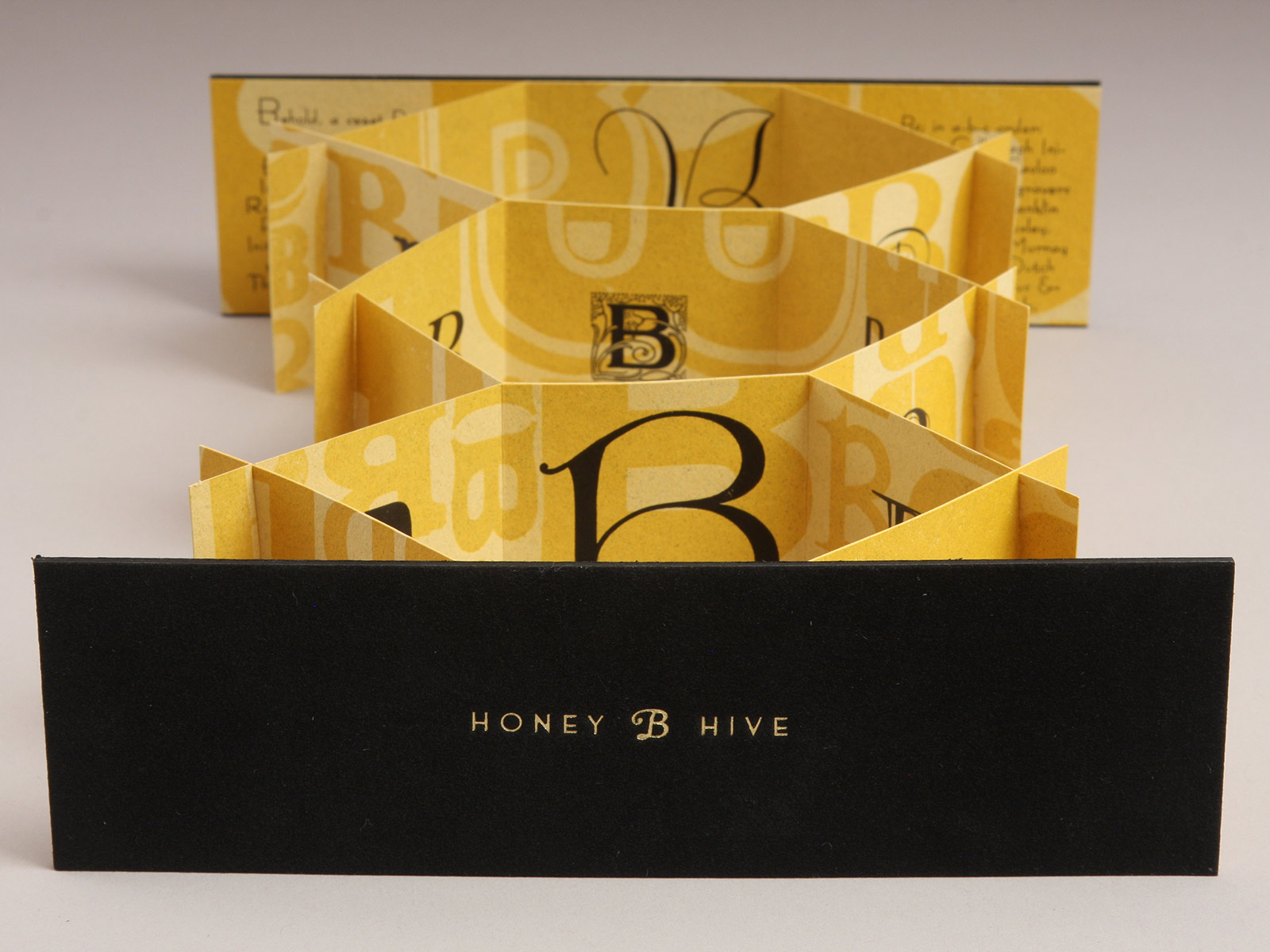
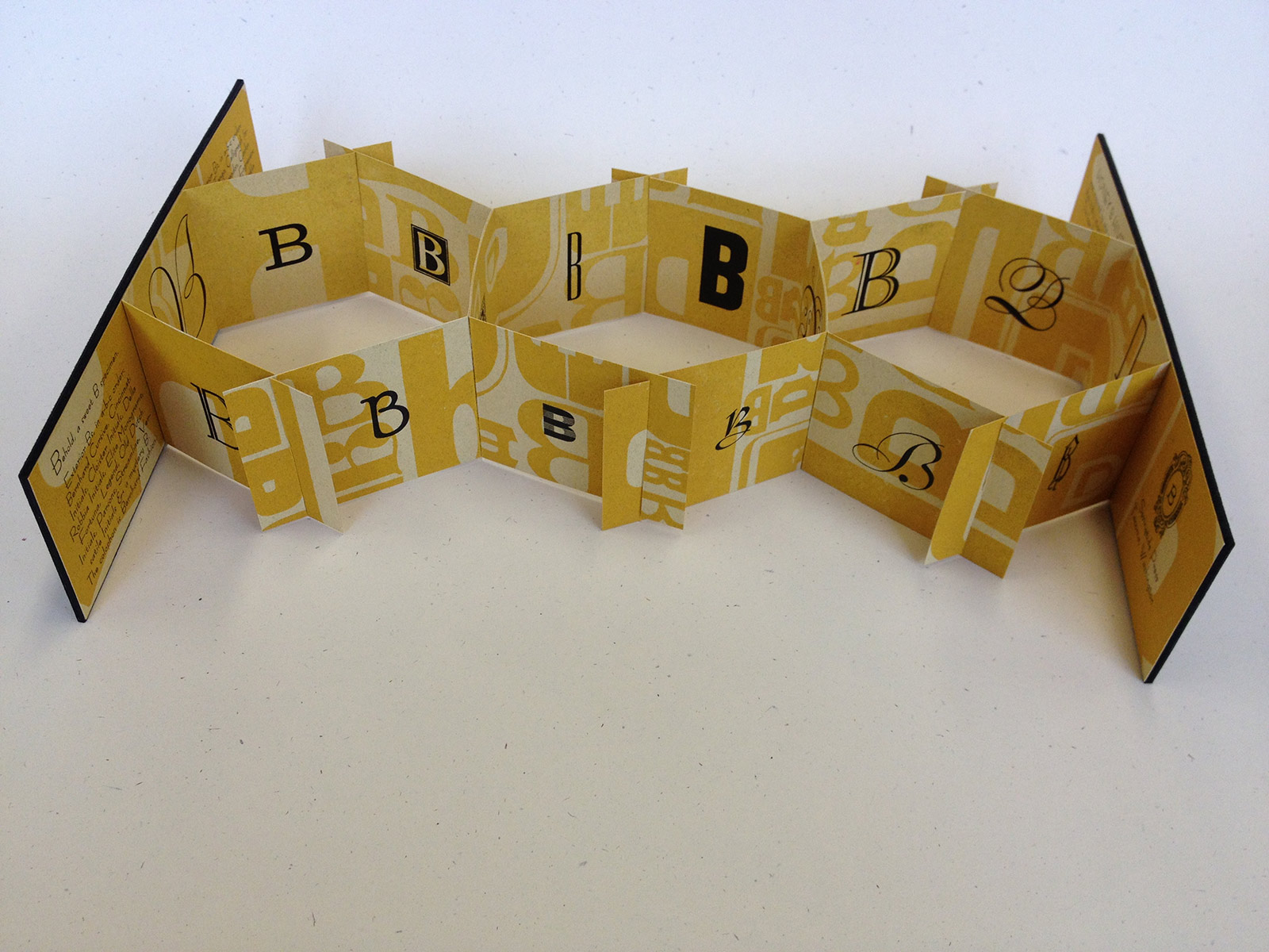
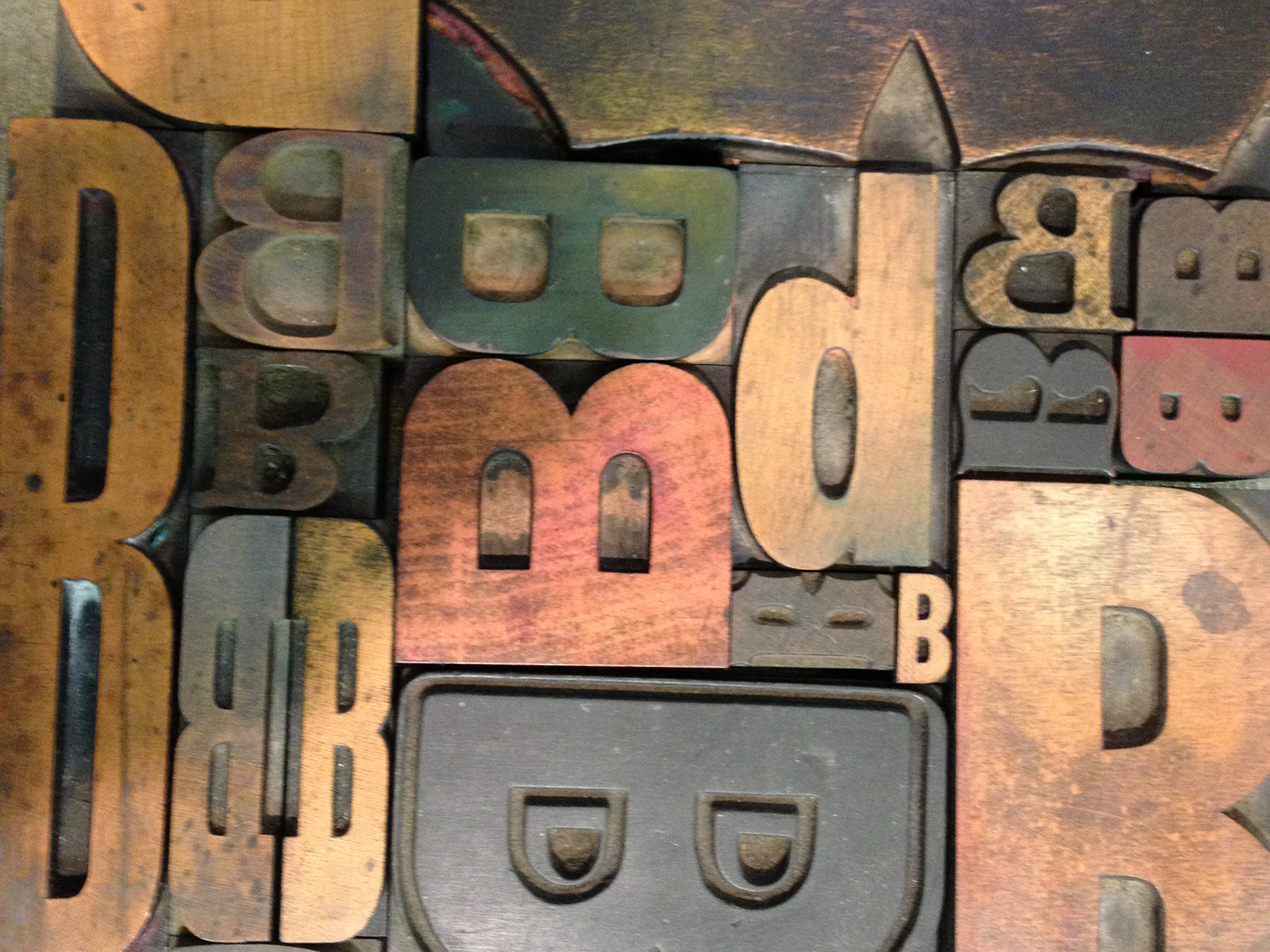
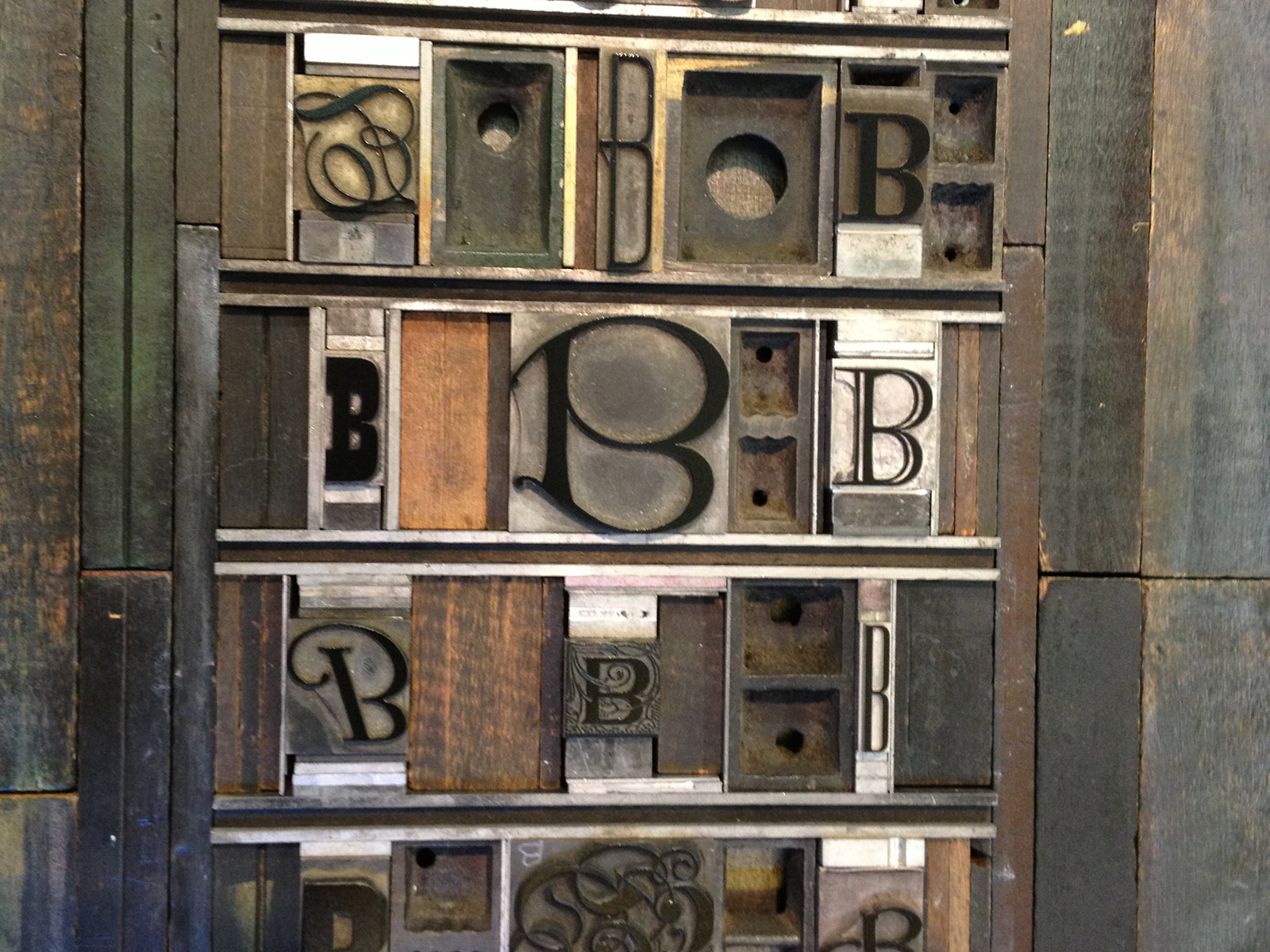
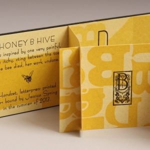
Honey B Hive, 2013
Honey B Hive is a sweet B specimen, displaying a hive full of Bs from the collection of vintage wood and metal type at Springtide Press. The book is handset, letterpress printed and enclosed in velour foil-stamped covers, all inspired by one very painful, then itchy, sting between the toes. (The bee died, her work undone.)
2 × 7 × 1/4'' closed, 2 × 7 × 11'' open; edition of 66 (in several computer languages, including Unicode, B = 66).
-
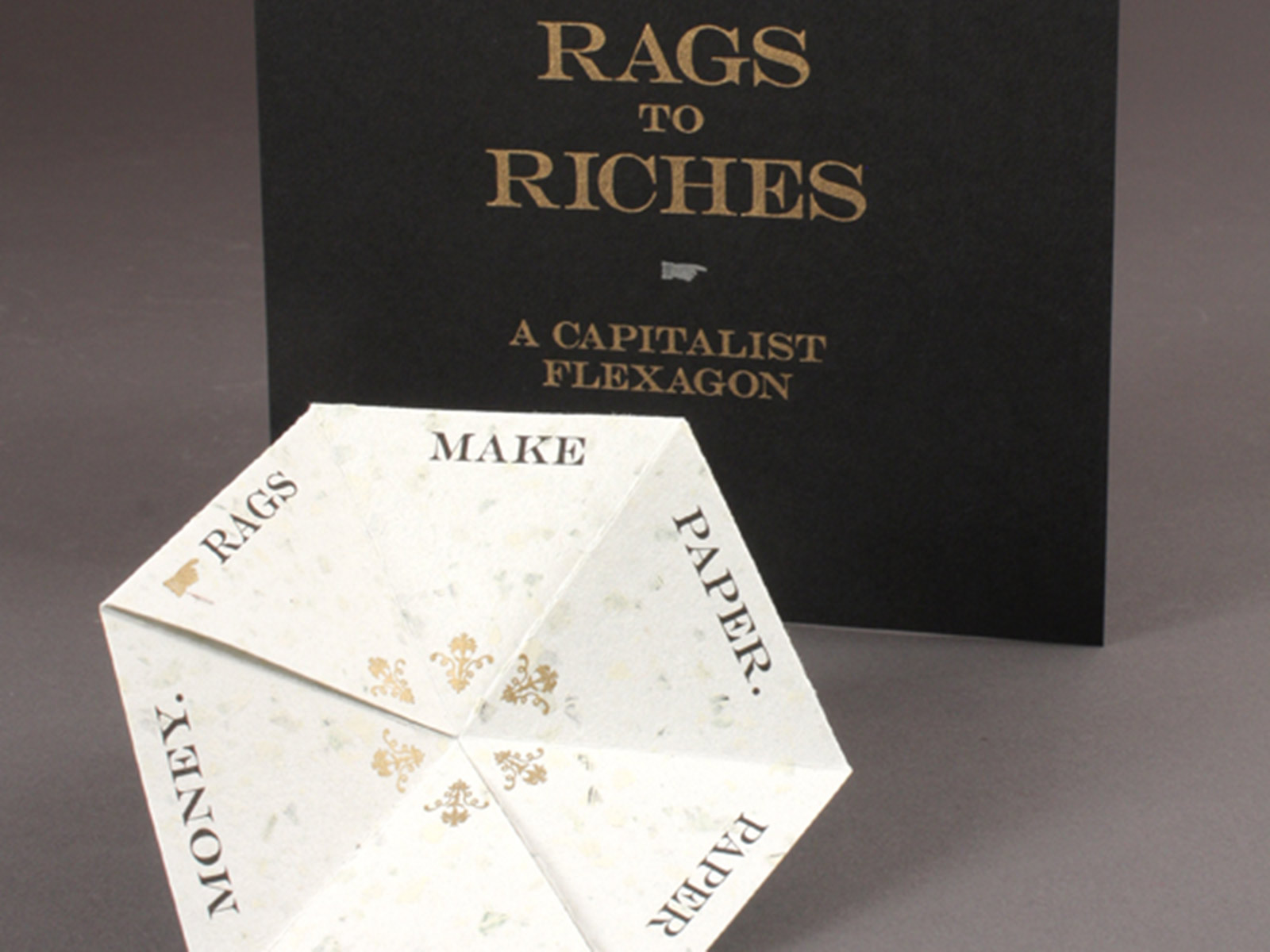
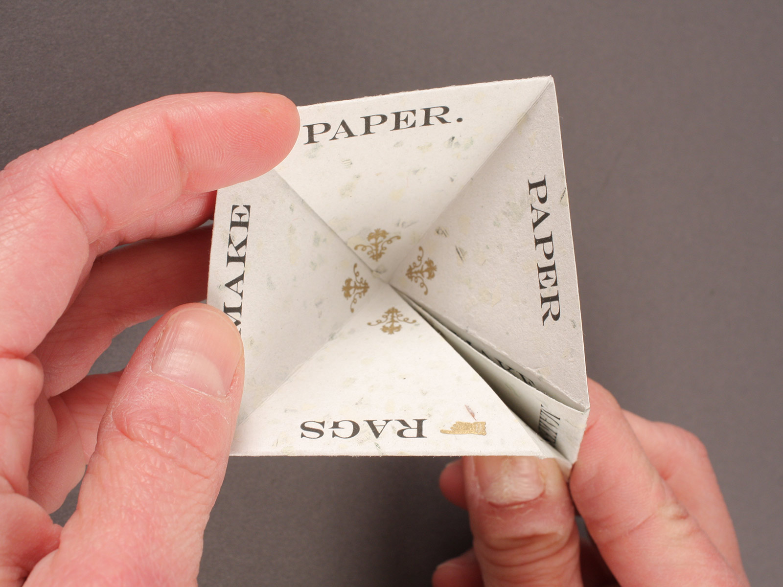
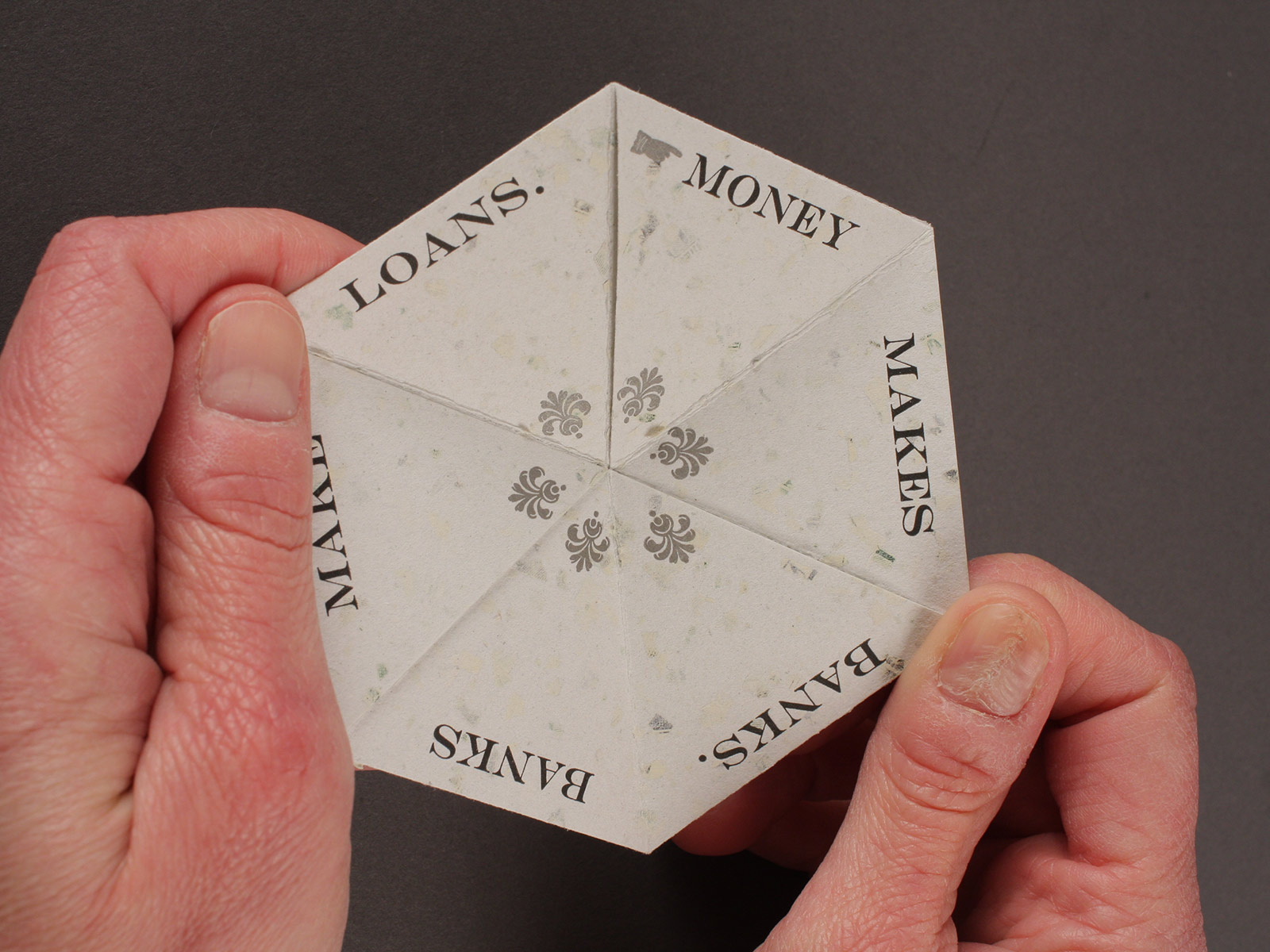
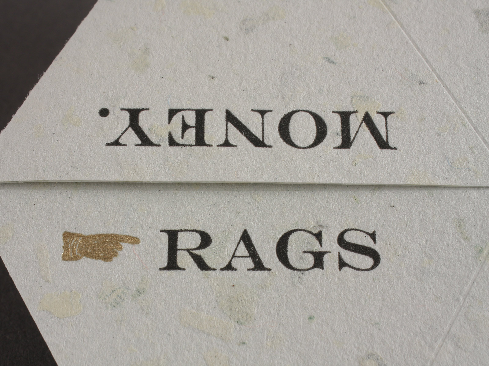
Rags to Riches Flexagon, 2012
Rags to Riches: A Capitalist Flexagon is a tri-hexagon, a structure invented in 1939 by Arthur Stone. A flexagon appears to have just two sides, but when flexed by the reader, a third side is revealed. Manipulating this hexagon uncovers a 19th century English proverb (begin at the golden pointer) and provides an opportunity to consider the flow of cash.
The panels read in a continuous cycle: Rags make paper. Paper makes money. / Money makes banks. Banks make loans. / Loans make beggars. Beggars make rags.
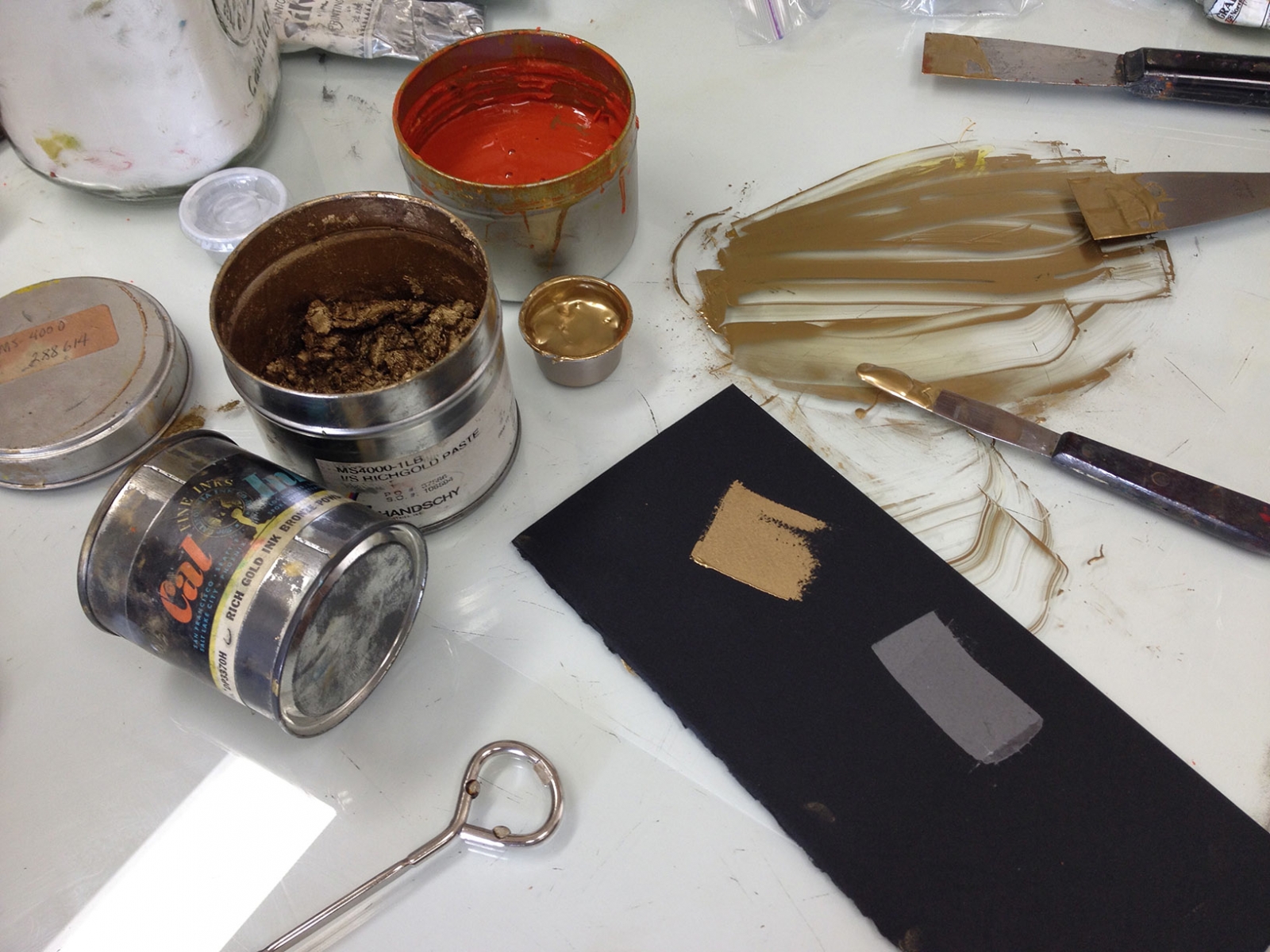
Letterpress printed in gold, copper, silver and black with photopolymer plates on paper handmade by Helen Hiebert from recycled linen rags and shredded currency. Laid in pocket of letterpress printed black folder. 6 × 6'', edition of 99.
-
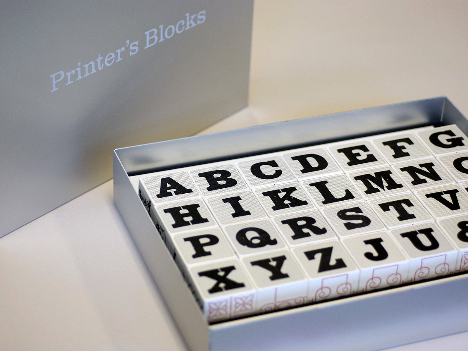
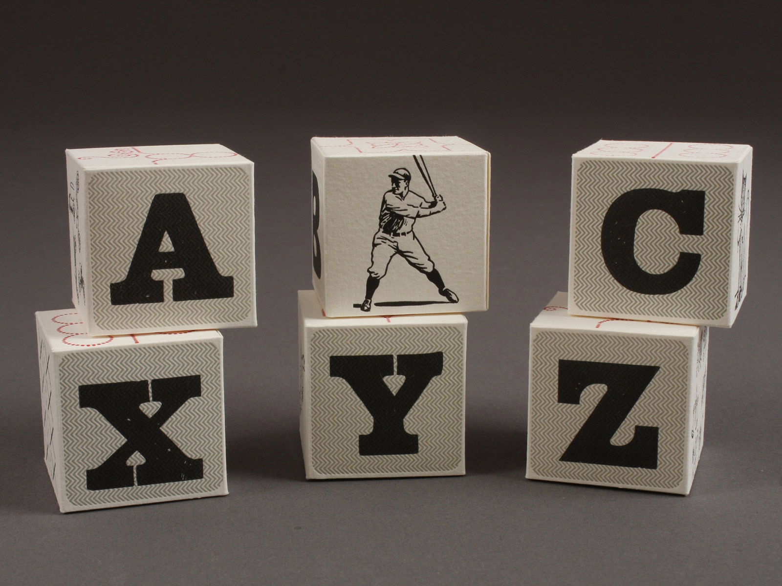
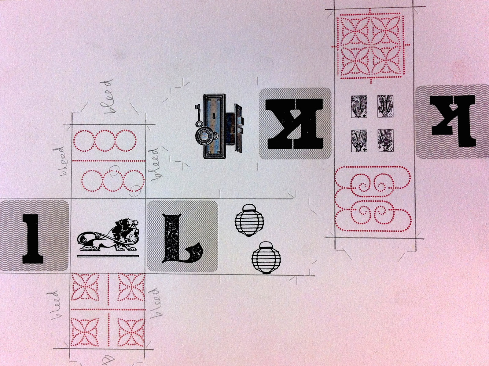
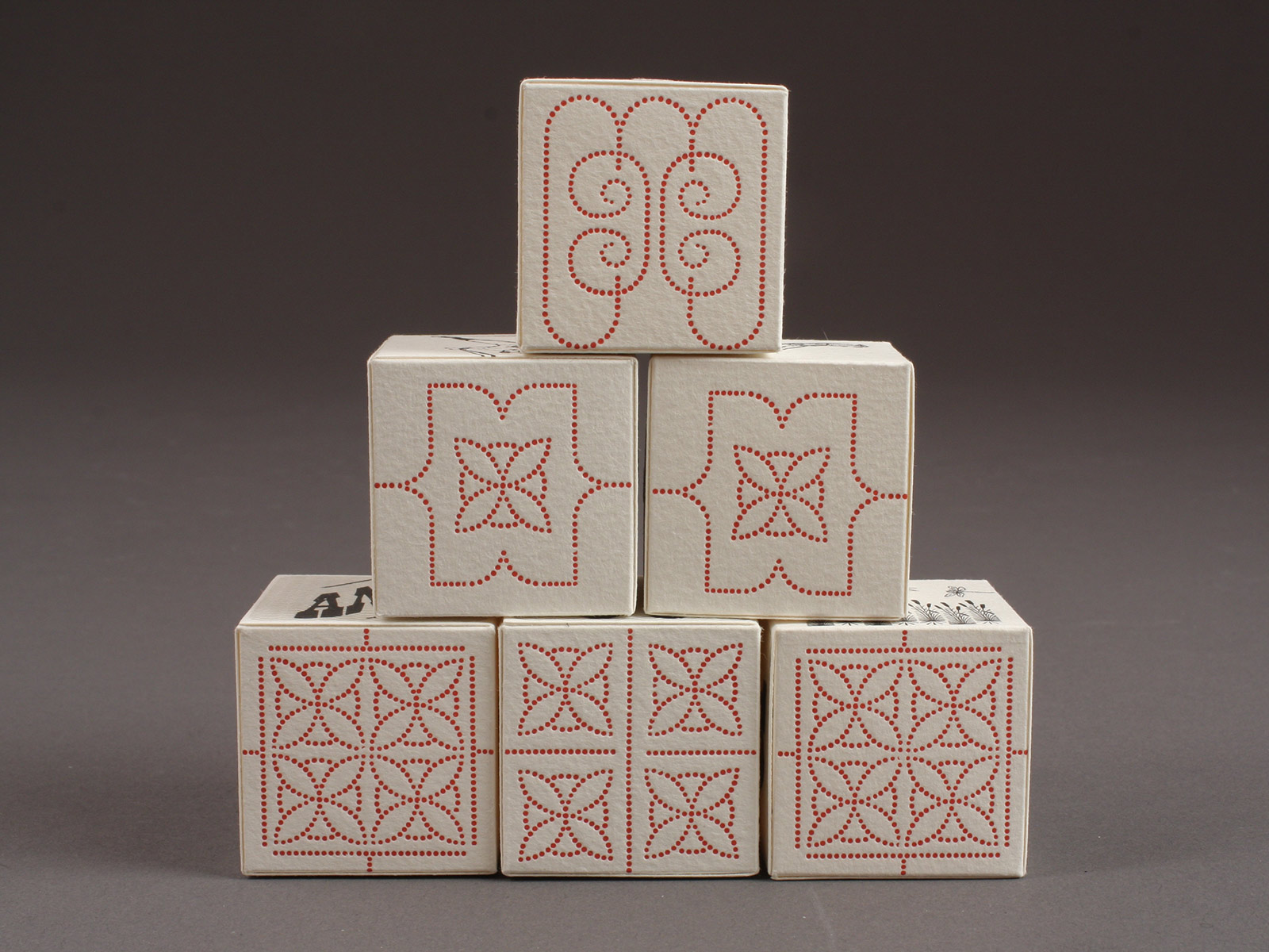
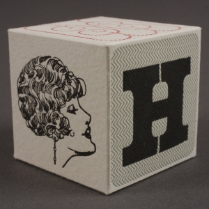
Printer’s Blocks, 2012
Printer's Blocks is an abecedarium composed of vintage wood type and printer’s blocks letterpress printed on Magnani Revere and formed into cubes. Letters are arranged in a box as they would be in a case of type (with J and U following Z) since those letters were not used by early English printers. Two sides of each block include a variety of handset patterns created from American Type Founder’s Dainty Border No. 1—that like the border—can be arranged to delight. Two bonus blocks are included with catchwords “and” and “the” plus ampersand and exclamation marks.
11.5 × 2 × 9" aluminum box contains 28 cubes that measure 1.5", edition of 40.
-
Unnatural Light, 2011
Something about light in the Pacific Northwest provokes contemplation—from its absence in winter to cyan summer skies that overtake the night. Unnatural Light reflects a lifetime of illumination through stories and wordplay with text that is challenging reading in daylight, but literally glows in the dark.
Stories of Unnatural Light were written, handset and letterpress printed by Jessica Spring on paper handmade at Helen Hiebert’s studio. Eight prints include vintage illustrations reproduced using photopolymer and self-healing mat that—with the type—utilize fluorescent and glow-in-the-dark inks. Trisha Hammer & Julie Naggs made clamshell boxes for the edition of 8.
-
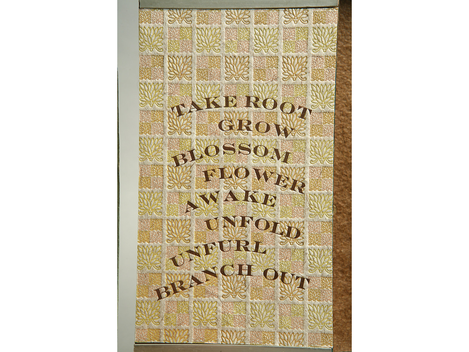
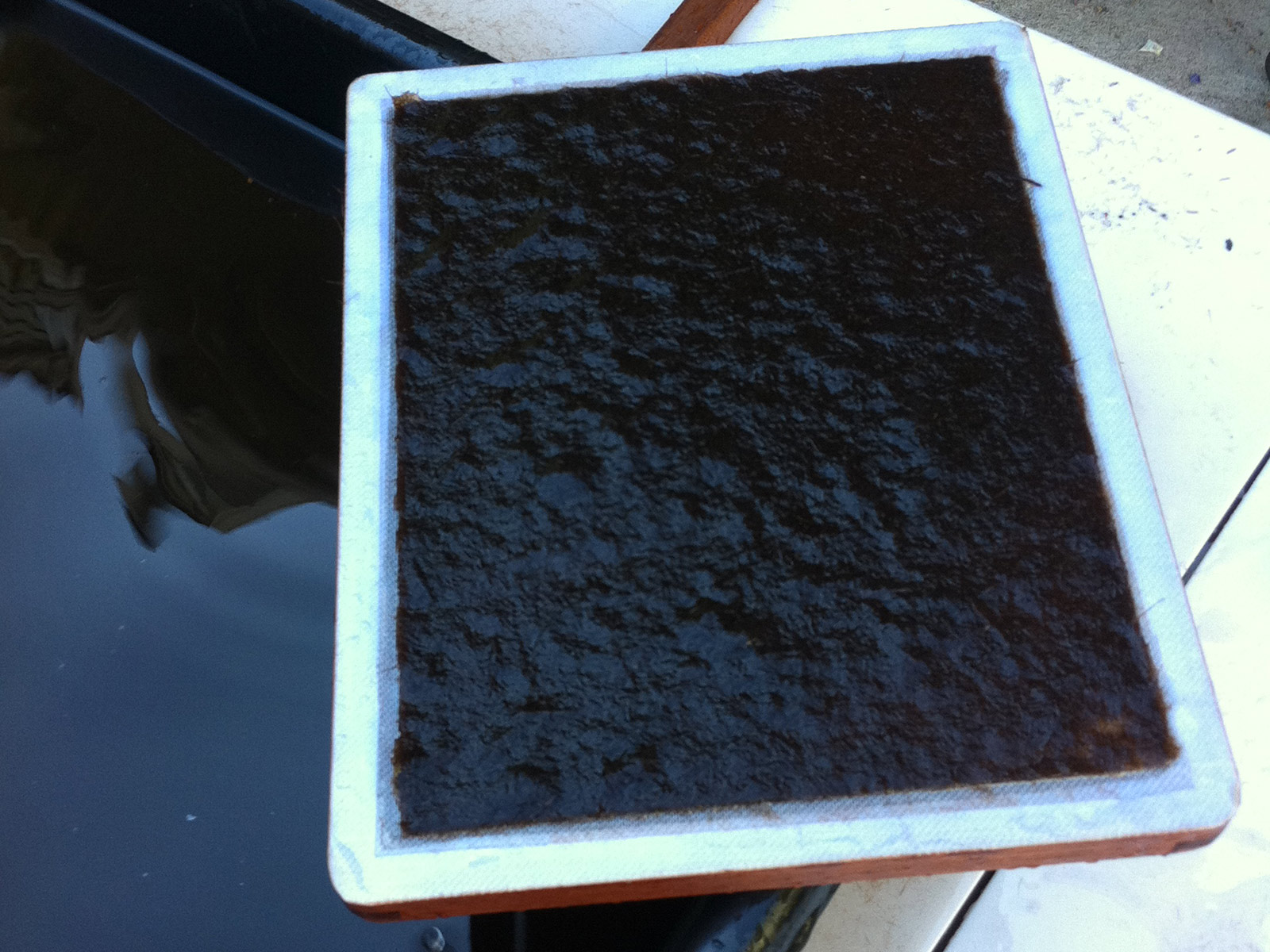
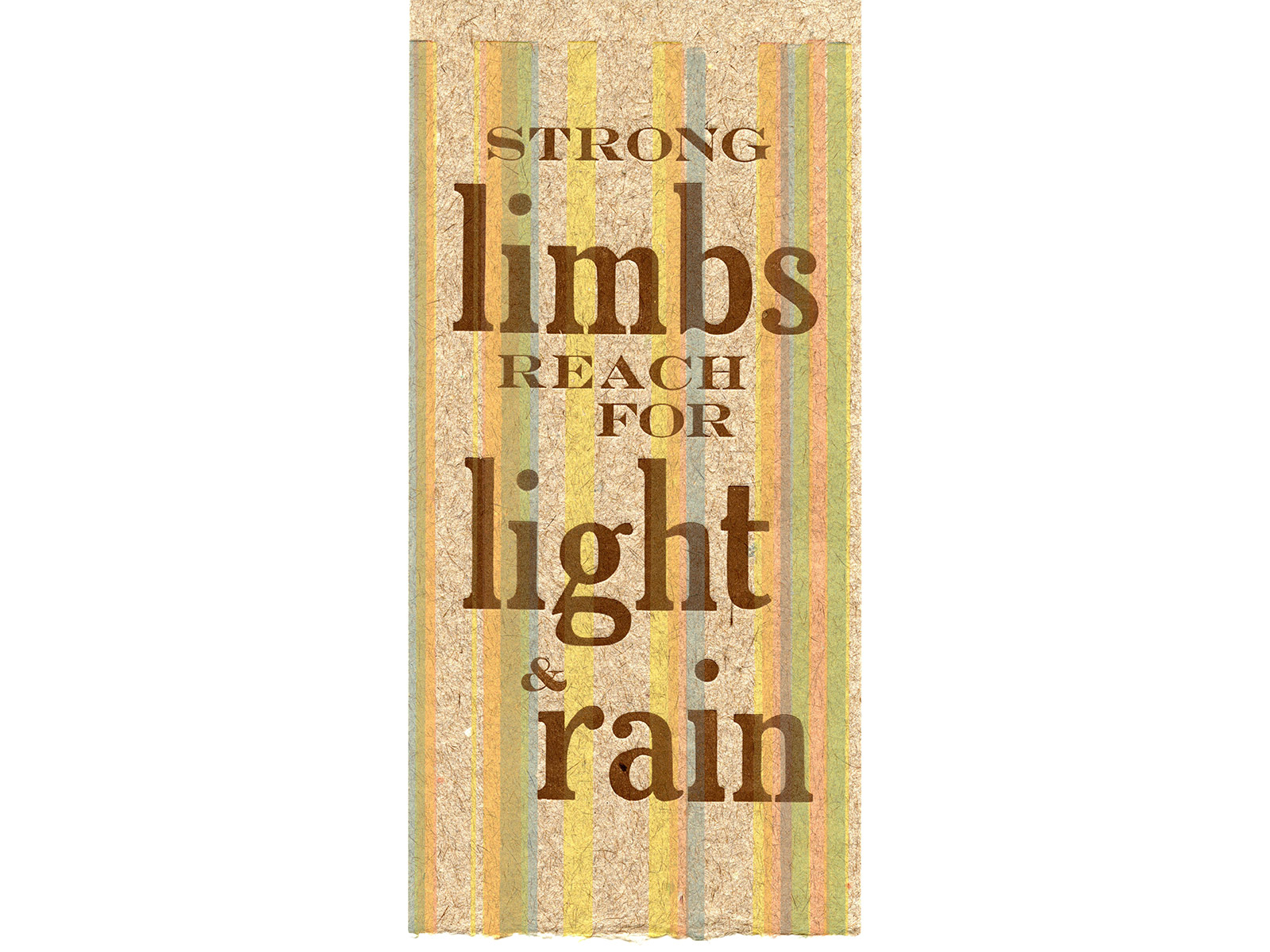
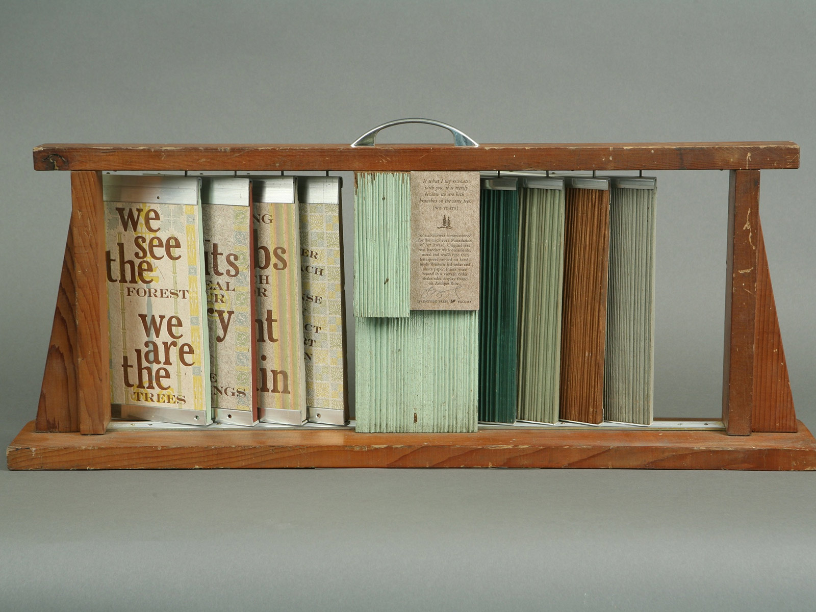
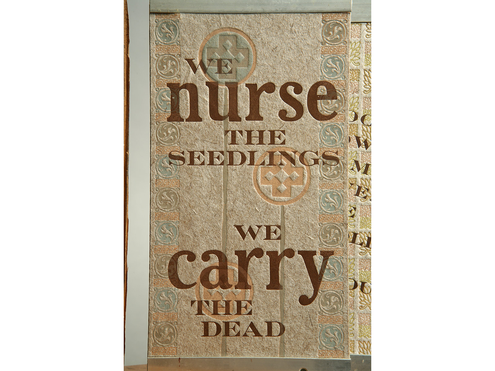
Ingrained, 2011
The Greater Tacoma Community Foundation of Art Award recognizes the essential role art plays in our community and to honor professional artists in the region. Each year, more than a dozen artists are nominated and one is selected for this significant award. The winning artist receives an award to create a commissioned art piece representing their interpretation of the Pierce County community. Ingrained was commissioned for the 2011 Foundation of Art award, and compares the strength of community to a forest of trees. Original text was handset with ornaments, metal and wood type then letterpress printed on handmade Western red cedar and abaca paper. The prints were bound into a vintage cedar shake sales display found on Tacoma’s antique row. -
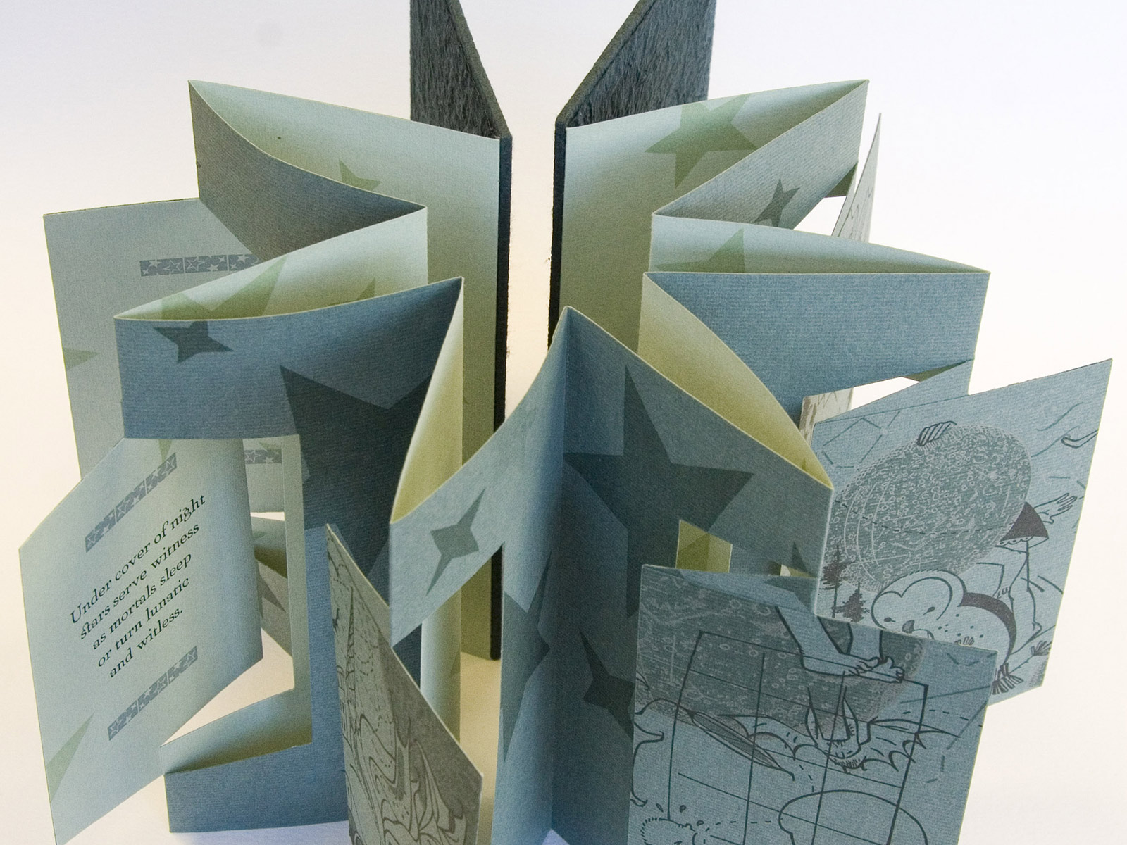
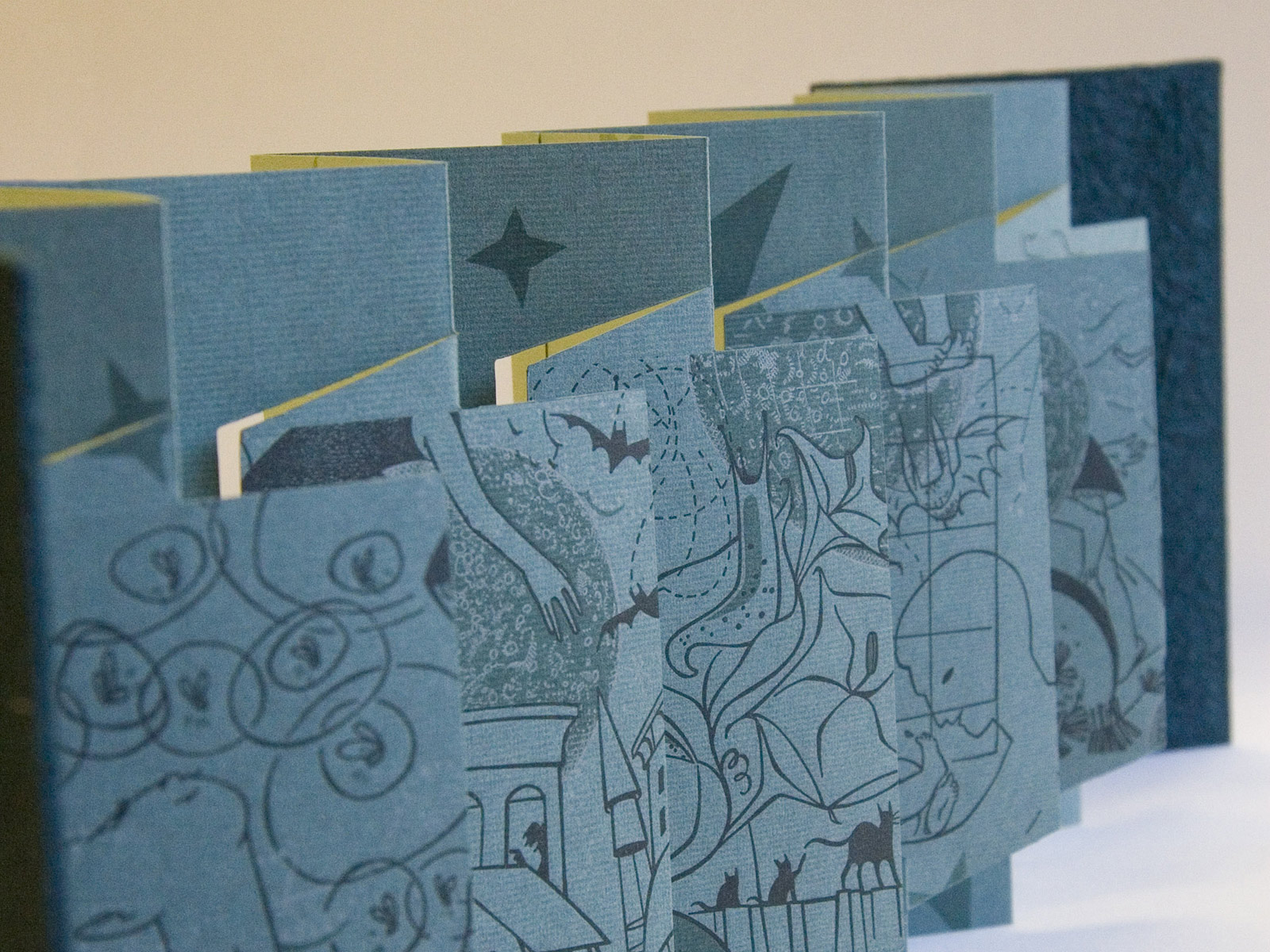
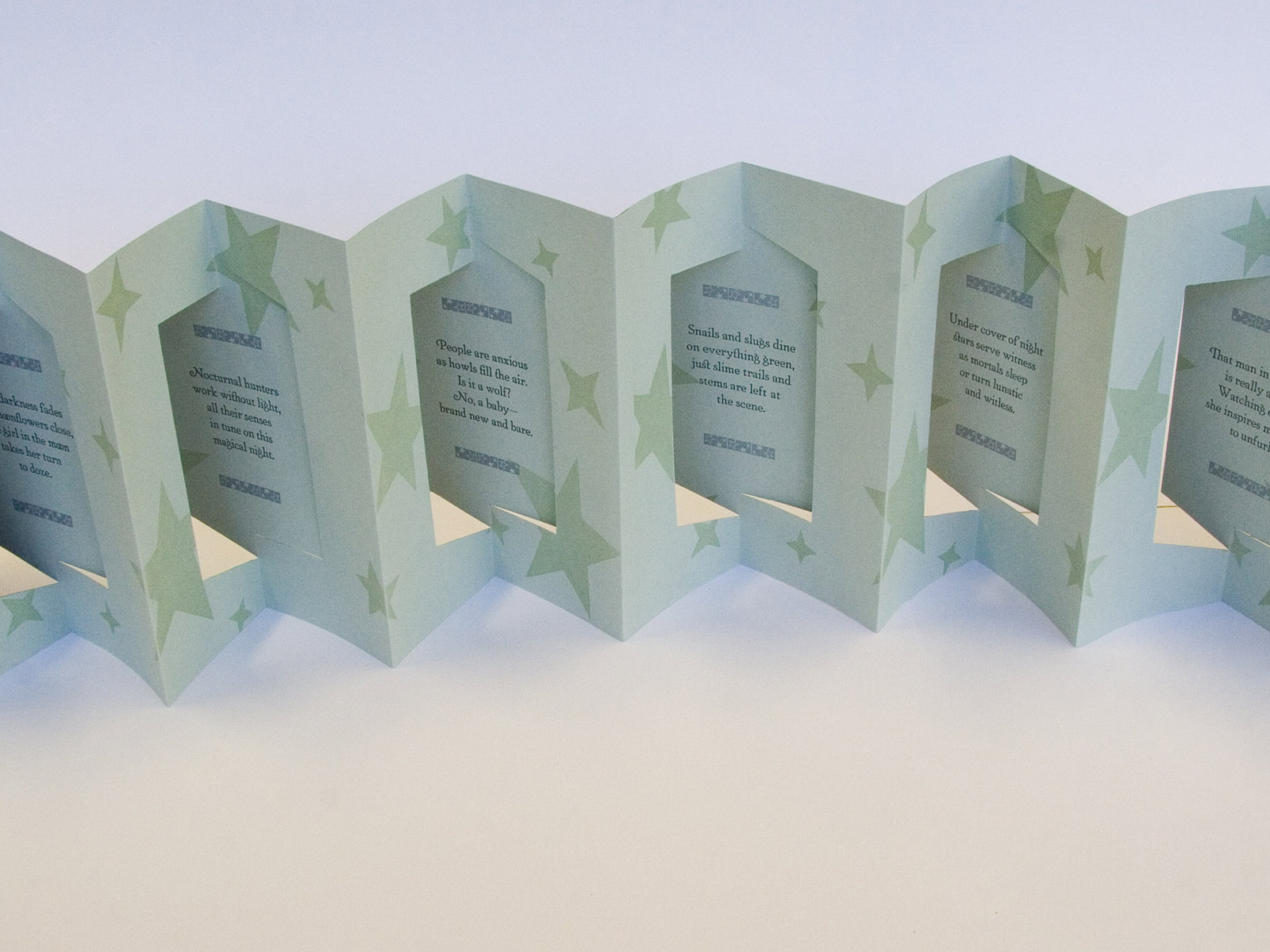
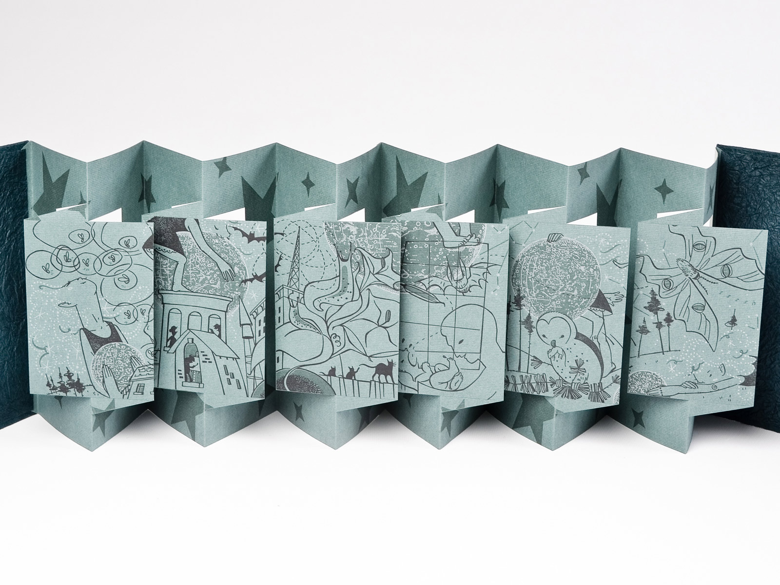
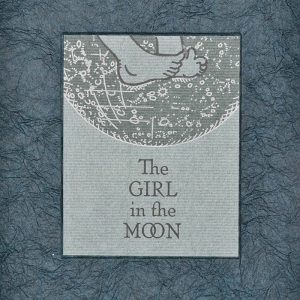
The Girl in the Moon, 2011
A collaboration with illustrator Susan Estelle Kwas, The Girl in the Moon cycles the reader through one full moon night to view all manner of mischief. Using an innovative structure designed by Hedi Kyle, the three-color illustrations float off the page and the book can be displayed as an accordion or in a star shape.
Illustrations were printed with photo-polymer plates and handset Artcraft was letterpress printed on duplexed Hahnemühle Ingres. Through the use of metallic and glow-in-the-dark inks, the book delights in both sun and moonlight. Boards are covered with indigo momigami and the book is packaged in a silver bubble-wrapped spacesuit.
5.25 × 8.25", edition of 72.
-
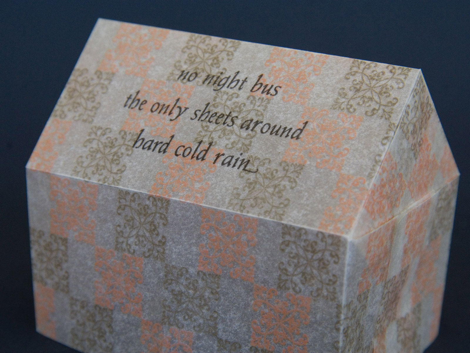
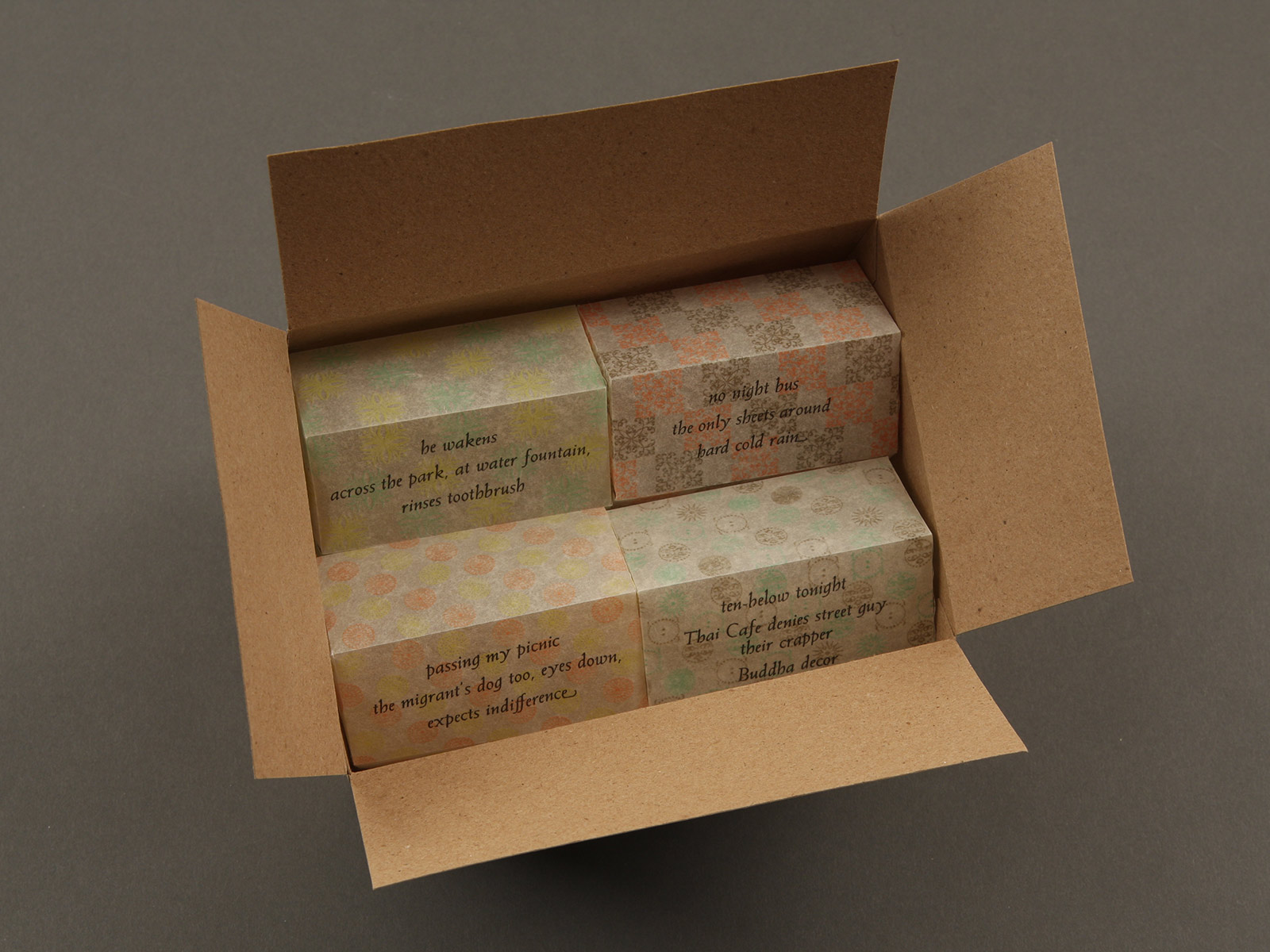
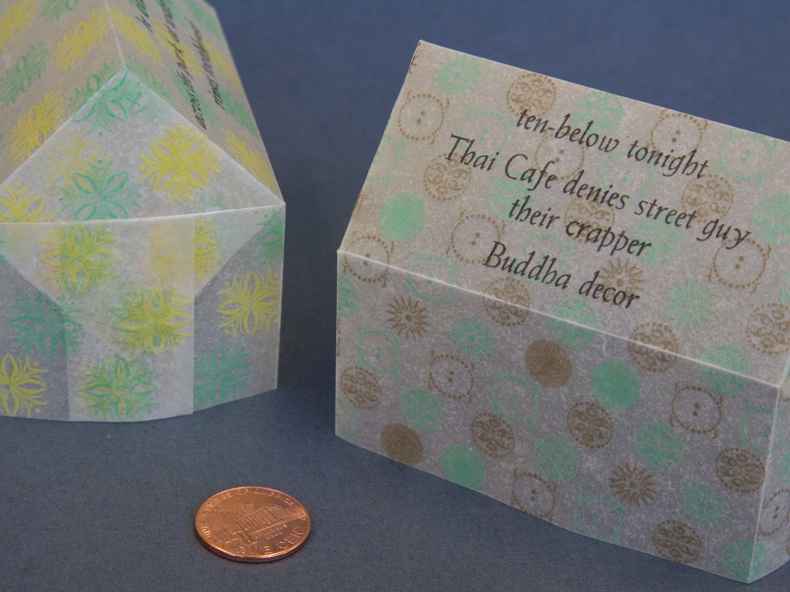
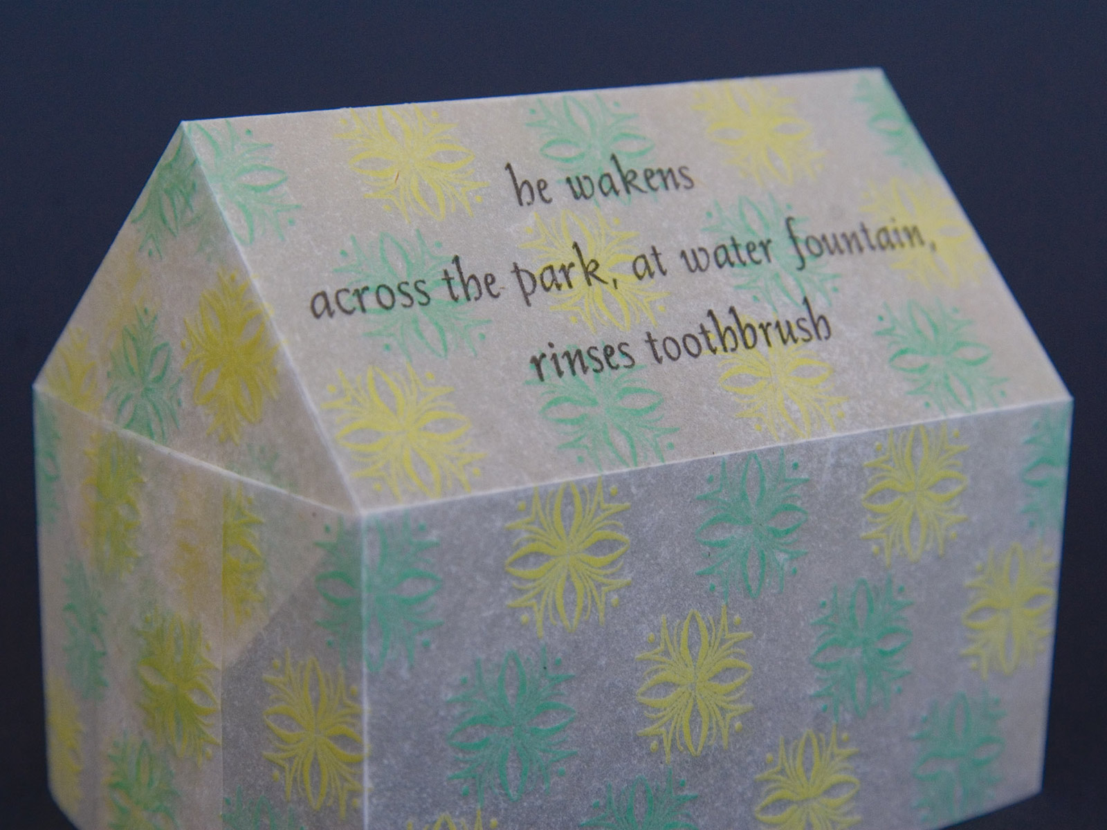
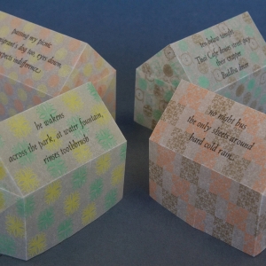
Sheets, 2010
Sheets is a cycle of haiku by poet Dolores Connelly, each poem capturing a moment within a season. The haiku are excerpted with permission of the author from A Twisted Balance: One-Line Haiku and a Few Senryu, an unpublished collection of one hundred haiku dedicated to people forced from their homelands or houses. The ongoing cycle of homelessness throughout a year is reflected in the patterns and cycling colors printed on the interior of each paper house, muted but shining through translucent fiber.
The text and ornaments are handset and letterpress printed on handmade abaca and housed in boxes made with Paper Studio’s recycled cardboard box paper.
6 × 4.5 × 2.5'', edition of 30.
-
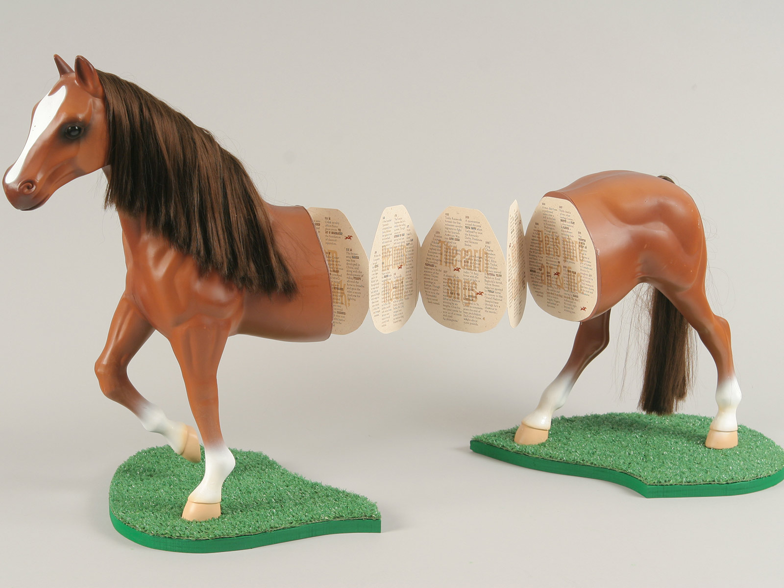
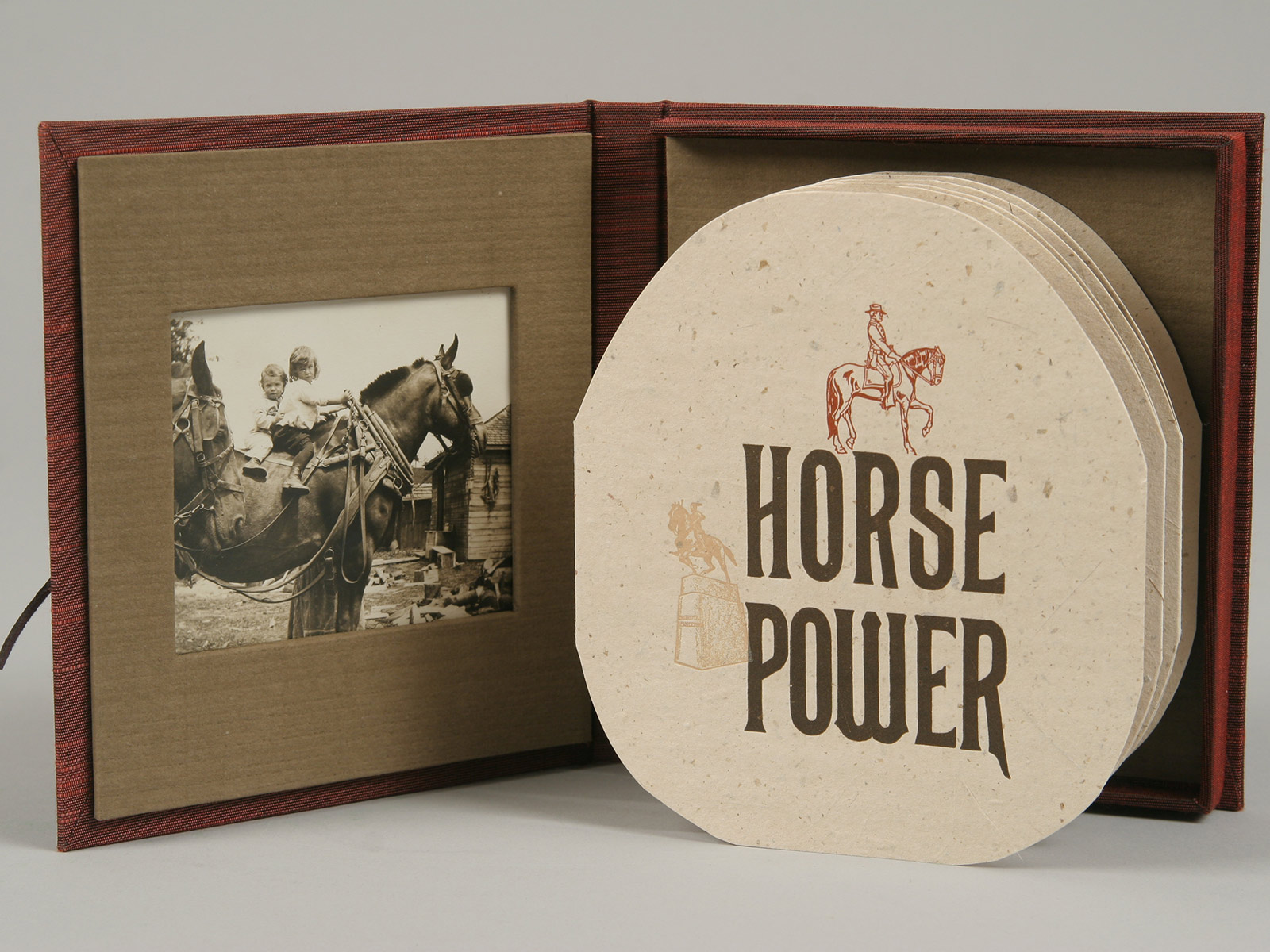
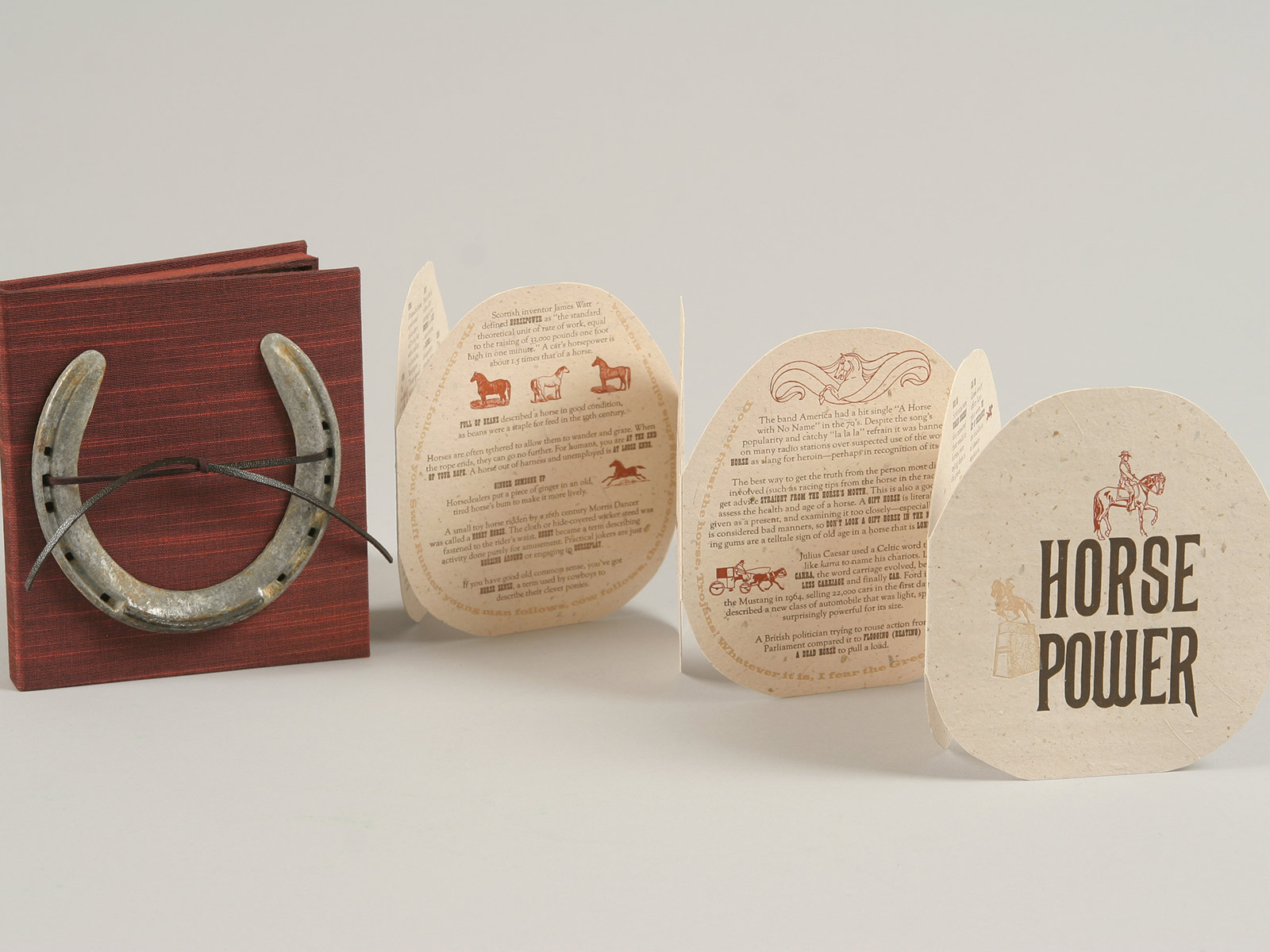
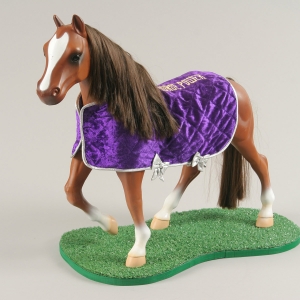
Horse Power, 2009
Sacrificed in the Rig Veda, glorified in the Koran, and captured in cave paintings, horses have left an indelible hoof print on our collective consciousness. Despite our rich history together, horses have become primarily a source of entertainment. Molded in plastic to collect, bred and raised for racing careers, or relegated to pulling carriages in the midst of city traffic, their power was supplanted by that of the engine. Horse Power traces the history of this majestic animal through domestication and popular culture and is letterpress printed with photopolymer plates, vintage horse blocks and wood type.
Thoroughbred Edition, one of a kind: 20-inch Model Horse bound with accordion book printed on handmade horsehair paper.
Draft Horse Edition, 15 copies signed and numbered: Printed on handmade horsehair paper enclosed in clamshell box with a horseshoe and one-of-a-kind vintage photograph.
Pony Edition, 35 copies signed and numbered: Printed on Stonehenge fawn with Fabriano Roma brown wrapper and leather tie.
-
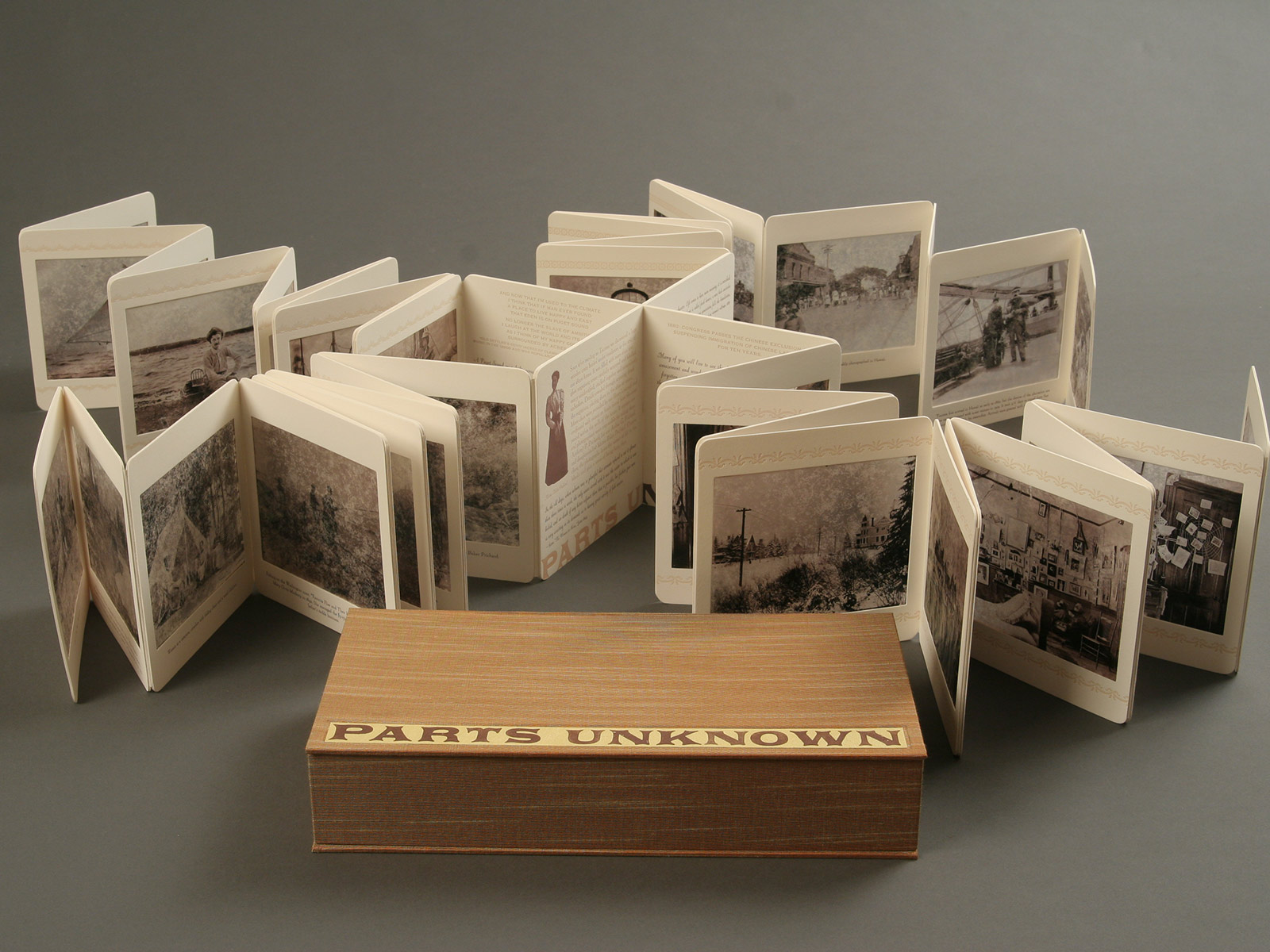
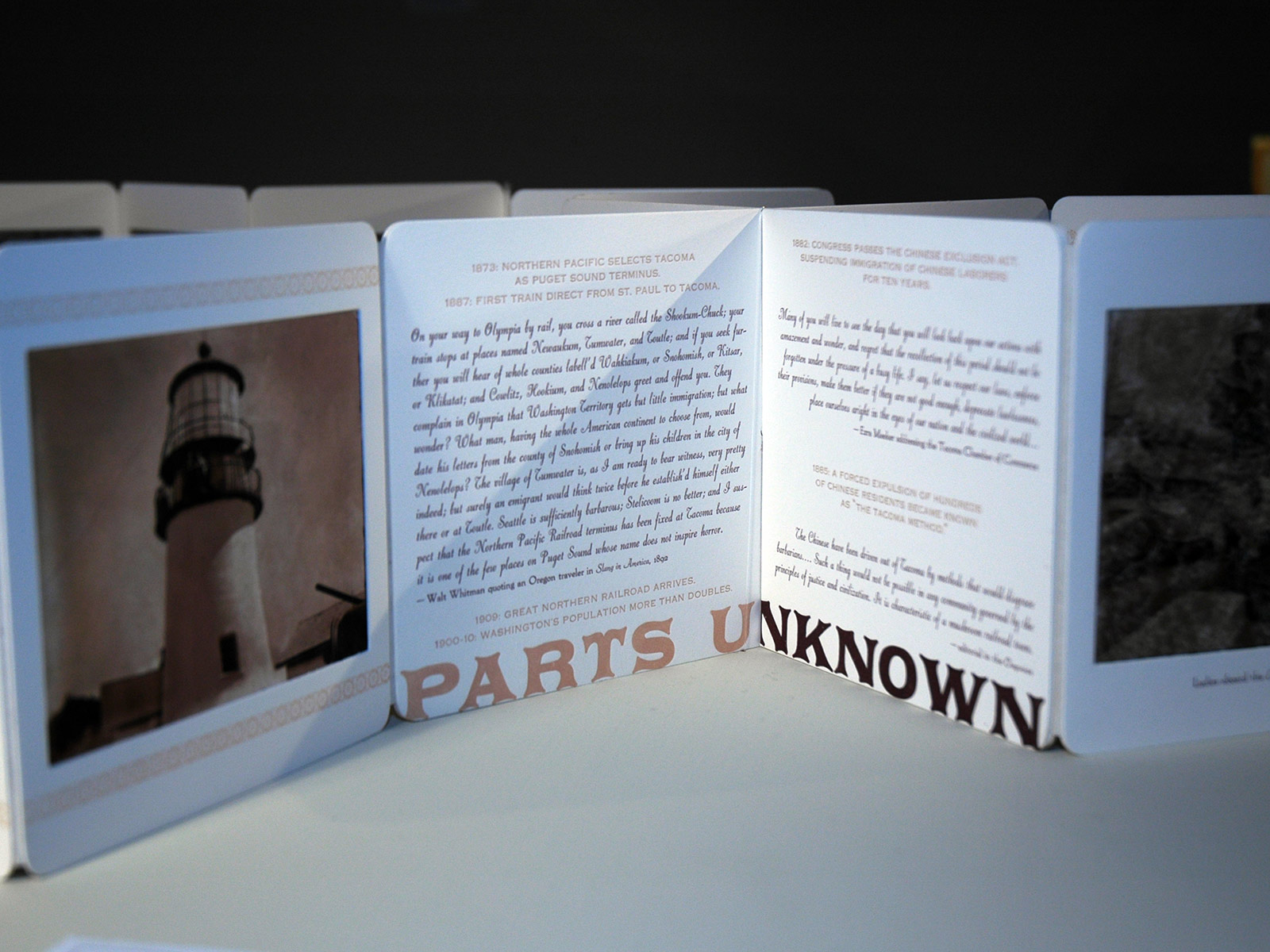
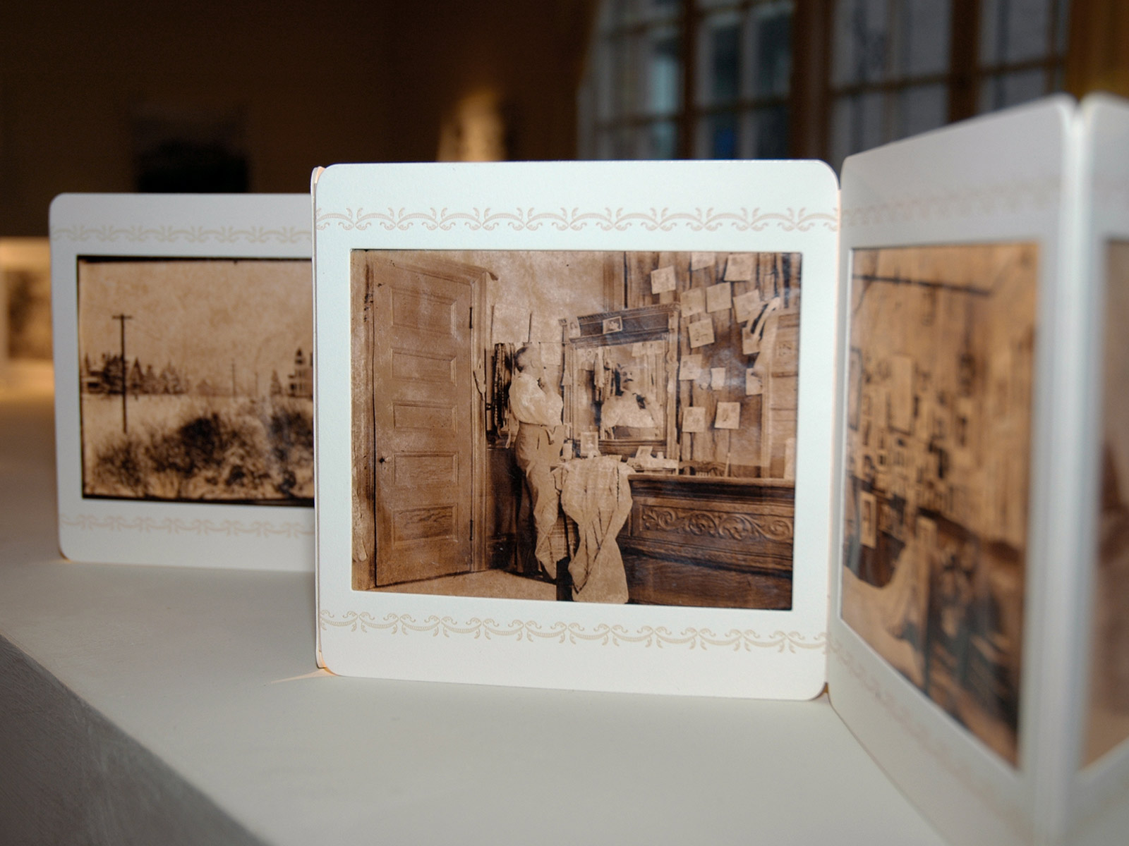
Parts Unknown, 2007
A collaboration between Jessica Spring and photographers who lived in her home over a century ago, Parts Unknown explores the mystery of a box of glass negatives discovered in the artist’s attic. These photographs document a new leisure class in a city moving beyond its frontier origins. Housed in a clamshell box, the book unfolds into four accordion chapters that converge at both a literal and historical crossroads, transporting the viewer to the 1890s. The images are ink-jet printed on handmade abaca, varnished, and bound in panels of Rising museum board. The text is hand set and letterpress printed.
12.5 × 6.5 × 2.5'' boxed, edition of 24 (sold out).
-
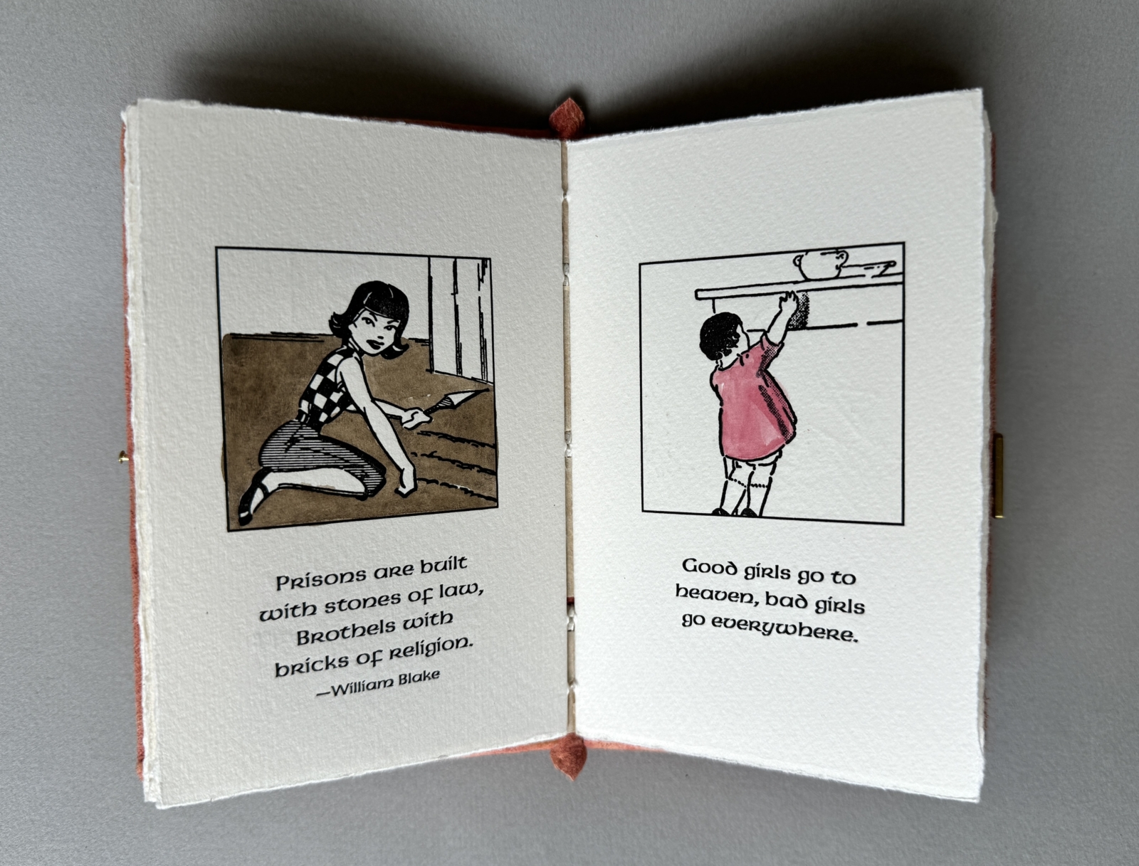
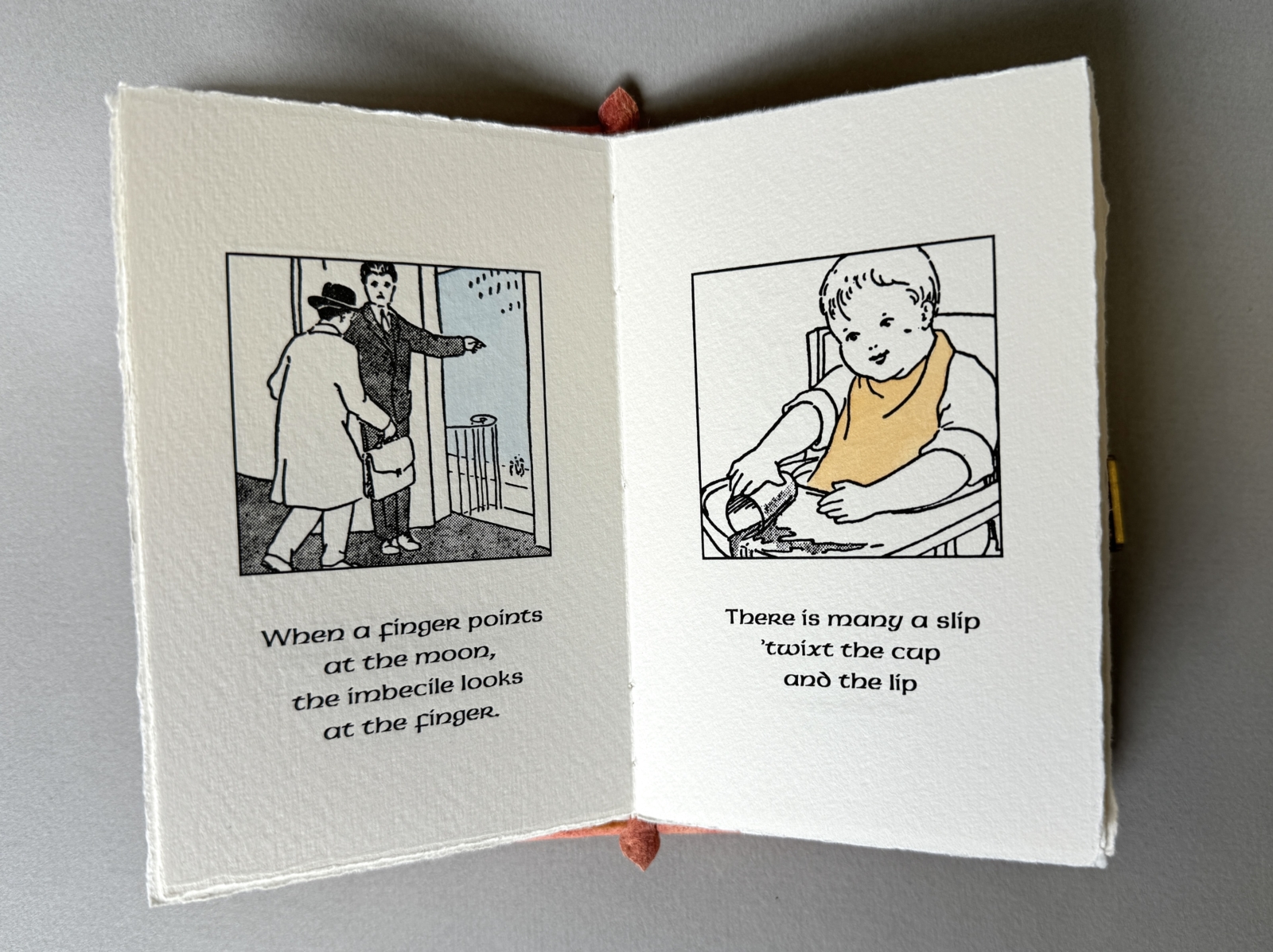
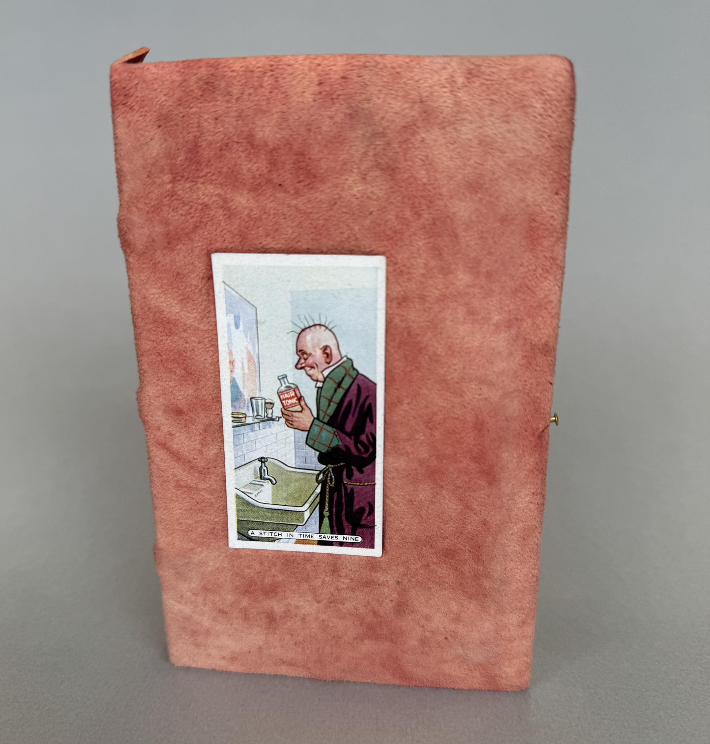
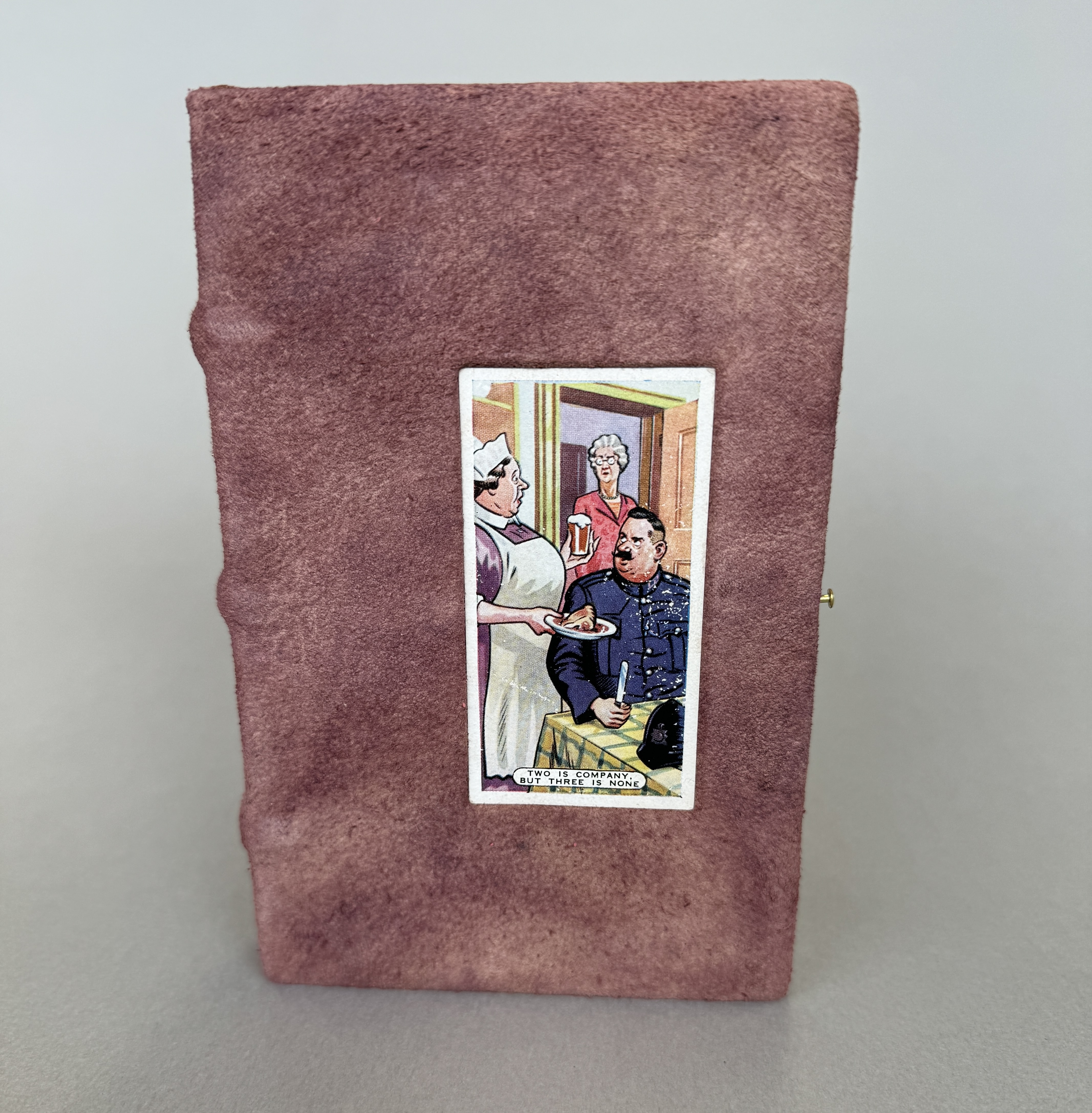
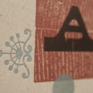
A Proverbial Book, 2002
A selection of proverbs are amusingly paired with hand-colored illustrations from a 1930s vocabulary primer. The text is letterpress printed with photopolymer plates on Fabriano Medievalis. Based on a medieval structure, the book is sewn on cords and covered in Brazilwood-dyed chamois and closes with a handmade brass clasp. Each cover varies both in dye color, and inlaid vintage cigarette card from a series of proverbs. Enclosed in archival wrapper.
3.75 x 5.5"
Varied edition of 40.
-
-
-
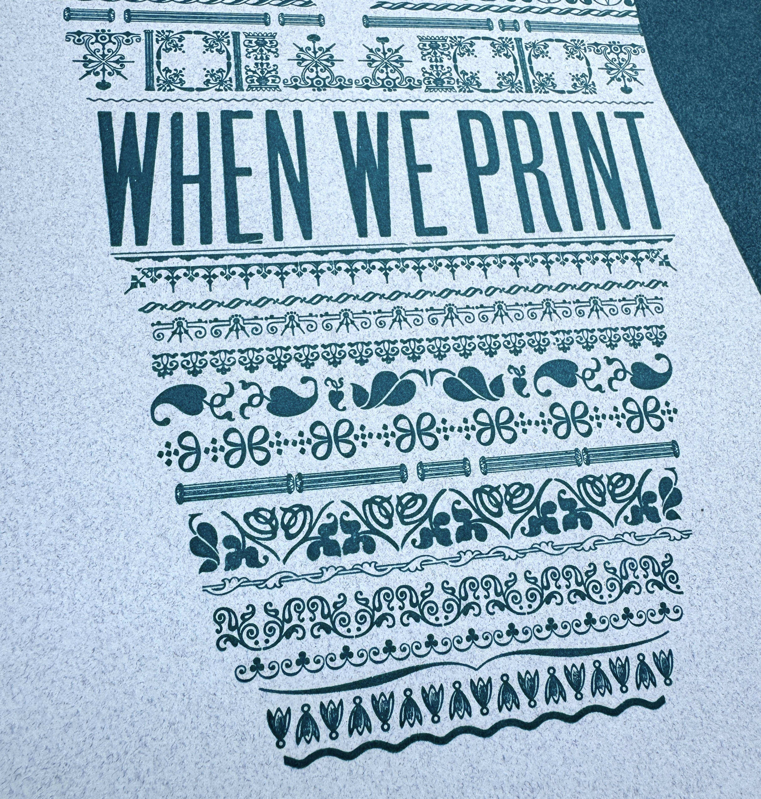
When We Print, We Win
-
Youʼll Like Tacoma
-
You Say Tomato, I Say Tomato
-
Percolation
-
Keep it Clean
-
Hustle
-

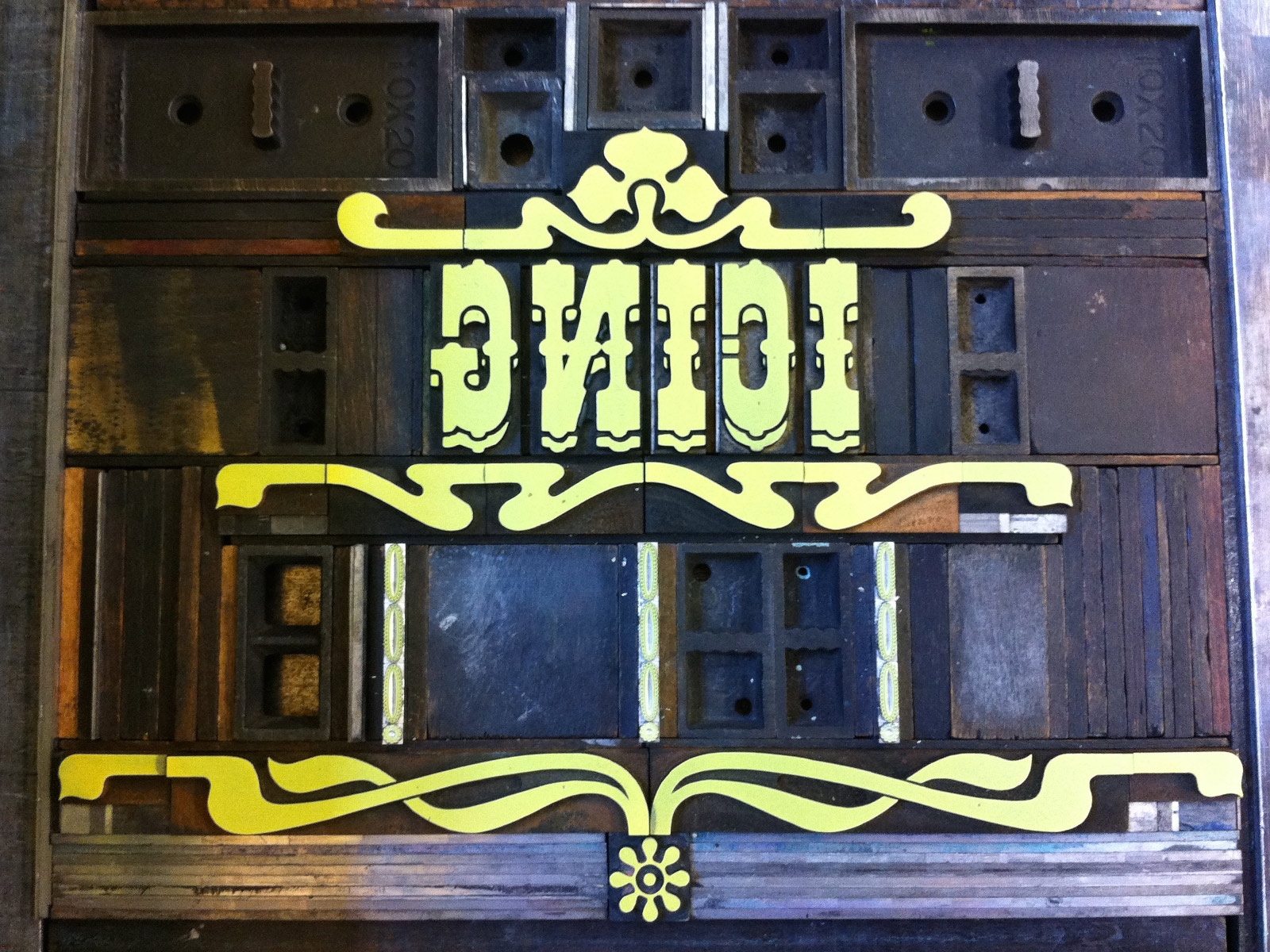
Cake
-
All Aboard
-
Damn Good Coffee
-
A La Mode
-
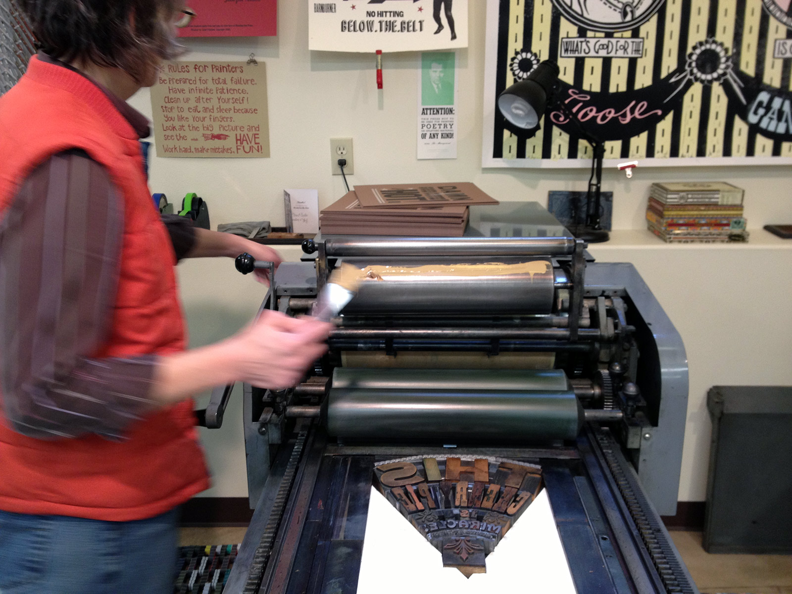
Soggy Sampler
-
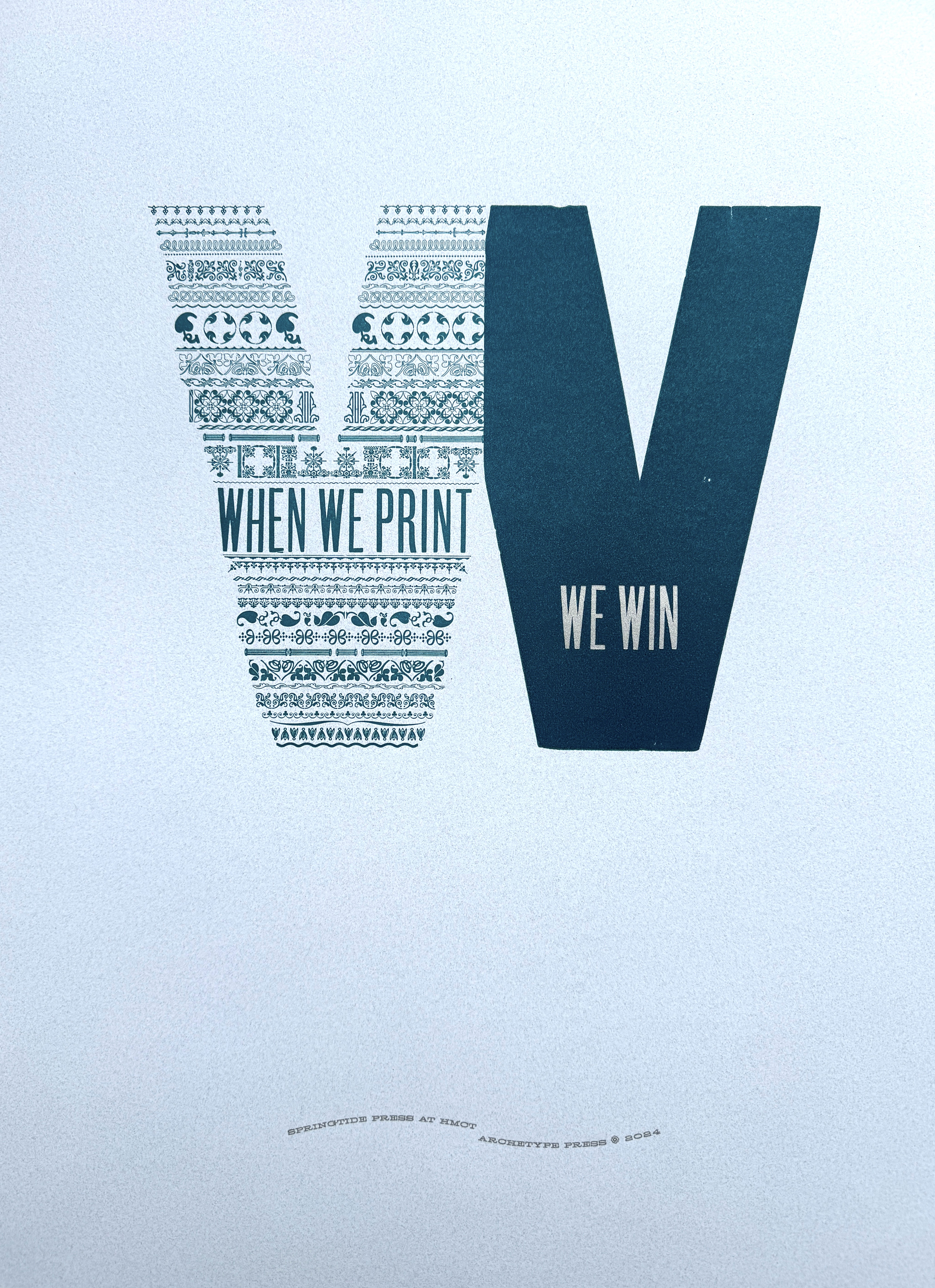
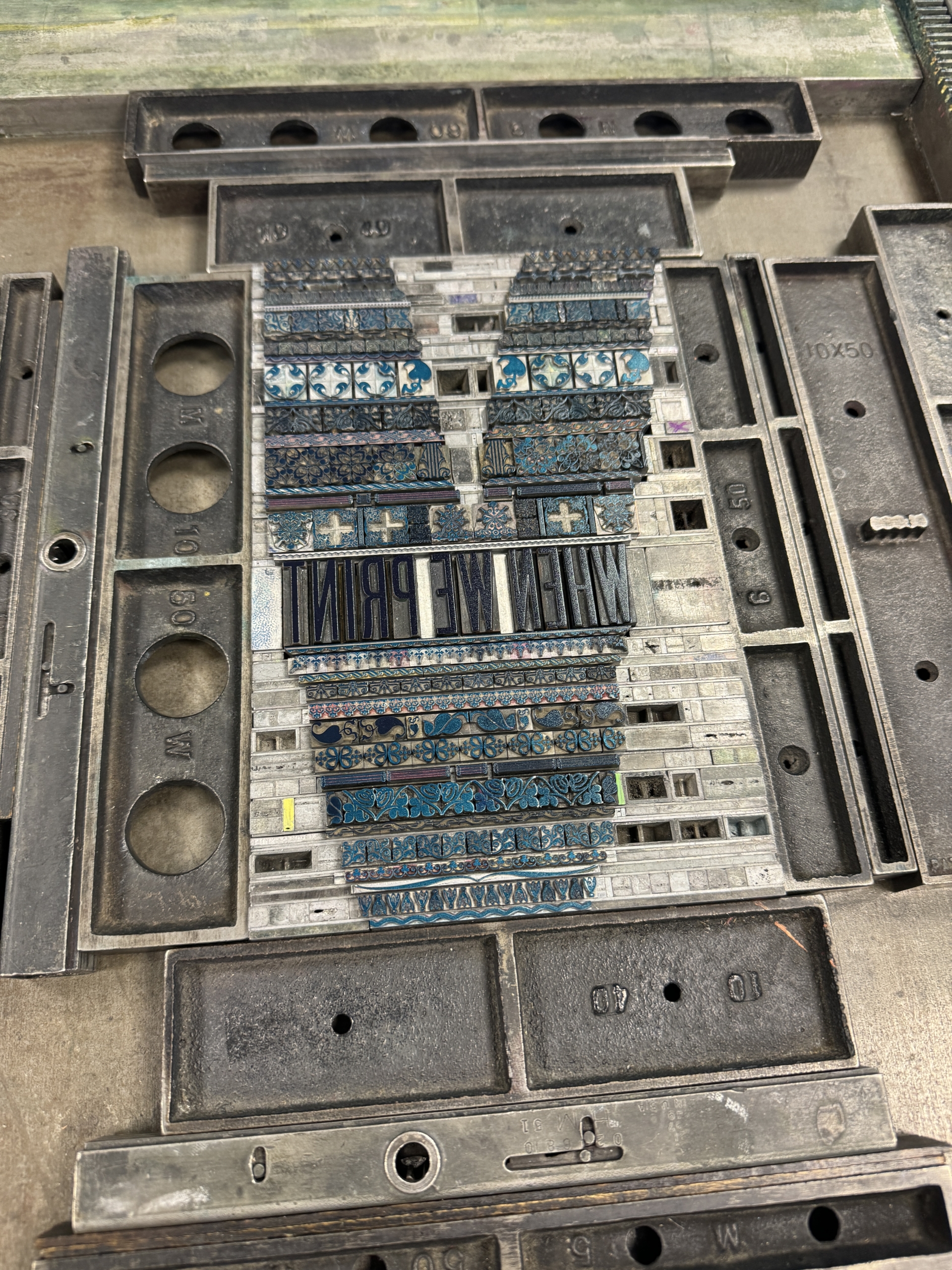
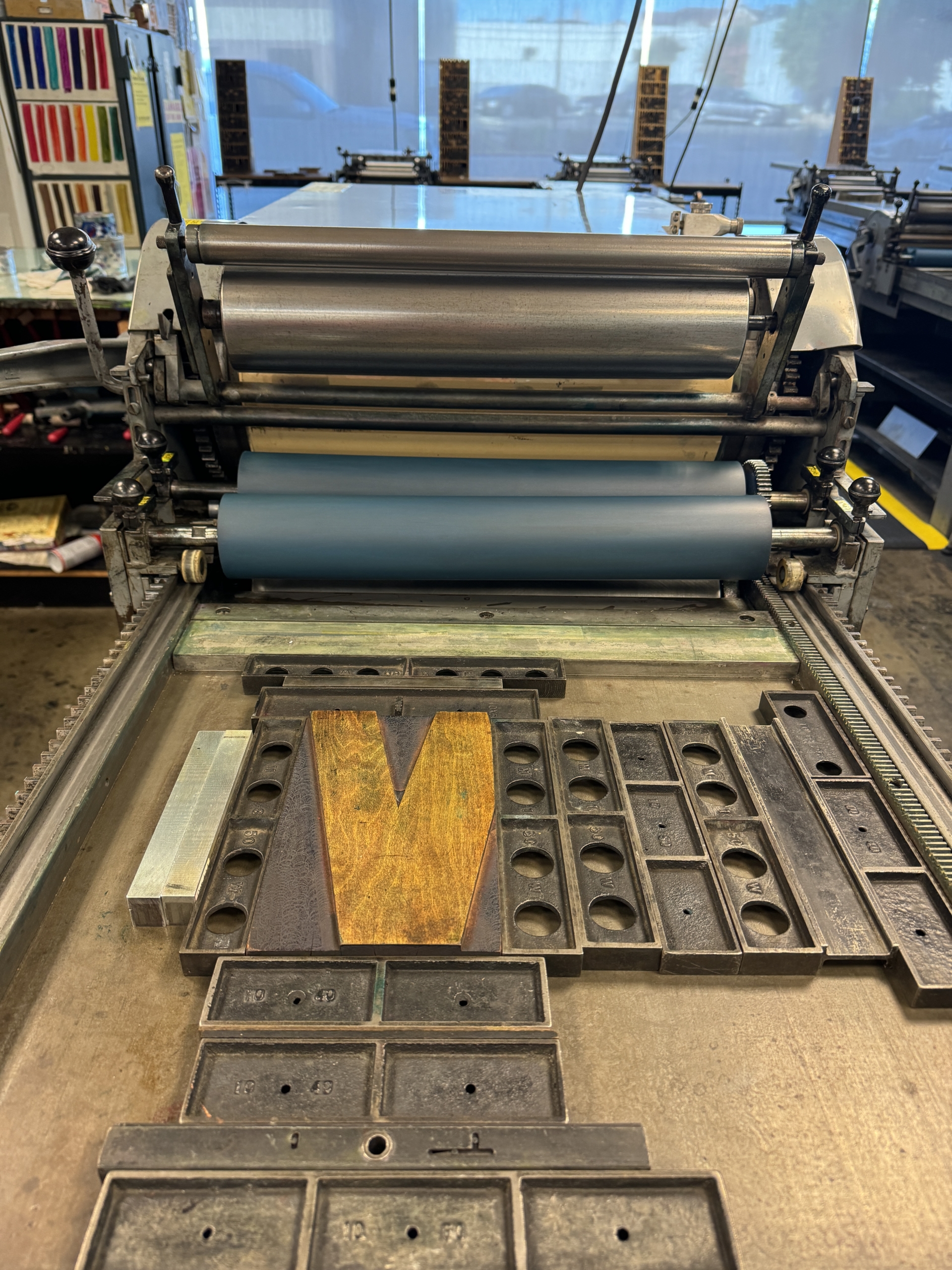
When We Print, We Win, 2025
During a week-long residency at Archetype Press in Pasadena at the end of October 2024, I was drawn to a large broken W. No doubt it resonated with the election (and waves, women, worry, and the World Series.) The broken letter was printed, then healed with a cacophony of ornaments to make it whole again. Letterpress printed on blue-speckled cover stock, the text within reads "When we print, we win." The edition of 100 broadsides is signed, and measure 16 x 20 inches. A portion of the proceeds support work by artists, students and educators at HMCT's Archetype Press.
-
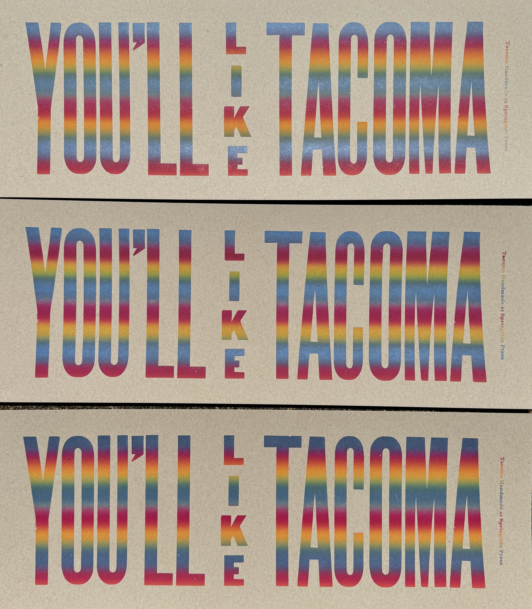
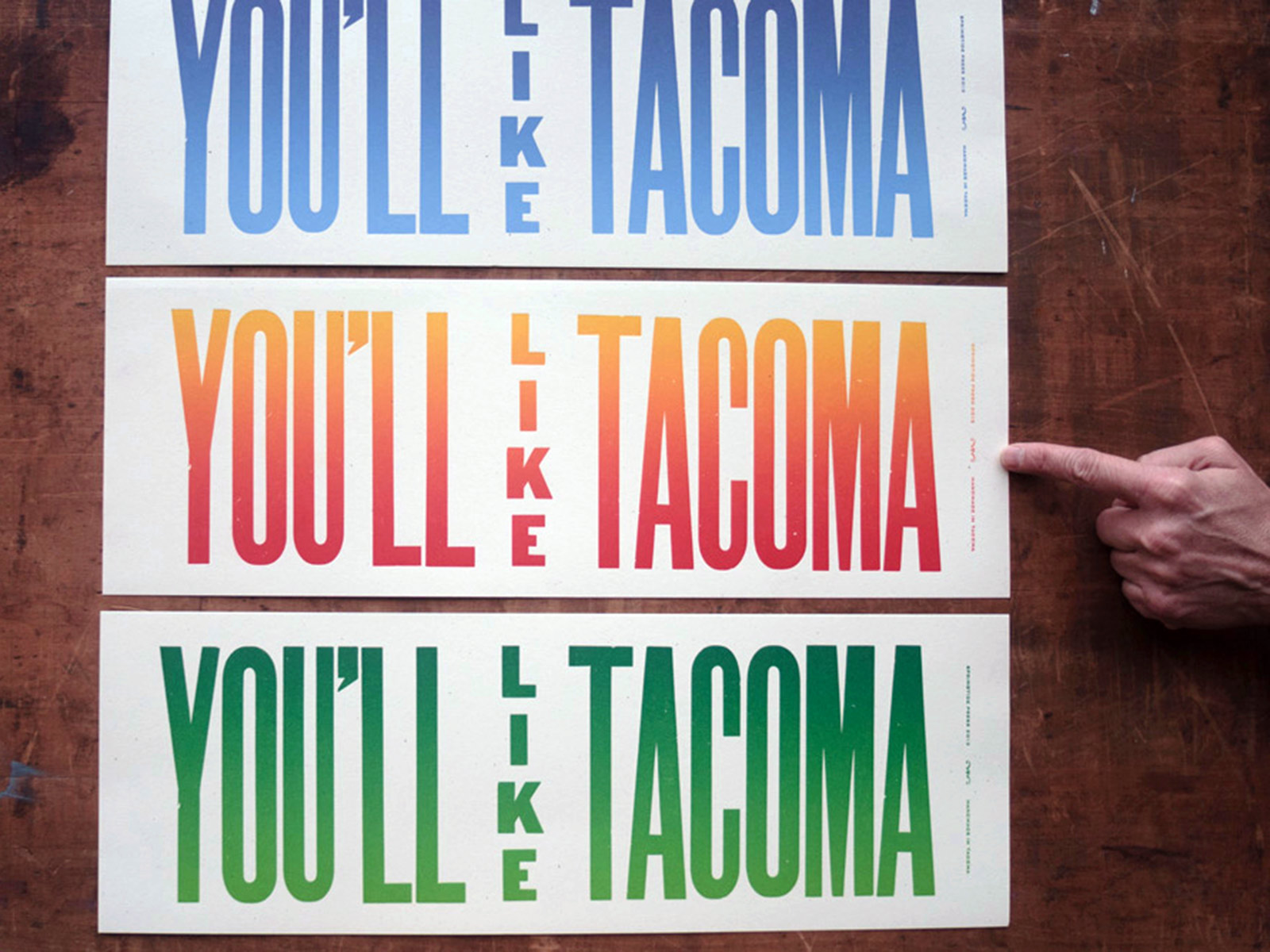
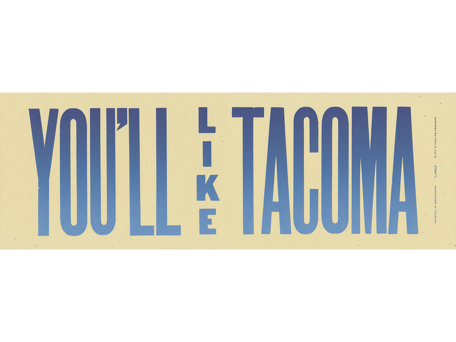
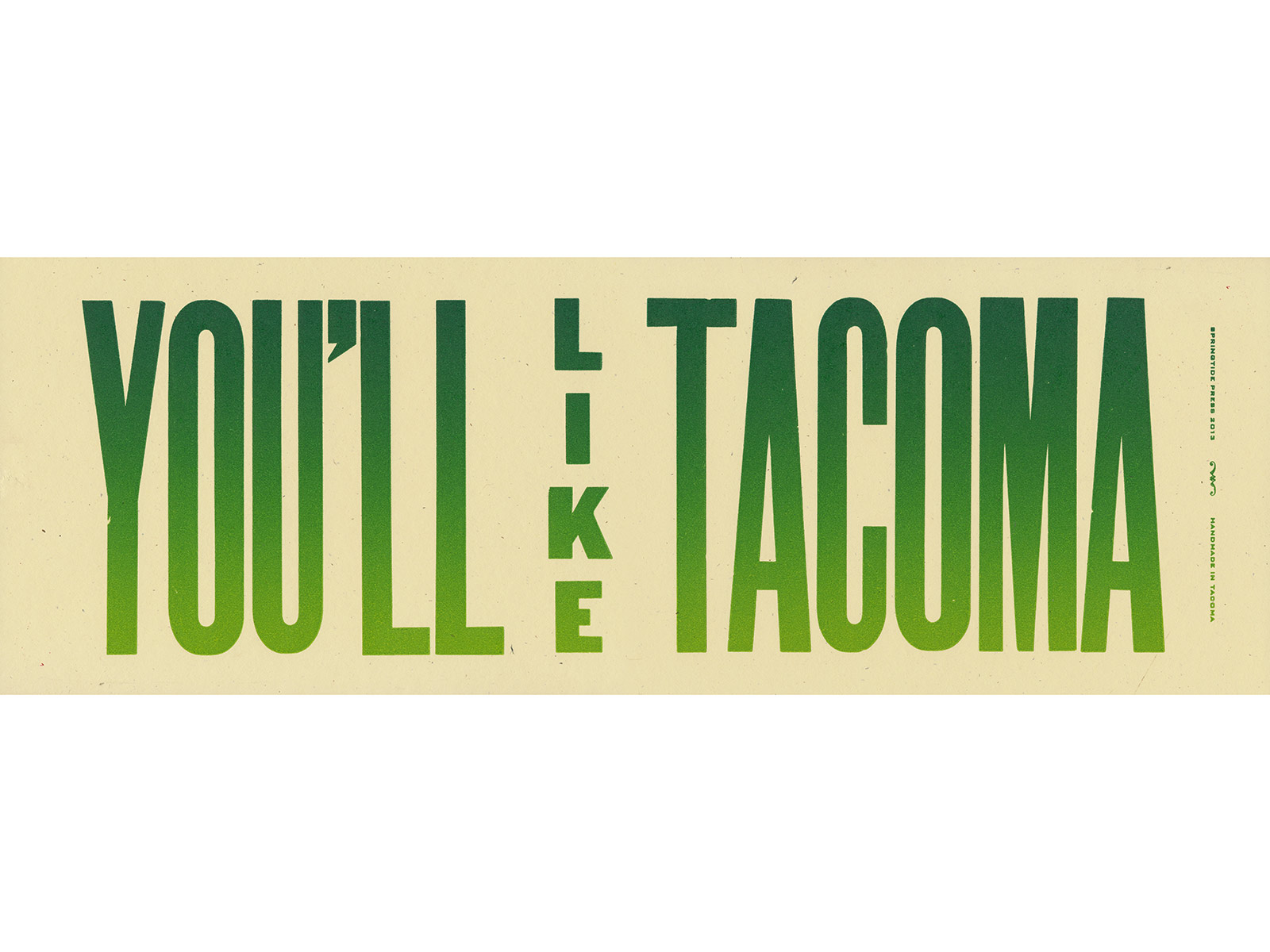
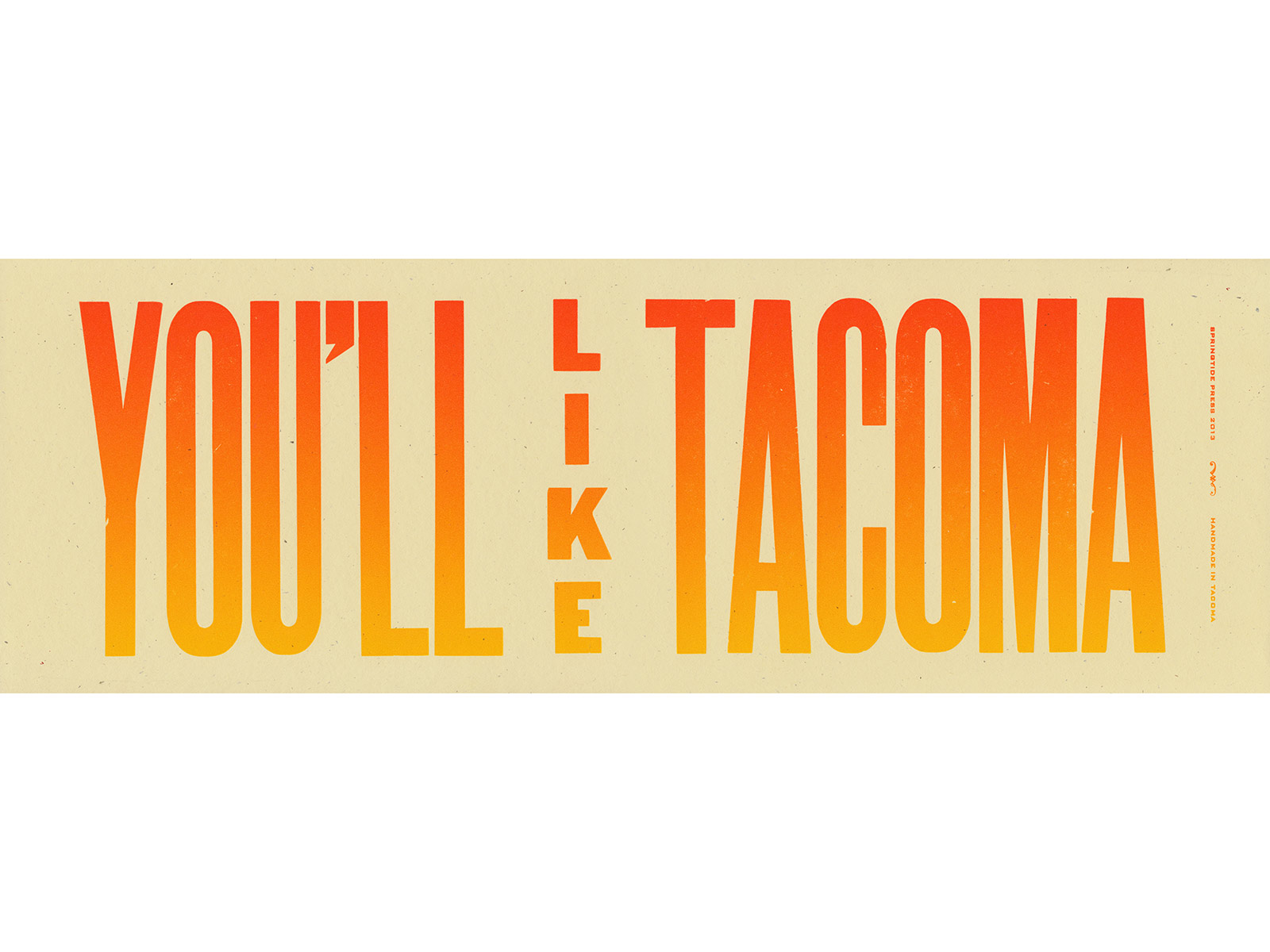
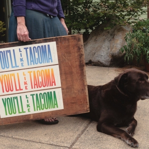
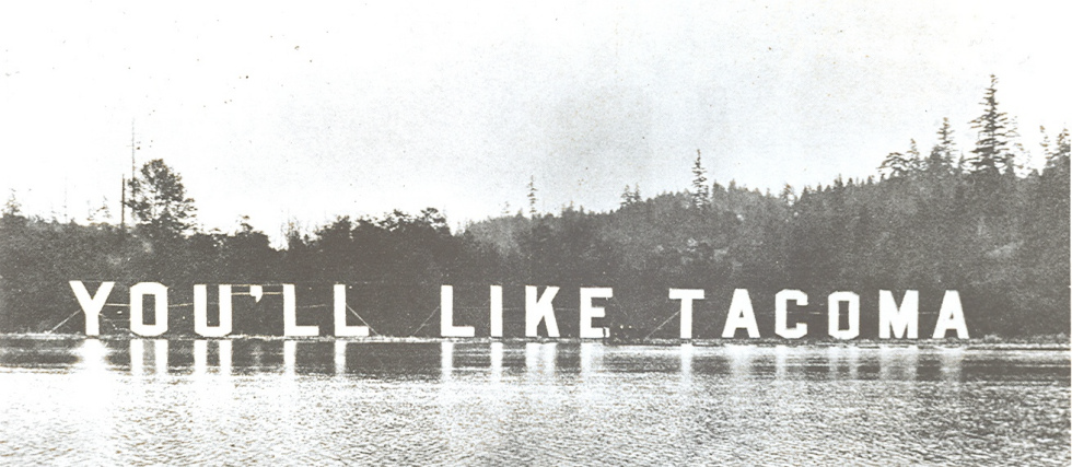
Youʼll Like Tacoma
You’ll Like Tacoma is one of my favorite mottos for our city, and this print was inspired by an electric sign built for the 1909 Alaska Yukon Pacific Exposition in Seattle. Displayed along Lake Washington, it was a huge and bright invitation. This version was made with vintage 30-line wood type and a variety of rainbow rolls, first printed for visitors on the city’s studio tours in 2012, and reprinted again on French Speckletone stock. The edition is unsigned and unnumbered.
6.25 × 18''
-
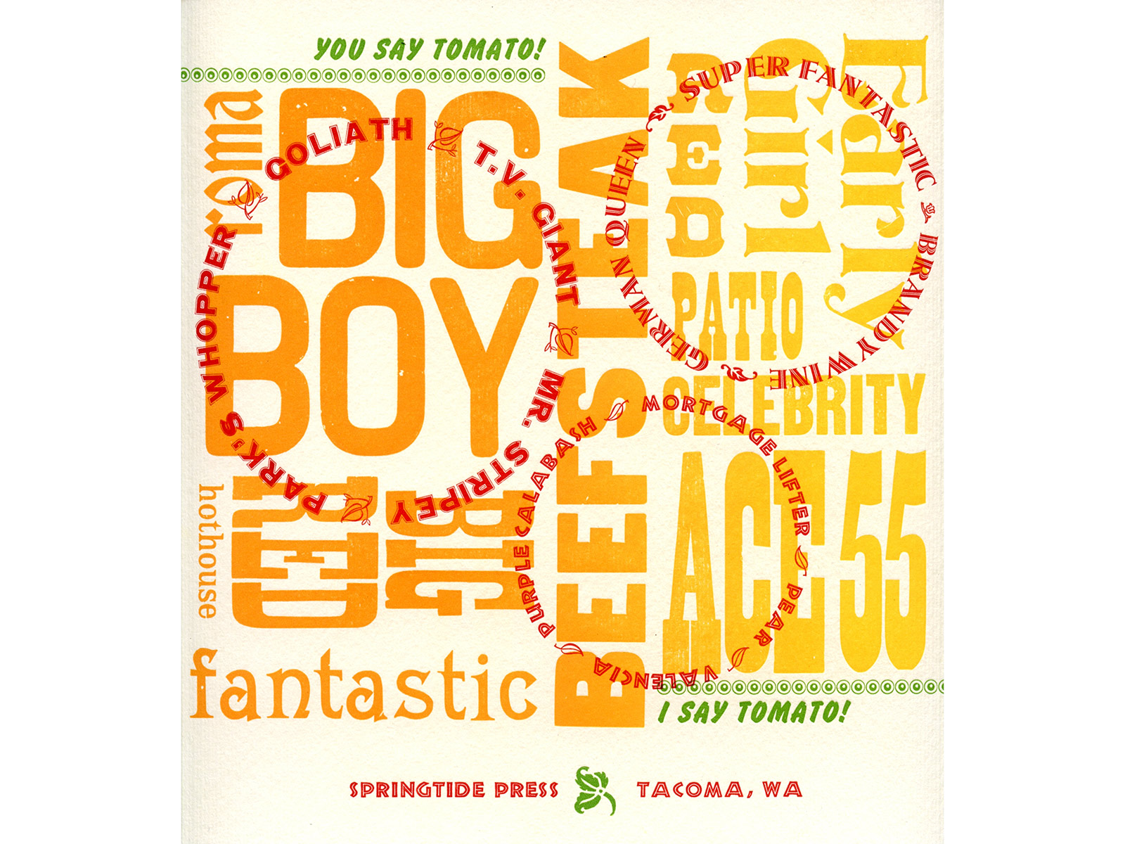
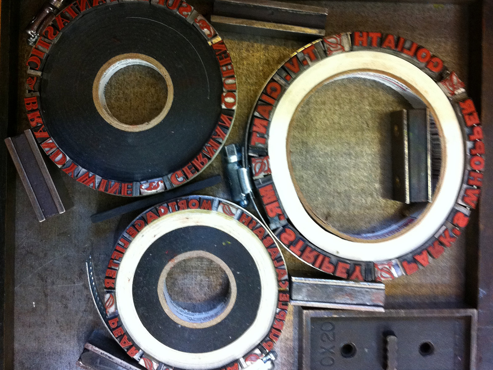
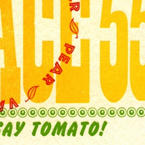
You Say Tomato, I Say Tomato
Wood type arranged and printed as a rainbow roll is overprinted with handset type in circles, all singing the praises of heirloom tomatoes. Bold green type contrasts the oranges, reds and yellows reading "You Say Tomato! I Say Tomato!” and is printed on Fabriano Murillo, a creamy textured paper. The edition is unsigned and unnumbered.
9 × 9.5''
-
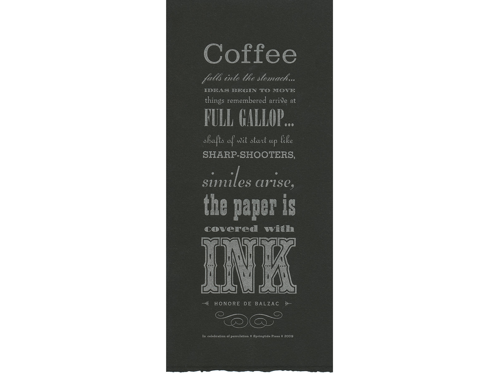
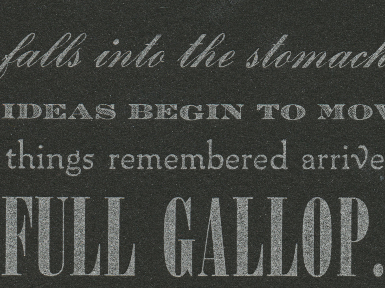
Percolation
Thirteen different vintage metal and wood typefaces were used to set Honore de Balzac’s quote, which reads: “Coffee falls into the stomach... ideas begin to move things remembered arrive at full gallop... shafts of wit start up like sharp-shooters, similes arise, the paper is covered with ink.” Letterpress printed with silver ink on Magnani Revere, including a deckle on the bottom edge of the sheet. This is an unsigned, unlimited edition.
4.5 × 11’’
-
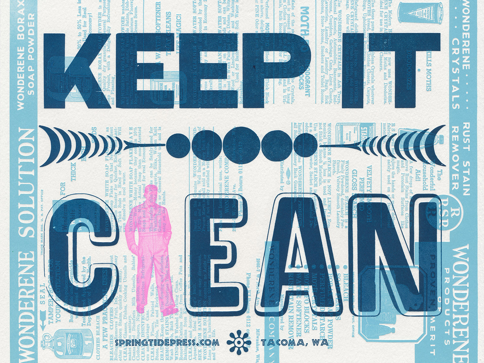
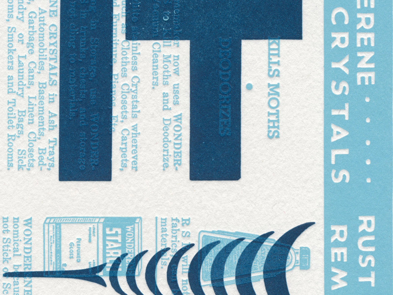
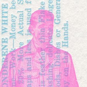
Keep it Clean
Printed with vintage advertising cuts for Wonderene products from Rust Remover to Borax Soap Powder, this print is one of a series of helpful mottos. A hot pink workman serves as an "L" and—like the wood type and ornaments—is transparent enough to reveal the text of the Wonderene advertisement. Keep It Clean is letterpress printed on white Arch paper, made from 100% recycled cotton clothing. The edition is unsigned and unnumbered.
10 × 13’’
-
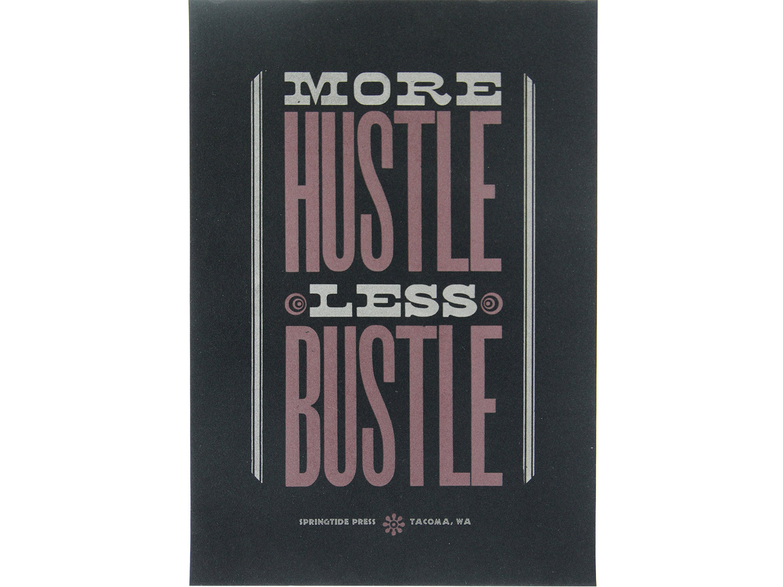
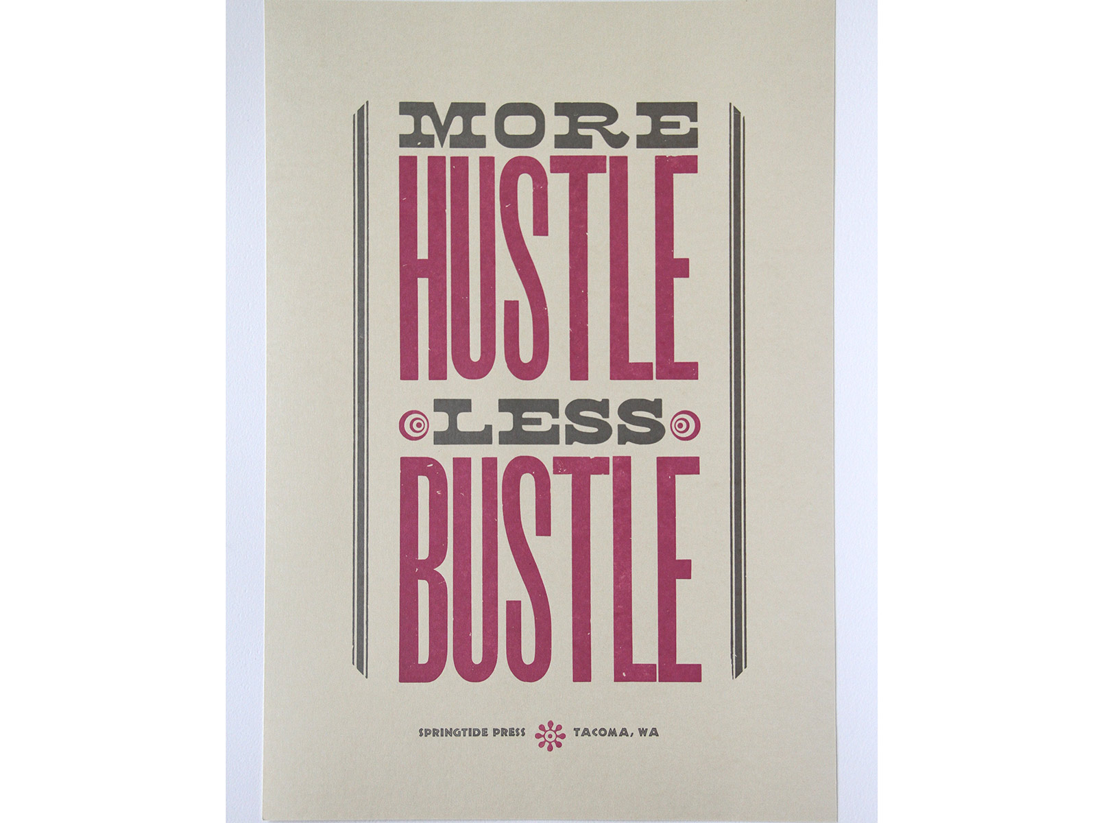
Hustle, 2014
One of a series of motto prints created at Springtide Press, Hustle pokes fun at motivational posters, but also serves to inspire. Handset wood and metal type was letterpress printed on sparkly, creamy Reich paper. A very limited edition of prints were completed on black velvet, inspired by Marvin Gaye playing in the background. The edition is unsigned and unnumbered.
12 × 18''
-
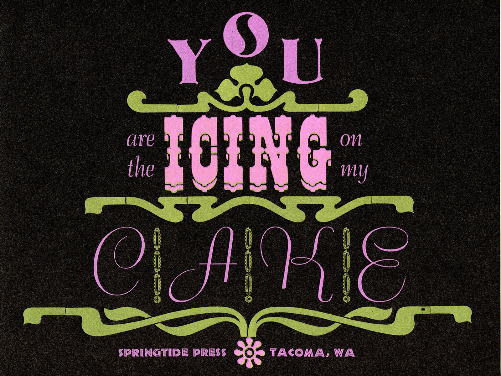
Cake
Printed on sparkly, chocolate brown paper, this print is handset and letterpress printed with vintage wood type and border as well as Bernhard Script, a typeface designed by Lucien Bernhard in the 1920s. Fluorescent inks were layered to create a rich sentiment: “You are the icing on my cake.” The edition is unsigned and unnumbered.
8.5 × 11’’
-
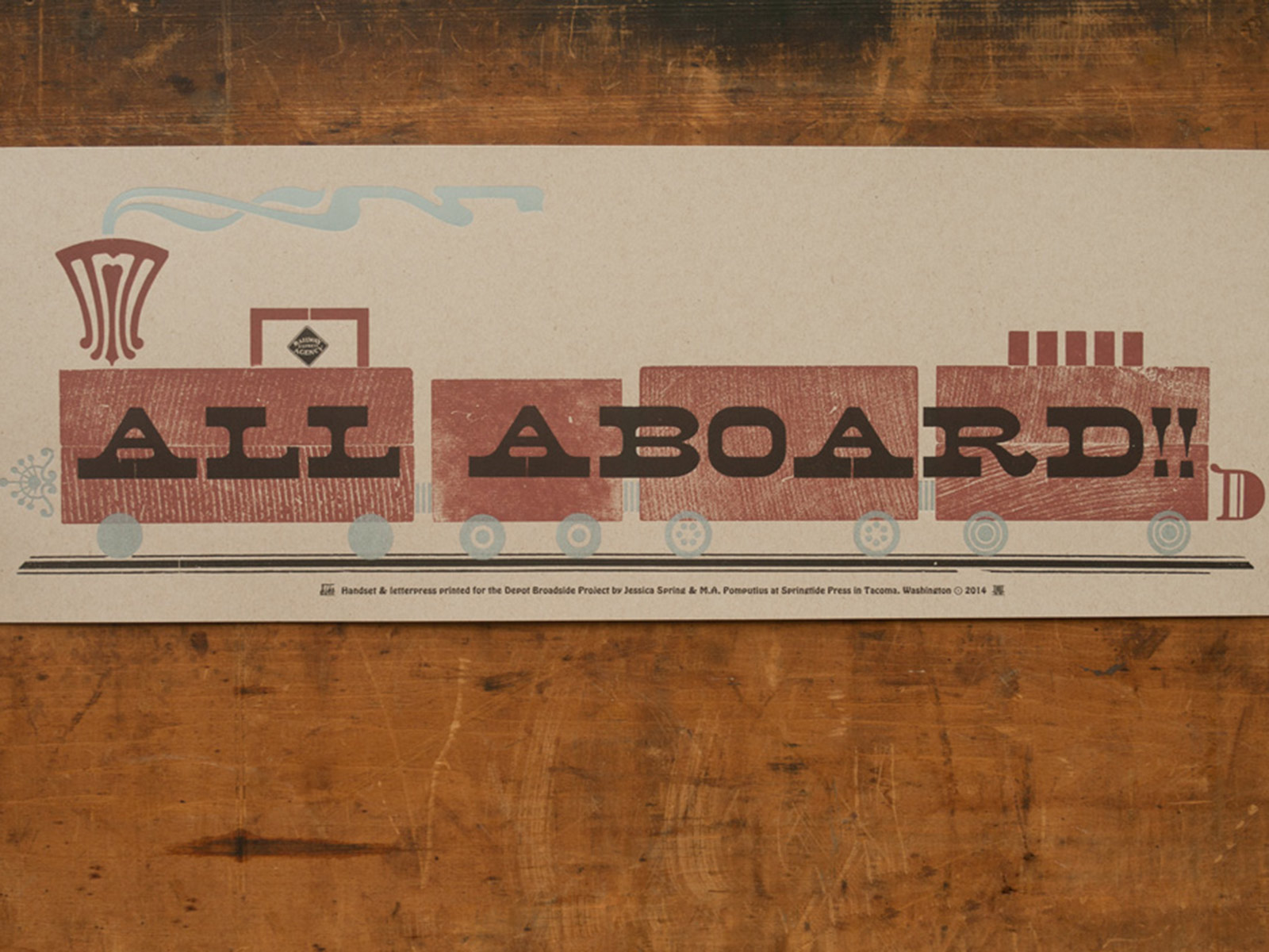
All Aboard, 2014
The Englewood Depot is a working vintage letterpress shop established in a former train depot in Colorado. In an effort to raise funds, the organizers called on printers from around the world to contribute prints. All Aboard combines wood type, wood borders, and new wood ornaments from Moore Wood Type composed and printed in three colors on French Speckletone with the assistance of Mary-Alice Pomputius. The edition is unsigned and unnumbered.
6.75 × 20''
-
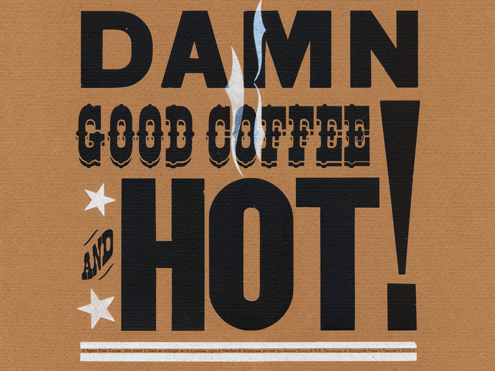
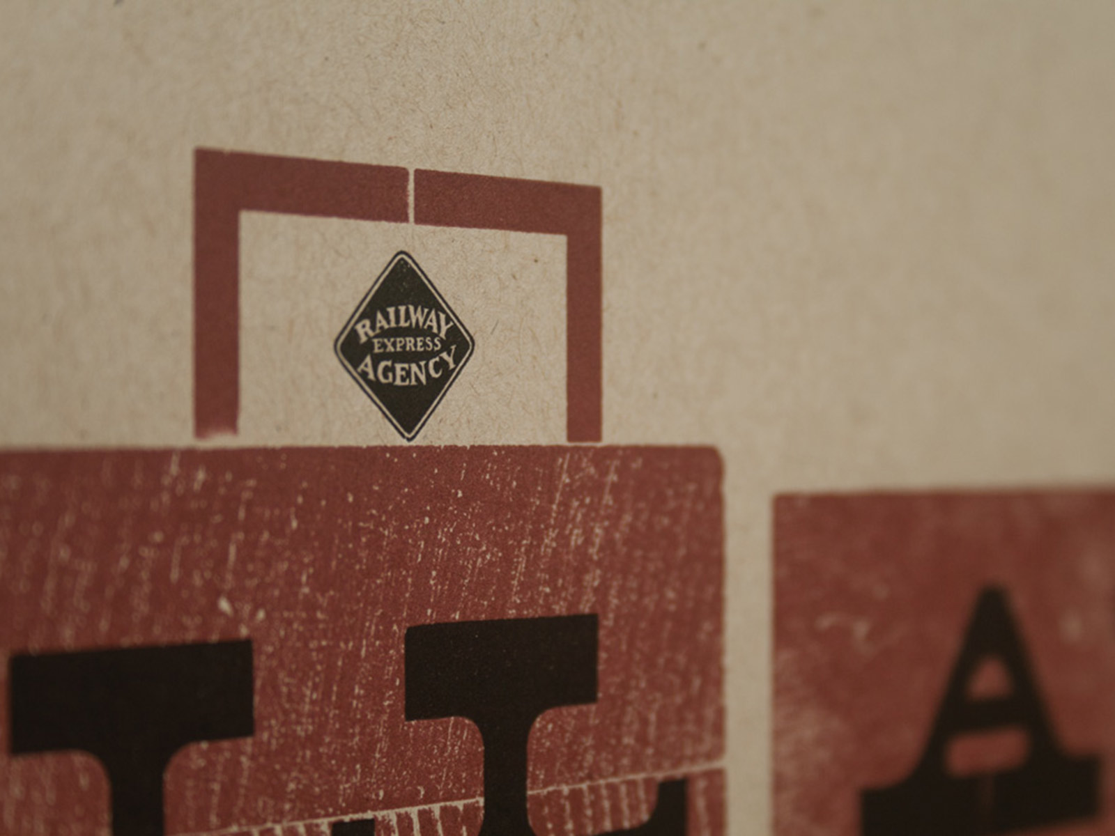
Damn Good Coffee, 2013
One of a twin series of prints inspired by wise words from characters in Twin Peaks, made in collaboration with Mary-Alice Pomputius. A quote from Agent Dale Cooper is handset and letterpress printed with some damn good wood type, border & stars. Carefully handset, the wood type is overprinted with translucent white steam. It was printed in two colors on lush, textured Fabriano Murillo paper and is best served with cherry pie a la mode. The colophon credits: “Agent Dale Cooper, who drank it black as midnight on a moonless night.”
13 × 13'' edition of 90, signed by both artists ❈ Purchase here from Etsy
-
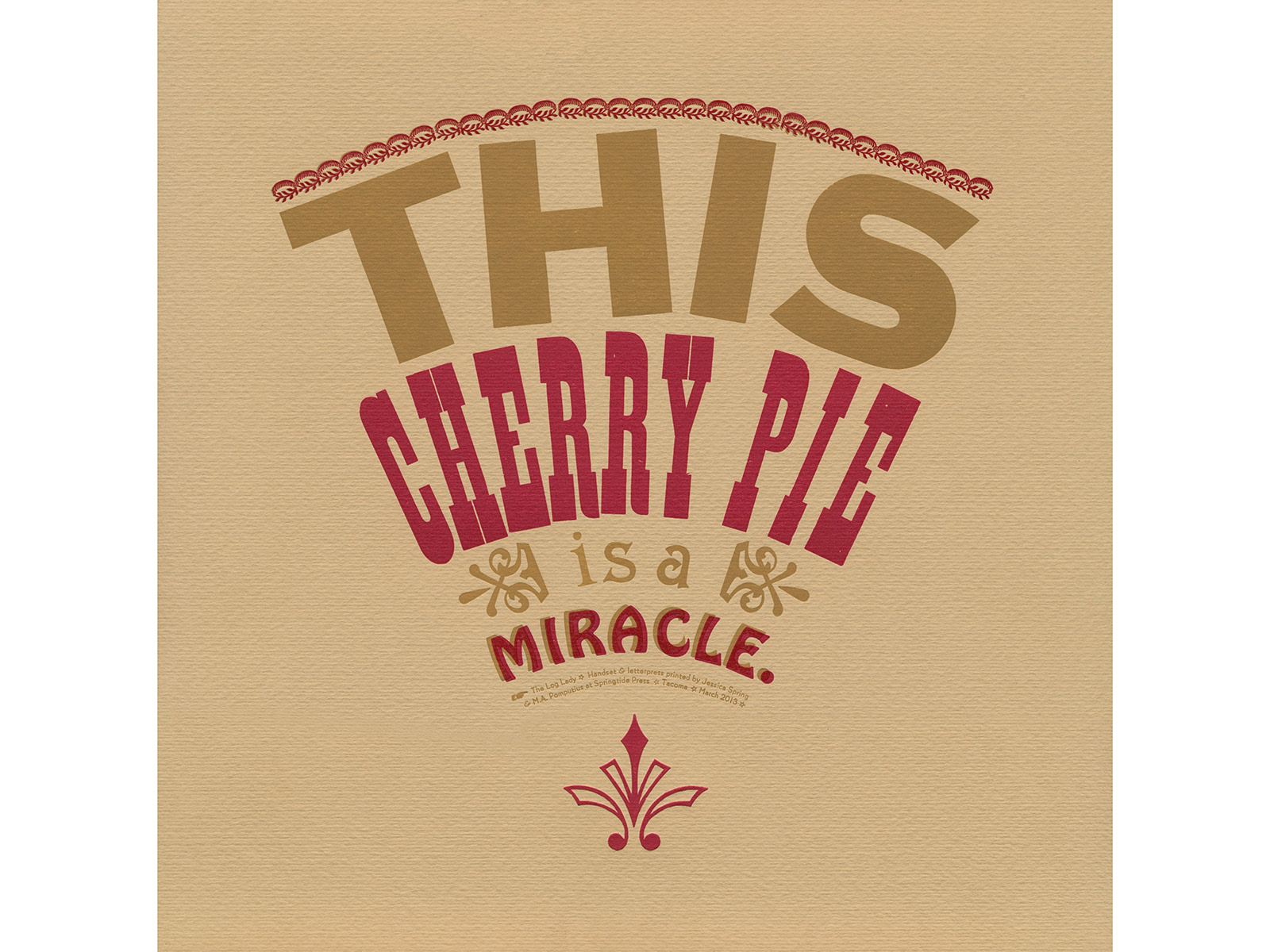
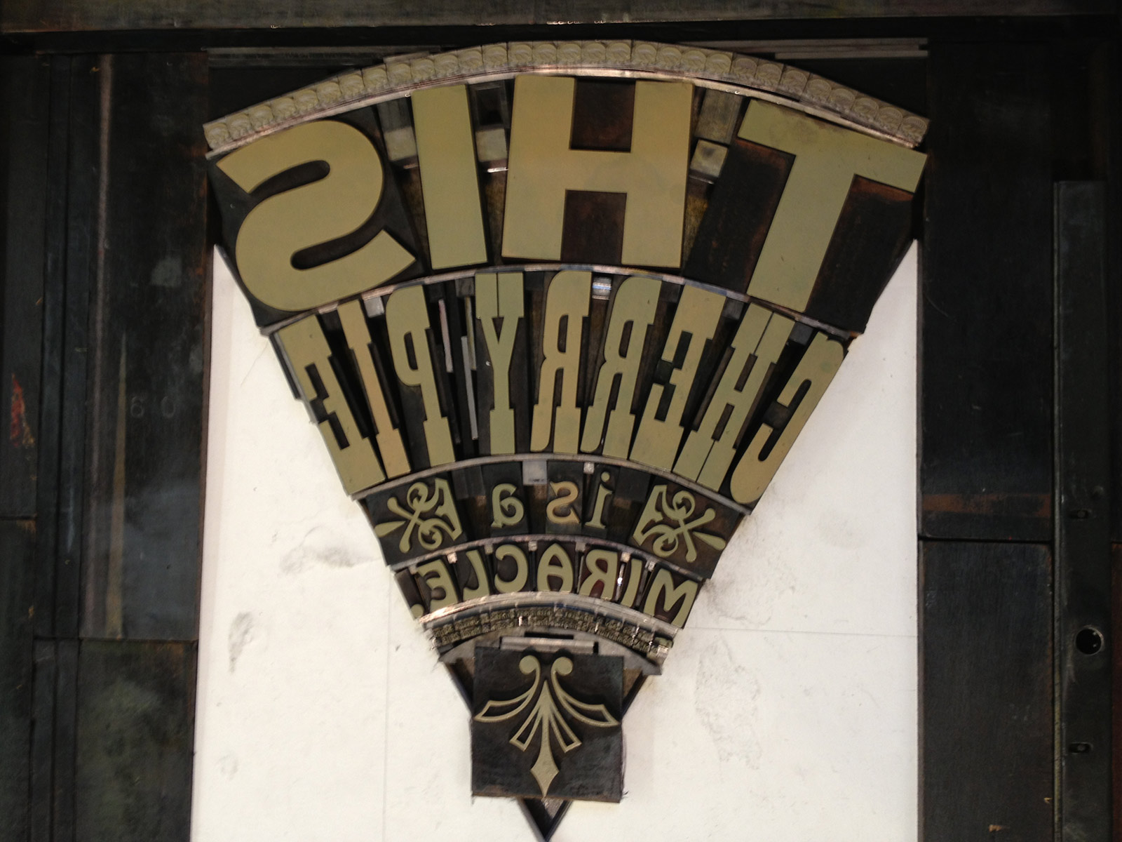
A La Mode, 2013
One of a twin series of prints inspired by wise words from characters in Twin Peaks, made in collaboration with Mary-Alice Pomputius. A quote from the Log Lady is handset and letterpress printed with some damn good wood type and miraculous 60 point Hobo. Carefully handset and curved, the text and ornaments resemble a slice of pie, complete with hand-formed crust. It was printed in two colors on lush, textured Fabriano Murillo paper and is best served a la mode. The colophon credits The Log Lady.
13 × 13'' edition of 50, signed by both artists ❈ Purchase here on Etsy
-
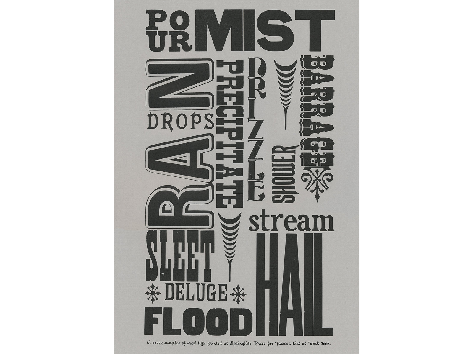
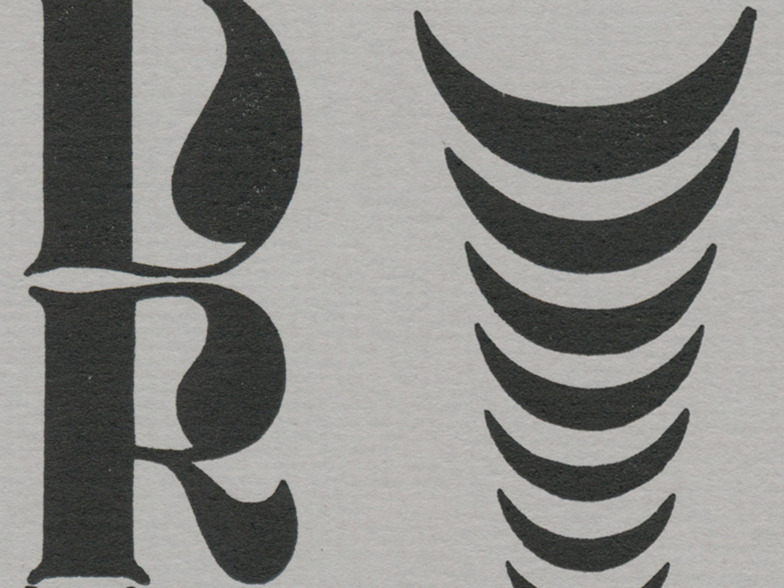
Soggy Sampler, 2006
Originally created for Tacoma’s Studio Tour visitors, this broadside is a type specimen of vintage wood type and ornaments found at the shop and is full of soggy words for rainy days. Letterpress printed with black ink on textured gray paper. The edition is unsigned and unnumbered.
12 × 17''
-
-
-
C.C. Stern Type Foundry
-
Land Acknowledgement
-
You'll Heal Tacoma
-
Dead Feminists
-
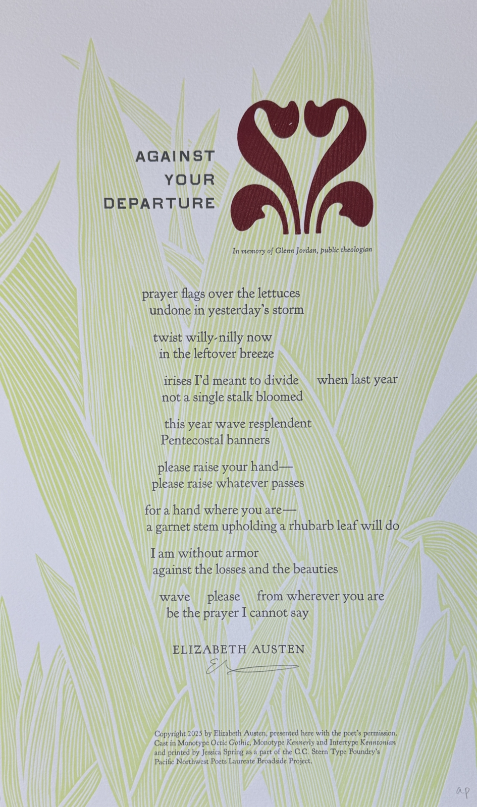
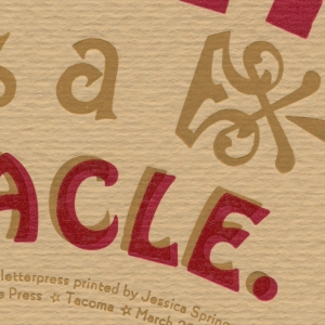
C.C. Stern Type Foundry, 2025
This broadside collaboration with C.C. Stern Type Foundry for the Pacific Northwest Poets Laureate series features "Against Your Departure" by Washington Poet Laureate Emerita Elizabeth Austen.
Spring, 2025.This was a daunting and joyful opportunity. Elizabeth’s beautiful poem resonated in so many ways: navigating grief, and the crush of the world right now, where the arrival of spring and the comfort of friends can provide much needed light and hope. I’m not a religious person, but I can put my hands to work for this sort of prayer. The Kennerley and Octic type was cast at the foundry, and added to my burden… I had an amazing poem, fresh and gorgeous type, yet still a challenging puzzle to solve. Inspired by irises nearly blooming in my yard, I carved iris foliage, and added Virgin Wood Type fleurons to suggest a bloom.
The broadside is available through C.C. Stern Type Foundry.
-
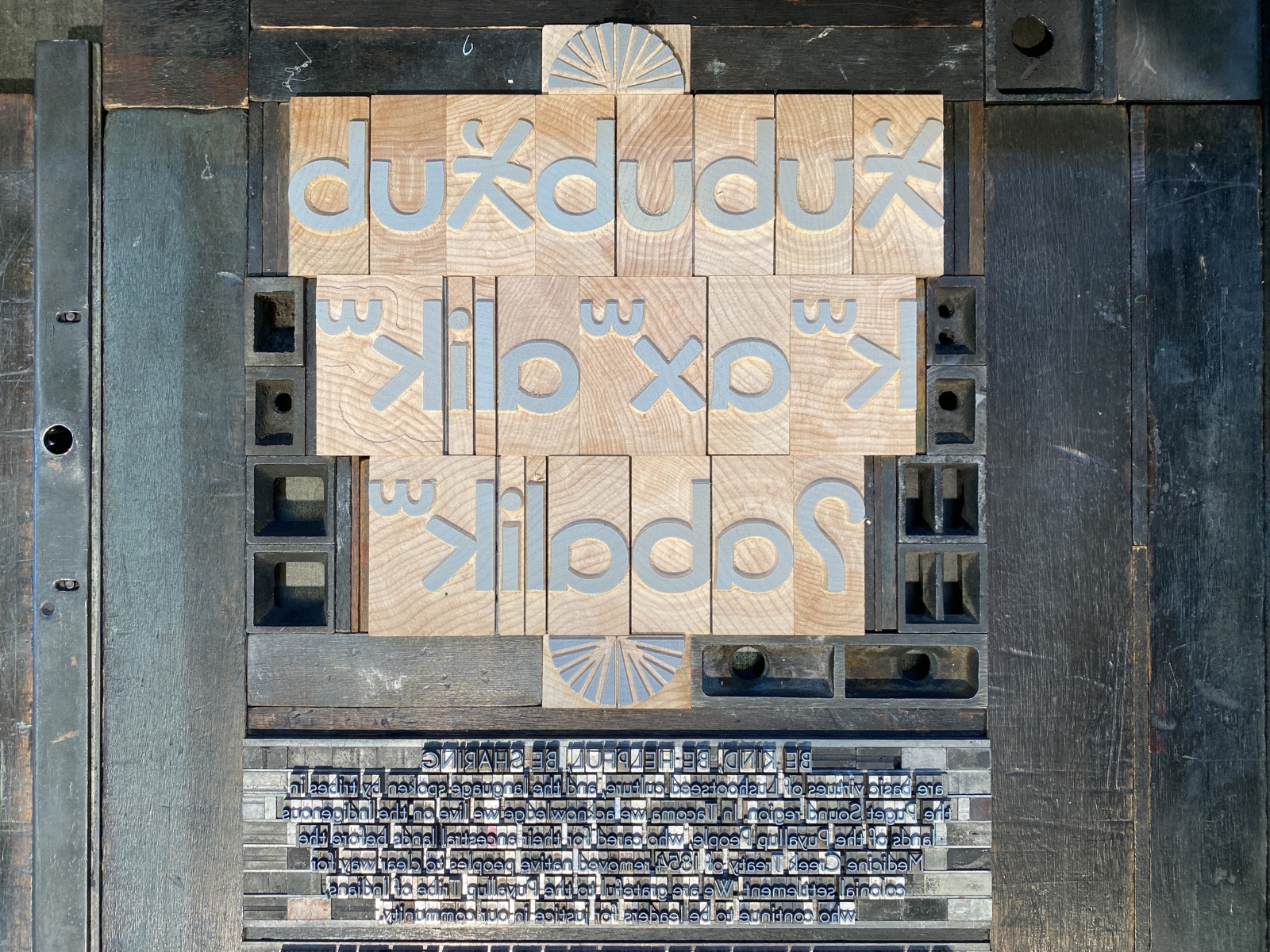
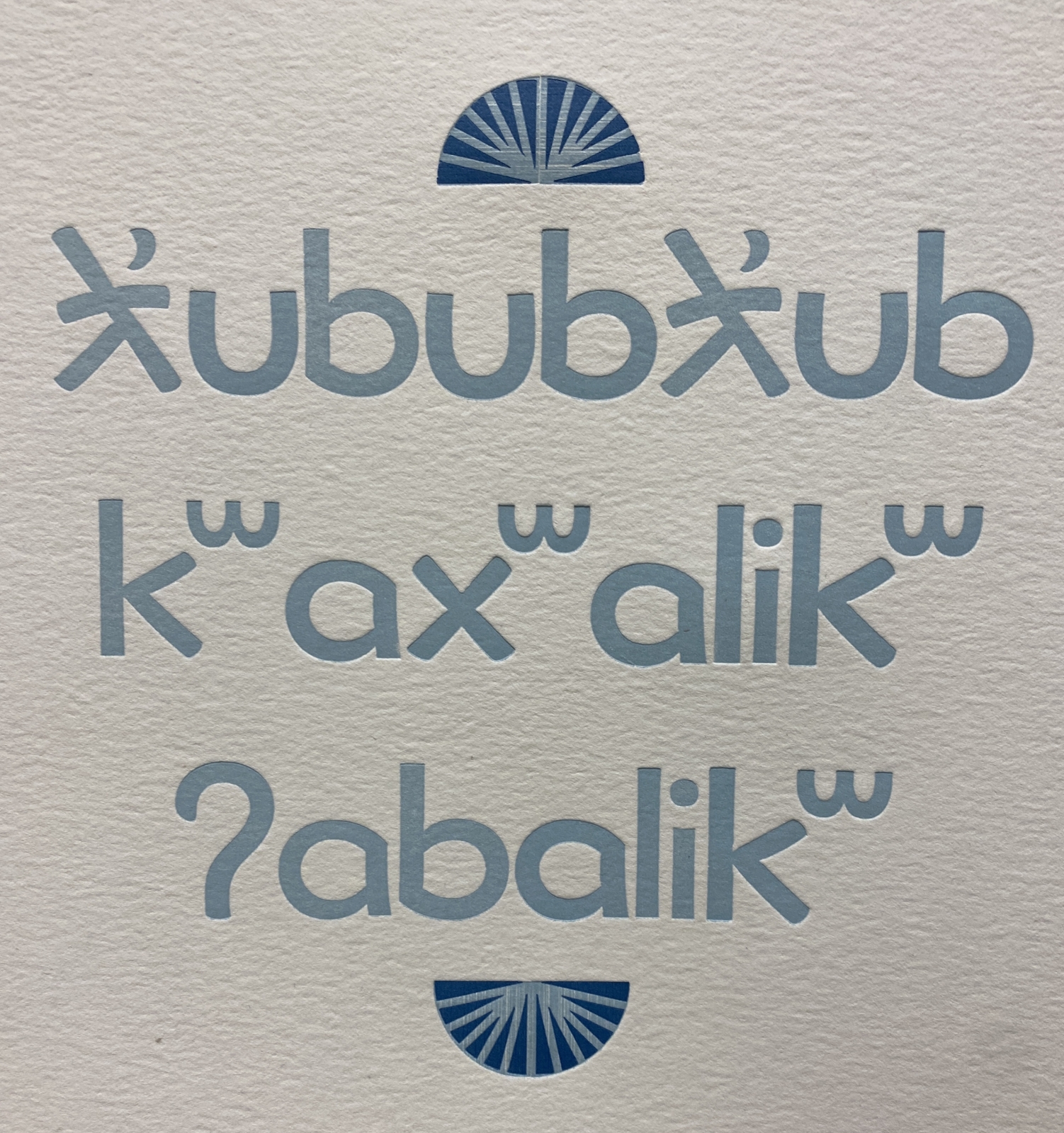
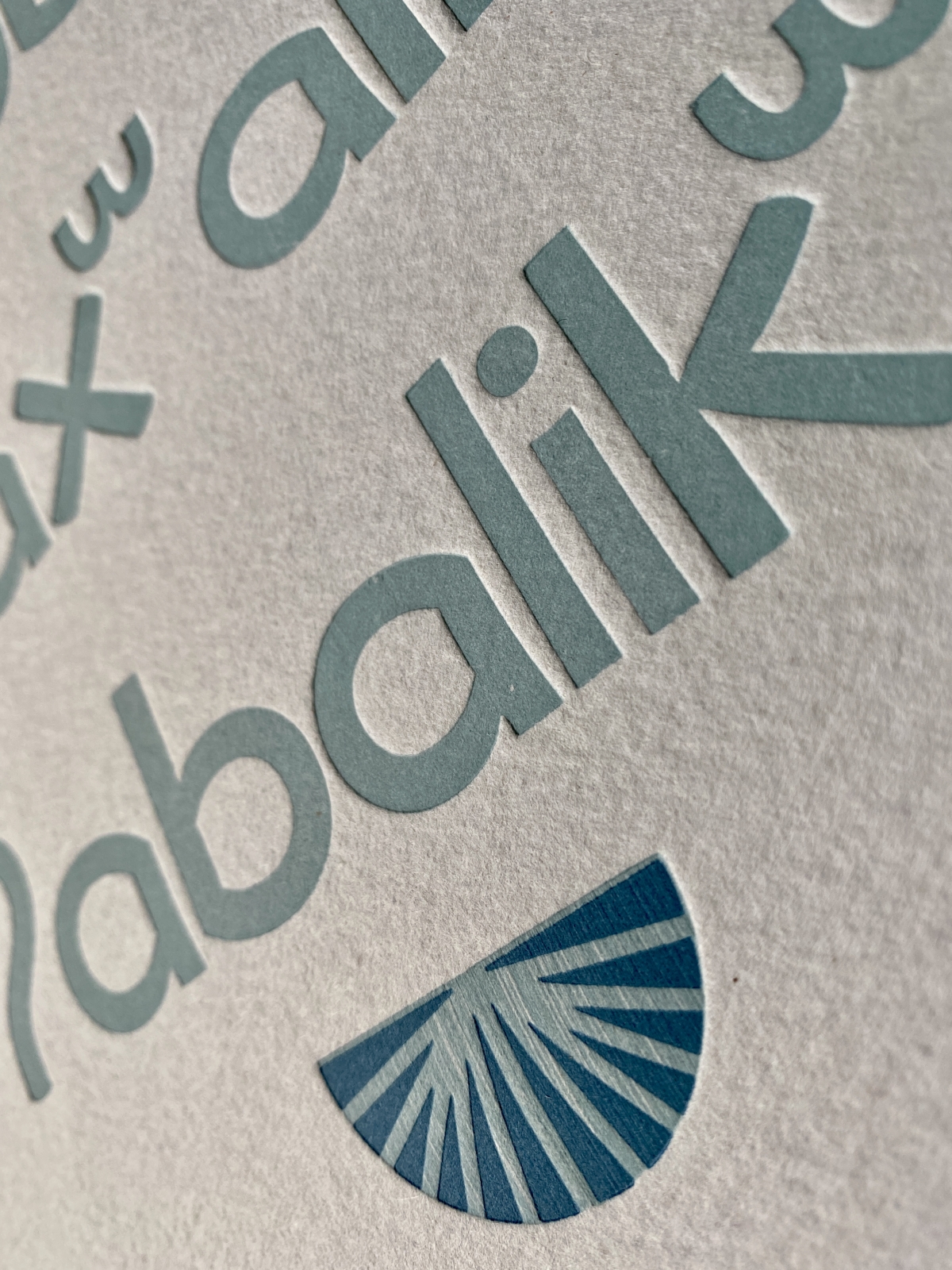
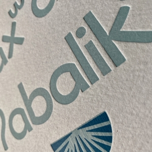
Land Acknowledgement, 2020
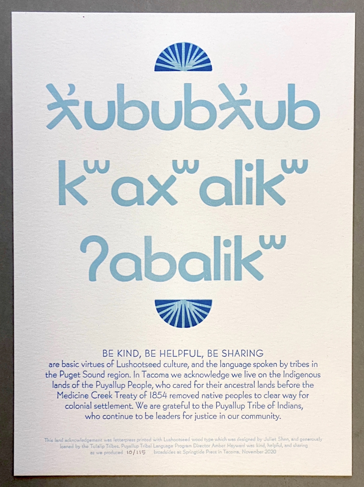
Type designer Juliet Shen worked with the Tulalip tribes to create a Lushootseed font which was cut in wood type at the Hamilton Wood Type & Printing Museum. At Juliet's suggestion, the Tulalip tribes generously lent the wood type for a visit to Tacoma. While the primary focus of the Puyallup Tribal Language Program is revitalizing Lushootseed and implementing day-to-day usage of the language, Program Director Amber Hayward generously assisted in this project. In working together, it became clear that printing the basic virtues of Lushootseed culture would be just right. Limited edition prints read: ƛ̓ububƛ̓ub, kʷaxʷalikʷ, ʔabalikʷ BE KIND, BE HELPFUL, BE SHARING are basic virtues of Lushootseed culture, and the language spoken by tribes in the Puget Sound region. In Tacoma we acknowledge we live on the Indigenous lands of the Puyallup People, who cared for their ancestral lands before the Medicine Creek Treaty of 1854 removed native peoples to clear way for colonial settlement. We are grateful to the Puyallup Tribes of Indians, who continue to be leaders for justice in our community. All print sales benefit the Puyallup Tribal Language Program. -

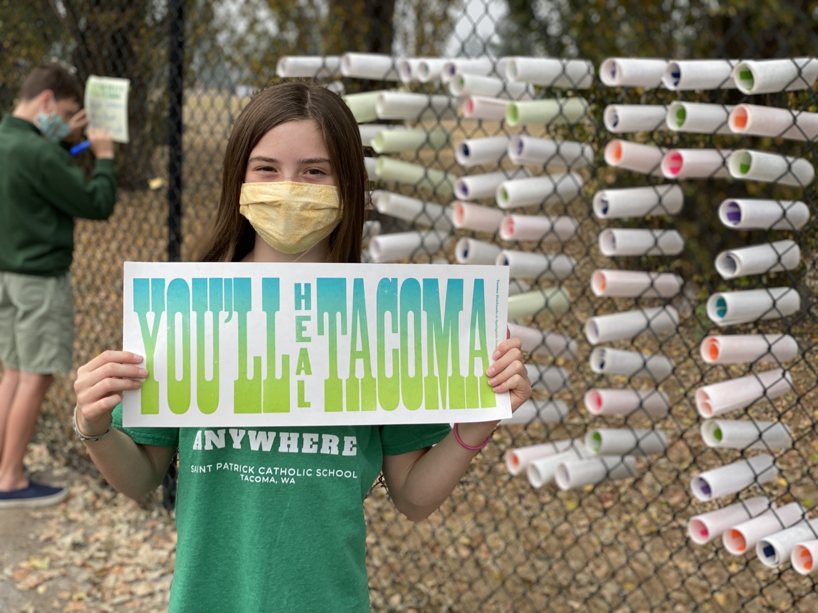
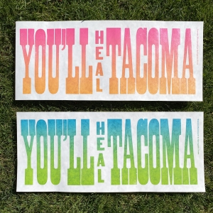
You'll Heal Tacoma, 2020
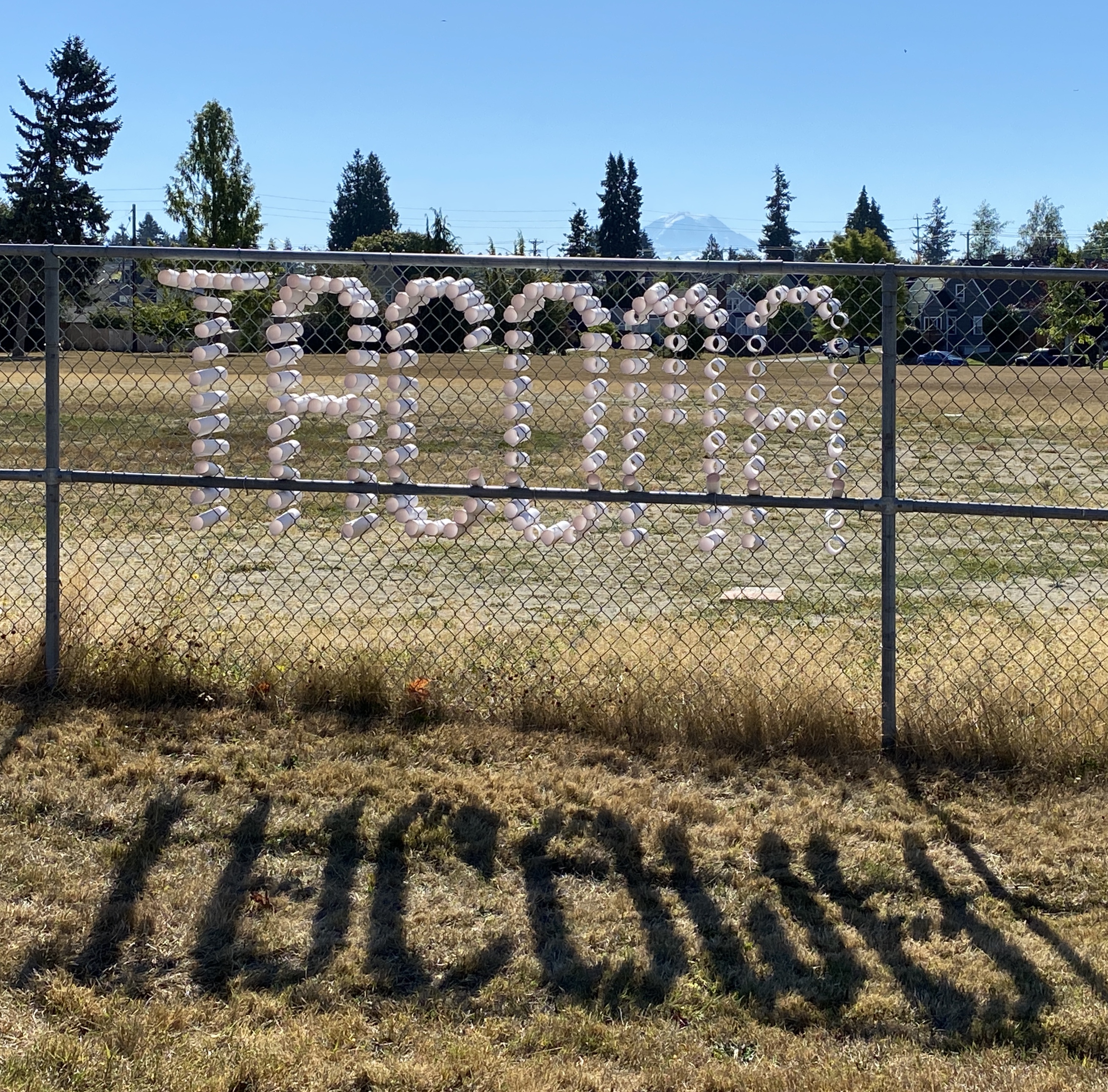
With a nod to the “You’ll Like Tacoma” signage featured at the 1909 Alaska Yukon Exposition, You’ll Heal Tacoma is literally a sign for our pandemic times. Both an urgent call to action and a future prediction, nearly 400 posters are rolled up to collectively spell the healing message in four foot letters. Tacomans are encouraged to remove one letterpress printed poster to take home, then replace it with their own message of healing. Nearly 25 feet long, You’ll Heal Tacoma will be installed along South 19th Street at Stanley Playfield. While the historic Tacoma sign was powered with electric bulbs, this version glows with hope and healing for our city.September 12–20, 2020. This project is made possible with support from Tacoma Metro Parks and the Office of Cultural Vitality.
-
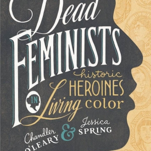
Dead Feminists
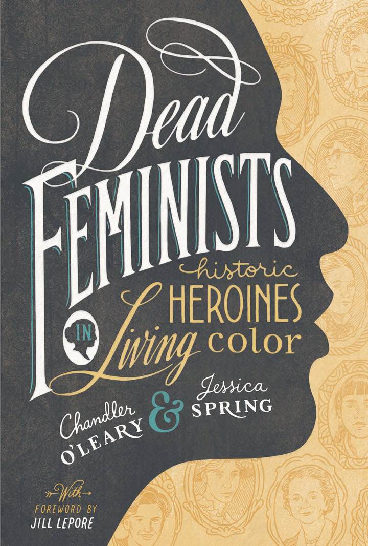
The Dead Feminists series is a collaboration with illustrator Chandler O’Leary. The series features quotes by historical feminists, tied in with current political and social issues. Each limited-edition broadside is letterpress printed from hand-drawn lettering and illustrations. A portion of the proceeds of each piece is donated to a cause that aligns with the issue highlighted by the artwork. Jessica and Chandler have released 30 broadsides since the series began in 2008, and their book "Dead Feminists: Historic Heroines in Living Color" is available through Sasquatch Books.
-


